TED日本語
TED Talks(英語 日本語字幕付き動画)
TED日本語 - フランソワーズ・ムーリー: ニューヨーカー誌、象徴的な表紙イラストの舞台裏
TED Talks
ニューヨーカー誌、象徴的な表紙イラストの舞台裏
The stories behind The New Yorker's iconic covers
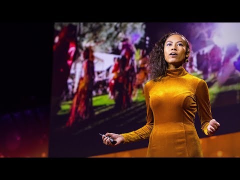
フランソワーズ・ムーリー
Francoise Mouly
内容
ニューヨーカー誌のアート・ディレクター、フランソワーズ・ムーリーをご紹介します。彼女は過去24年間、この雑誌の名高い表紙の決定に携わってきました。9/11直後の週には黒地に黒で描かれたツインタワー、そして最近はトレードマークの紳士ユースタス・ティリーをロシア風に描いたイラストを手がけました。イメージを回顧しながらムーリーが考えるのは、シンプルなイラストが、いかにして私たちが毎日目にするイメージの洪水を突き破れるか、そしていかにして時代のある一瞬の感覚(そして感性)を上品に捉えることができるかということです。


字幕
SCRIPT
Script
So 24 years ago, I was brought to The New Yorker as art editor to rejuvenate what had by then become a somewhat staid institution and to bring in new artists and to try to bring the magazine from its ivory tower into engaging with its time. And it was just the right thing for me to do because I've always been captivated by how an image can -- a simple drawing -- can cut through the torrent of images that we see every single day. How it can capture a moment, how it can crystallize a social trend or a complex event in a way that a lot of words wouldn't be able to do -- and reduce it to its essence and turn it into a cartoon.
So I went to the library and I looked at the first cover drawn by Rea Irvin in 1925 -- a dandy looking at a butterfly through his monocle, and we call it Eustace Tilley. And I realized that as the magazine had become known for its in-depth research and long reports, some of the humor had gotten lost along the way, because now often Eustace Tilley was seen as a haughty dandy, but in fact, in 1925, when Rea Irvin first drew this image, he did it as part of a humor magazine to amuse the youth of the era, which was the flappers of the roaring twenties. And in the library, I found the images that really captured the zeitgeist of the Great Depression. And it showed us not just how people dressed or what their cars looked like, but also what made them laugh, what their prejudices were. And you really got a sense of what it felt like to be alive in the '30s.
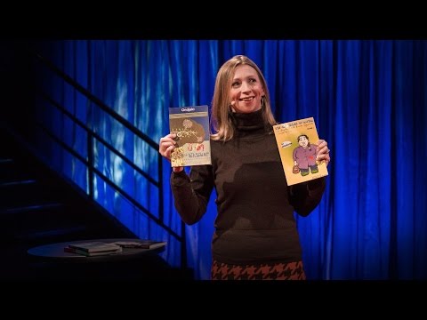
So I called on contemporary artists, such as Adrian Tomine here. I often call on narrative artists -- cartoonists, children's book authors -- and I give them themes such as, you know, what it's like to be in the subway, or Valentine's Day, and they send me sketches. And once the sketches are approved by the editor, David Remnick, it's a go. And I love the way those images are actually not telling you what to think. But they do make you think, because the artist is actually -- it's almost a puzzle; the artist is drawing the dots, and you, the reader, have to complete the picture. So to get this image on the left by Anita Kunz, or the one on right by Tomer Hanuka, you have to play spot the differences. And it is something that ... It's really exciting to see how the engagement with the reader ... how those images really capture -- play with the stereotypes. But when you get it, it rearranges the stereotypes that are in your head.
But the images don't just have to show people, sometimes it can be a feeling. Right after September 11, I was at a point, like everybody else, where I really didn't know how to deal with what we were going through, and I felt that no image could capture this moment, and I wanted to just do a black cover, like no cover. And I talked to my husband, cartoonist Art Spiegelman, and mentioned to him that I was going to propose that, and he said, "Oh, if you're going to do a black cover, then why don't you do the silhouette of the Twin Towers, black on black?" And I sat down to draw this, and as soon as I saw it, a shiver ran down my spine and I realized that in this refusal to make an image, we had found a way to capture loss and mourning and absence. And it's been a profound thing that I learned in the process -- that sometimes some of the images that say the most do it with the most spare means. And a simple image can speak volumes.
So this is the image that we published by Bob Staake right after the election of Barack Obama, and captured a historic moment. But we can't really plan for this, because in order to do this, we have to let the artist experience the emotions that we all feel when that is happening. So back in November 2016, during the election last year, the only image that we could publish was this, which was on the stand on the week that everybody voted.
(Laughter)
Because we knew somebody would feel this --
(Laughter)
when the result of the election was announced. And when we found out the result, we really were at a loss, and this is the image that was sent by Bob Staake again, and that really hit a chord. And again, we can't really figure out what's going to come next, but here it felt like we didn't know how to move forward, but we did move forward, and this is the image that we published after Donald Trump's election and at the time of the Women's March all over the US.
So over those 24 years, I have seen over 1,000 images come to life week after week, and I'm often asked which one is my favorite, but I can't pick one because what I'm most proud of is how different every image is,one from the other. And that's due to the talent and the diversity of all of the artists that contribute.
And now, well, now, we're owned by Russia, so --
(Laughter)
In a rendering by Barry Blitt here, Eustace has become Eustace Vladimirovich Tilley. And the butterfly is none other than a flabbergasted Donald Trump flapping his wings, trying to figure out how to control the butterfly effect, and the famed logo that was drawn by Rae Irvin in 1925 is now in Cyrillic.
So, what makes me really excited about this moment is the way that ... You know, free press is essential to our democracy. And we can see from the sublime to the ridiculous that artists can capture what is going on in a way that an artist armed with just India ink and watercolor can capture and enter into the cultural dialogue. It puts those artists at the center of that culture, and that's exactly where I think they should be. Because the main thing we need right now is a good cartoon.
Thank you.
(Applause)
私は24年前 アートディレクターとして ニューヨーカー誌に招かれました 当時 少し古臭くなっていた体制を 若返らせること そして 新たなアーティストを招いて この雑誌を象牙の塔から 引きずり出し 時代との関わりを 築くことが目的でした これは私には まさに うってつけの仕事でした というのも 私がいつも惹かれるのは たった1つのイメージ ― 1枚のシンプルなイラストが 日々 目に入るイメージの洪水を 突き抜けて現れる様子や イメージが瞬間を捉える様子 ― そしてイメージが 社会の動向や複雑な出来事を 言葉では不可能なやり方で はっきりと具体化し 本質を取り出して 漫画にしていく様子だからです
そこで私は図書館へ行き リー・アーヴィンが1925年に描いた 創刊号の表紙を見ました 片めがね越しに蝶を覗く 紳士のイラストで 彼の愛称は 「ユースタス・ティリー」です ニューヨーカー誌が 徹底した調査と長文の記事で 知られるようになるにつれて 次第にユーモアが 失われていったことに 気づきました というのも ユースタス・ティリーは 今でこそ高慢で きざだと思われがちですが 実際には リー・アーヴィンが1925年に このイラストを初めて描いた時は ユーモア雑誌の表紙として その時代の若者たち ― 狂騒の20年代に生きる 奔放なおてんば娘を 喜ばせることが目的だったからです 私は その図書館で 大恐慌の時代精神を見事に捉えた イラストを見つけました それは単に人々の装いや 自動車のフォルムを 描き出すだけでなく 人々が何を見て笑い どんな偏見を持っていたのかまで 表していました 1930年代に生きるとは どういうことか 本当に知ることができたのです
だから私は現代アーティストを 招きました エイドリアン・トミネはその一人です 私はよく 物語を志向する アーティスト ― 漫画家や児童文学作家に声をかけ 色々なテーマ 例えば 地下鉄に乗っている時の様子とか バレンタインデーといったテーマを与えて スケッチを送ってもらいました そのスケッチに 編集長のデイヴィッド・レムニックから 承認が下りると それがゴーサインです 私が気に入っているのは そういうイメージが 考え方を押し付けることなく 見る者を考えさせるところです というのも アーティストが… イラストは パズル的なのです アーティストが描いた点を 読者が結んで 絵を完成させなければなりません 左側のアニタ・クンツや 右のトマー・ハヌカのイラストを 理解するためには 間違い探しをしなければなりません そして これは何だか… とてもワクワクするのは いかに読者との 繋がりができていくか いかに これらのイラストが ステレオタイプを使って遊ぶかを 目の当たりにすることです それを理解すれば 頭の中にあるステレオタイプは 変化します
ただ イラストが表すのは 人間とは限りません 感情を表すこともあります 9/11の直後のことです 誰でもそうだったと思いますが あの時 私は 自分たちが経験したことを どう捉えればいいかわかりませんでした その瞬間を捉えるイラストなどありえないと感じて ニューヨーカー誌の表紙を 真っ黒にしようと思っていました 表紙がないみたいに それで 私の夫で漫画家の アート・スピーゲルマンに そう提案しようと思っていると 相談したところ 彼は こう言ったんです 「表紙を黒くするんだったら ツイン・タワーのシルエットを 黒地に黒で描いては?」 そこで私は机に向かい 完成したものを見た途端 背筋がゾッとしました その時 気づいたのは イメージを描くのを 拒否することで 喪失感や 深い悲しみや 虚無が表現できる ということでした この表紙を作る過程で学んだのは とても深いことでした 時には雄弁に語るイメージを 極めて抑えた手段で 実現できるということ ― そしてシンプルなイメージでも 多くを語れるということです
さて このイラストは ボブ・スタークの作品で バラク・オバマが 大統領に選ばれた直後の 歴史的な瞬間を捉えたものです ただ 予定稿は準備できません このように描くには 出来事の真っ只中で 皆が感じることを 作家も感じなくてはならないからです ですから 2016年11月の 大統領選 期間中に 掲載できたイラストは これだけでした これが投票日の週に ニュース・スタンドに並んだのです
[ああ 神様 やめて](笑)
選挙結果が出れば こんな風に感じる人も ―
(笑)
いるだろうと思ったからです 結果が判明すると 私たちは途方に暮れました これもボブ・スタークによる イラストですが 強く訴えるものがあります それでも 今後どうなるかは わかりません この時も どうすればいいか わからないながらに とにかく私たちは進み続けました これはドナルド・トランプが 大統領に選ばれた後 アメリカ中で女性による ウィメンズ・マーチが行われた時に 発行したものです
さて 私はこれまで 24年間に渡って 千点を超えるイラストが 毎週生まれるのを見てきたので よく 一番好きな作品を 尋ねられますが 1つに絞るのは無理です 私にとって一番の誇りは イラストが1つ1つ 違っていることですから そして それは寄稿している アーティストたちの 才能と多様性のおかげです
そして現在 ― 注目の的はロシアです そこで ―
(笑)
バリー・ブリットによる この作品では ユースタス・“ウラジーミロヴィチ”・ティリーになっていて 蝶は 他でもない 仰天するドナルド・トランプの姿 羽ばたきながら 「バタフライ効果」を制御する 方法を見つけようとしています リー・アーヴィンが1925年に描いた 有名なロゴも キリル文字になっています
さて 今 私が本当に ワクワクしているのは… 民主主義には 報道の自由が不可欠ですが 崇高なものにしろ 馬鹿げたものにしろ アーティストには 今を捉える力があることがわかります アーティストたちが インクと水彩絵の具だけを手に 時代を捉え 文化的な対話を 始めるのです この対話によって 彼らは 文化の中心に身を置けるのですし そこがまさに 彼らの居場所だと思うのです 今 私たちに必要なのは 「よい漫画」なのですから
ありがとうございます
(拍手)
品詞分類
- 主語
- 動詞
- 助動詞
- 準動詞
- 関係詞等
TED 日本語
TED Talks
関連動画

アーティストは経済にどう貢献し、私たちは彼らをどう支えられるか?ハディ・エルデベック
2018.04.09コンテンツを流行らせる要素とは?ダオ・グエン
2018.01.08私がアートを制作するのは、伝統を受け継ぐタイムカプセルを作るためケイラ・ブリエット
2017.12.08とらえ難い心情を表す素敵な新語の数々ジョン・ケーニック
2017.03.312千本のおくやみ記事から学んだことラックス・ナラヤン
2017.03.23メロドラマが教えてくれる4つの大げさな人生訓ケイト・アダムス
2017.01.03音楽がもたらしたコンピューターの発明スティーヴン・ジョンソン
2016.12.09Ideas worth dating -- デートする価値のあるアイデアレイン・ウィルソン
2016.10.30購読解除の苦悩!ジェイムズ・ヴィーチ
2016.09.27コスプレへの愛アダム・サヴェッジ
2016.08.23「アンチ」を科学的に分類してみようネギン・ファルサド
2016.07.05データで描く、示唆に富む肖像画ルーク・デュボワ
2016.05.19詐欺メール 返信すると どうなるかジェイムズ・ヴィーチ
2016.02.01世界中の国の本を1冊ずつ読んでいく私の1年アン・モーガン
2015.12.21日常の音に隠された思いがけない美とはメクリト・ハデロ
2015.11.10アメリカで最も白人主義的な町々に突入!リッチ・ベンジャミン
2015.08.11


洋楽 おすすめ
RECOMMENDS
洋楽歌詞
ダイナマイトビーティーエス
洋楽最新ヒット2020.08.20ディス・イズ・ミーグレイテスト・ショーマン・キャスト
洋楽人気動画2018.01.11グッド・ライフGイージー、ケラーニ
洋楽人気動画2017.01.27ホワット・ドゥ・ユー・ミーン?ジャスティン・ビーバー
洋楽人気動画2015.08.28ファイト・ソングレイチェル・プラッテン
洋楽人気動画2015.05.19ラヴ・ミー・ライク・ユー・ドゥエリー・ゴールディング
洋楽人気動画2015.01.22アップタウン・ファンクブルーノ・マーズ、マーク・ロンソン
洋楽人気動画2014.11.20ブレイク・フリーアリアナ・グランデ
洋楽人気動画2014.08.12ハッピーファレル・ウィリアムス
ポップス2014.01.08カウンティング・スターズワンリパブリック
ロック2013.05.31ア・サウザンド・イヤーズクリスティーナ・ペリー
洋楽人気動画2011.10.26ユー・レイズ・ミー・アップケルティック・ウーマン
洋楽人気動画2008.05.30ルーズ・ユアセルフエミネム
洋楽人気動画2008.02.21ドント・ノー・ホワイノラ・ジョーンズ
洋楽人気動画2008.02.15オンリー・タイムエンヤ
洋楽人気動画2007.10.03ミス・ア・シングエアロスミス
ロック2007.08.18タイム・トゥ・セイ・グッバイサラ・ブライトマン
洋楽人気動画2007.06.08シェイプ・オブ・マイ・ハートスティング
洋楽人気動画2007.03.18ウィ・アー・ザ・ワールド(U.S.A. フォー・アフリカ)マイケル・ジャクソン
洋楽人気動画2006.05.14ホテル・カリフォルニアイーグルス
ロック2005.07.06