TED日本語
TED Talks(英語 日本語字幕付き動画)
TED日本語 - ローマン・マーズ: 街の旗が、誰にも気づかれない最悪のデザインになる理由
TED Talks
街の旗が、誰にも気づかれない最悪のデザインになる理由
Why city flags may be the worst-designed thing you've never noticed
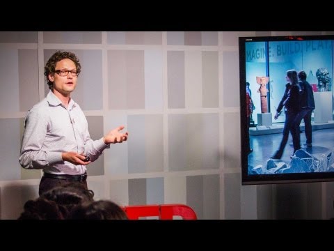
ローマン・マーズ
Roman Mars
内容
ローマン・マーズは、旗に取り憑かれていますが、このトークを聞けば、あなたもそうなるかもしれません。旗は、どこにでも見られる市民の誇りの象徴ですが、デザインが酷い場合も多いのです。でも、これをそのままにしておく手はありません。旗の研究、「旗章学」に関する、驚くような面白い話を通して、マーズは、旗をデザインする時の5つの基本原則を明らかにします。そして、その原則が、ほぼあらゆるデザインに当てはまる理由を教えてくれます。


字幕
SCRIPT
Script

I know what you're thinking: "Why does that guy get to sit down?" That's because this is radio.
(Music)
I tell radio stories about design, and I report on all kinds of stories: buildings and toothbrushes and mascots and wayfinding and fonts. My mission is to get people to engage with the design that they care about so they begin to pay attention to all forms of design. When you decode the world with design intent in mind, the world becomes kind of magical. Instead of seeing the broken things, you see all the little bits of genius that anonymous designers have sweated over to make our lives better. And that's essentially the definition of design: making life better and providing joy. And few things give me greater joy than a well-designed flag.
Yeah! Happy 50th anniversary on your flag, Canada. It is beautiful, gold standard. Love it.
I'm kind of obsessed with flags. Sometimes I bring up the topic of flags, and people are like, "I don't care about flags," and then we start talking about flags, and trust me,100 percent of people care about flags. There's just something about them that works on our emotions.
My family wrapped my Christmas presents as flags this year, including the blue gift bag that's dressed up as the flag of Scotland. I put this picture online, and sure enough, within the first few minutes, someone left a comment that said, "You can take that Scottish Saltire and shove it up your ass." (Laughter) Which -- see, people are passionate about flags, you know? That's the way it is.
What I love about flags is that once you understand the design of flags, what makes a good flag, what makes a bad flag, you can understand the design of almost anything. So what I'm going to do here is, I cracked open an episode of my radio show, "99 % Invisible," and I'm going to reconstruct it here on stage, so when I press a button over here -- Voice: S for Sound -- Roman Mars: It's going to make a sound, and so whenever you hear a sound or a voice or a piece of music, it's because I pressed a button.
Voice: Sssssound.
RM: All right, got it? Here we go. Three,two.
This is 99 % Invisible. I'm Roman Mars.
Narrator: The five basic principles of flag design.
Roman Mars: According to the North American Vexillological Association. Vexillological.
Ted Kaye: Vexillology is the study of flags.
RM: It's that extra "lol" that makes it sound weird.
Narrator: Number one, keep it simple. The flag should be so simple that a child can draw it from memory.
RM: Before I moved to Chicago in 2005, I didn't even know cities had their own flags.
TK: Most larger cities do have flags.
RM: Well, I didn't know that. That's Ted Kaye, by the way.
TK: Hello. RM: He's a flag expert. He's a totally awesome guy.
TK: I'm Ted Kaye. I have edited a scholarly journal on flag studies, and I am currently involved with the Portland Flag Association and the North American Vexillological Association.
RM: Ted literally wrote the book on flag design.
Narrator: "Good Flag, Bad Flag."
RM: It's more of a pamphlet, really. It's about 16 pages.
TK: Yes, it's called "Good Flag, Bad Flag: How to Design a Great Flag."
RM: And that first city flag I discovered in Chicago is a beaut: white field,two horizontal blue stripes, and four six-pointed red stars down the middle.
Narrator: Number two: use meaningful symbolism.
TK: The blue stripes represent the water, the river and the lake.
Narrator: The flag's images, colors or pattern should relate to what it symbolizes.
TK: The red stars represent significant events in Chicago's history. RM: Namely, the founding of Fort Dearborn on the future site of Chicago, the Great Chicago Fire, the World Columbian Exposition, which everyone remembers because of the White City, and the Century of Progress Exposition, which no one remembers at all.
Narrator: Number three, use two to three basic colors.
TK: The basic rule for colors is to use two to three colors from the standard color set: red, white, blue, green, yellow and black.
RM: The design of the Chicago flag has complete buy-in with an entire cross-section of the city. It is everywhere; every municipal building flies the flag.
Whet Moser: Like, there's probably at least one store on every block near where I work that sells some sort of Chicago flag paraphernalia.
RM: That's Whet Moser from Chicago magazine.
WM: Today, just for example, I went to get a haircut, and when I sat down in the barber's chair, there was a Chicago flag on the box that the barber kept all his tools in, and then in the mirror there was a Chicago flag on the wall behind me. When I left, a guy passed me who had a Chicago flag badge on his backpack. RM: It's adaptable and remixable. The six-pointed stars in particular show up in all kinds of places. WM: The coffee I bought the other day had a Chicago star on it. RM: It's a distinct symbol of Chicago pride. TK: When a police officer or a firefighter dies in Chicago, often it's not the flag of the United States on his casket. It can be the flag of the city of Chicago. That's how deeply the flag has gotten into the civic imagery of Chicago.
RM: And it isn't just that people love Chicago and therefore love the flag. I also think that people love Chicago more because the flag is so cool.
TK: A positive feedback loop there between great symbolism and civic pride.
RM: Okay. So when I moved back to San Francisco in 2008, I researched its flag, because I had never seen it in the previous eight years I lived there. And I found it, I am sorry to say, sadly lacking.
(Laughter)
I know. It hurts me, too.
(Laughter)
TK: Well, let me start from the top.
Narrator: Number one, keep it simple. TK: Keeping it simple.
Narrator: The flag should be so simple that a child can draw it from memory.
TK: It's a relatively complex flag.
RM: Okay, here we go. Okay. The main component of the San Francisco flag is a phoenix representing the city rising from the ashes after the devastating fires of the 1850s.
TK: A powerful symbol for San Francisco.
RM: I still don't really dig the phoenix. Design-wise, it manages to both be too crude and have too many details at the same time, which if you were trying for that, you wouldn't be able to do it, and it just looks bad at a distance, but having deep meaning puts that element in the plus column. Behind the phoenix, the background is mostly white, and then it has a substantial gold border around it.
TK: Which is a very attractive design element.
RM: I think it's okay. But -- (Laughter) -- here come the big no-nos of flag design.
Narrator: Number four, no lettering or seals. Never use writing of any kind.
RM: Underneath the phoenix, there's a motto on a ribbon that translates to "Gold in peace, iron in war," plus -- and this is the big problem -- it says San Francisco across the bottom.
TK: If you need to write the name of what you're representing on your flag, your symbolism has failed.
RM: The United States flag doesn't say "USA" across the front. In fact, country flags, they tend to behave. Like, hats off to South Africa and Turkey and Israel and Somalia and Japan and Gambia. There's a bunch of really great country flags, but they obey good design principles because the stakes are high. They're on the international stage. But city, state and regional flags are another story. (Laughter) There is a scourge of bad flags, and they must be stopped. (Laughter) (Applause) That is the truth and that is the dare. The first step is to recognize that we have a problem. A lot of people tend to think that good design is just a matter of taste, and quite honestly, sometimes it is, actually, but sometimes it isn't, all right? Here's the full list of NAVA flag design principles.
Narrator: The five basic principles of flag design. Number one. TK: Keep it simple. Narrator: Number two. TK: Use meaningful symbolism.
Narrator: Number three. TK: Use two to three basic colors.
Narrator: Number four. TK: No lettering or seals.
Narrator: Never use writing of any kind.
TK: Because you can't read that at a distance.
Narrator: Number five. TK: And be distinctive.
RM: All the best flags tend to stick to these principles. And like I said before, most country flags are okay. But here's the thing: if you showed this list of principles to any designer of almost anything, they would say these principles -- simplicity, deep meaning, having few colors or being thoughtful about colors, uniqueness, don't have writing you can't read -- all those principles apply to them, too. But sadly, good design principles are rarely invoked in U.S. city flags. Our biggest problem seems to be that fourth one. We just can't stop ourselves from putting our names on our flags, or little municipal seals with tiny writing on them. Here's the thing about municipal seals: They were designed to be on pieces of paper where you can read them, not on flags 100 feet away flapping in the breeze.
So here's a bunch of flags again. Vexillologists call these SOBs: seals on a bedsheet -- (Laughter) -- and if you can't tell what city they go to, yeah, that's exactly the problem, except for Anaheim, apparently. They fixed it. (Laughter)
These flags are everywhere in the U.S. The European equivalent of the municipal seal is the city coat of arms, and this is where we can learn a lesson for how to do things right. So this is the city coat of arms of Amsterdam. Now, if this were a United States city, the flag would probably look like this. You know, yeah. (Laughter) But instead, the flag of Amsterdam looks like this. Rather than plopping the whole coat of arms on a solid background and writing "Amsterdam" below it, they just take the key elements of the escutcheon, the shield, and they turn it into the most badass city flag in the world. (Laughter) (Applause)
And because it's so badass, those flags and crosses are found throughout Amsterdam, just like Chicago, they're used.
Even though seal-on-a-bedsheet flags are particularly painful and offensive to me, nothing can quite prepare you for one of the biggest train wrecks in vexillological history. Are you ready? It's the flag of Milwaukee, Wisconsin. (Laughter) I mean, it's distinctive, I'll give them that.
Steve Kodis: It was adopted in 1955.
RM: The city ran a contest and gathered a bunch of submissions with all kinds of designs.
SK: And an alderman by the name of Fred Steffan cobbled together parts of the submissions to make what is now the Milwaukee flag.
RM: It's a kitchen sink flag. There's a gigantic gear representing industry, there's a ship recognizing the port, a giant stalk of wheat paying homage to the brewing industry. It's a hot mess, and Steve Kodis, a graphic designer from Milwaukee, wants to change it.
SK: It's really awful. It's a misstep on the city's behalf, to say the least.
RM: But what puts the Milwaukee flag over the top, almost to the point of self-parody, is on it is a picture of the Civil War battle flag of the Milwaukee regiment.
SK: So that's the final element in it that just makes it that much more ridiculous, that there is a flag design within the Milwaukee flag.
RM: On the flag. Yeah. Yeah. (Laughter) Yeah.
(Music)
Now, Milwaukee is a fantastic city. I've been there. I love it. The most depressing part of this flag, though, is that there have been two major redesign contests. The last one was held in 2001. One hundred and five entries were received.
TK: But in the end, the members of the Milwaukee Arts Board decided that none of the new entries were worthy of flying over the city.
RM: They couldn't agree to change that thing! (Laughter) That's discouraging enough to make you think that good design and democracy just simply do not go together. But Steve Kotas is going to try one more time to redesign the Milwaukee flag.
SK: I believe Milwaukee is a great city. Every great city deserves a great flag.
RM: Steve isn't ready to reveal his design yet. One of the things about proposing one of these things is you have to get people on board, and then you reveal your design. But here's the trick: If you want to design a great flag, a kickass flag like Chicago's or D.C.'s, which also has a great flag, start by drawing a one-by-one-and-a-half- inch rectangle on a piece of paper. Your design has to fit within that tiny rectangle. Here's why.
TK: A three-by-five-foot flag on a pole 100 feet away looks about the same size as a one-by-one-and-a-half-inch rectangle seen about 15 inches from your eye. You'd be surprised by how compelling and simple the design can be when you hold yourself to that limitation.
RM: Meanwhile, back in San Francisco. Is there anything we can do?
TK: I like to say that in every bad flag there's a good flag trying to get out. (Laughter) The way to make San Francisco's flag a good flag is to take the motto off because you can't read that at a distance. Take the name off, and the border might even be made thicker, so it's more a part of the flag. And I would simply take the phoenix and make it a great big element in the middle of the flag.
RM: But the current phoenix, that's got to go.
TK: I would simplify or stylize the phoenix. Depict a big, wide-winged bird coming out of flames. Emphasize those flames.
RM: So this San Francisco flag was designed by Frank Chimero based on Ted Kaye's suggestions. I don't know what he would do if we was completely unfettered and didn't follow those guidelines. Fans of my radio show and podcast, they've heard me complain about bad flags. They've sent me other suggested designs. This one's by Neil Mussett. Both are so much better. And I think if they were adopted, I would see them around the city.
In my crusade to make flags of the world more beautiful, many listeners have taken it upon themselves to redesign their flags and look into the feasibility of getting them officially adopted. If you see your city flag and like it, fly it, even if it violates a design rule or two. I don't care. But if you don't see your city flag, maybe it doesn't exist, but maybe it does, and it just sucks, and I dare you to join the effort to try to change that.
As we move more and more into cities, the city flag will become not just a symbol of that city as a place, but also it could become a symbol of how that city considers design itself, especially today, as the populace is becoming more design-aware. And I think design awareness is at an all-time high. A well-designed flag could be seen as an indicator of how a city considers all of its design systems: its public transit, its parks, its signage. It might seem frivolous, but it's not.
TK: Often when city leaders say, "We have more important things to do than worry about a city flag," my response is, "If you had a great city flag, you would have a banner for people to rally under to face those more important things."
RM: I've seen firsthand what a good city flag can do in the case of Chicago. The marriage of good design and civic pride is something that we need in all places. The best part about municipal flags is that we own them. They are an open-source, publicly owned design language of the community. When they are done well, they are remixable, adaptable, and they are powerful. We could control the branding and graphical imagery of our cities with a good flag, but instead, by having bad flags we don't use, we cede that territory to sports teams and chambers of commerce and tourism boards. Sports teams can leave and break our hearts. And besides, some of us don't really care about sports. And tourism campaigns can just be cheesy. But a great city flag is something that represents a city to its people and its people to the world at large. And when that flag is a beautiful thing, that connection is a beautiful thing. So maybe all the city flags can be as inspiring as Hong Kong or Portland or Trondheim, and we can do away with all the bad flags like San Francisco, Milwaukee, Cedar Rapids, and finally, when we're all done, we can do something about Pocatello, Idaho, considered by the North American Vexillological Association as the worst city flag in North America. (Laughter) (Applause) Yeah. That thing has a trademark symbol on it, people. (Laughter) That hurts me just to look at.
Thank you so much for listening.
(Applause)
[ "Music by: Melodium (@ melodiumbox) and Keegan DeWitt (@ keegandewitt)" ]
皆さんは こう思っているでしょう 「なんで こいつは座っているんだ?」 それは ラジオ番組だからです
(音楽)
デザインに関する ラジオストーリーをお送りします レポートするのは あらゆるデザイン ― 建築から 歯ブラシ マスコット ― サインデザイン フォントに至る あらゆるものです 私の使命は みんなに デザインに関心を持ってもらい あらゆるデザインに 目を向けてもらうことです デザインを念頭において 世界を解釈すると 世界は まるで魔法のように 魅力的な場所になります 目にするものは ただの断片ではなく 私たちの暮らしをより良くするために 無名のデザイナーたちが 心血を注いだ 才能のかけらに見えてくるのです これがデザインの定義の本質です より良い暮らしと 喜びを与えるのが デザインです 私が最も喜びを感じるのは 優れたデザインの旗です
(笑)(拍手)
そうです! カナダの国旗制定50周年おめでとう 美しい まさに旗の金字塔です
私は旗が何だか気になってしまい その話題を よく取りあげますが 「旗なんてどうでもいい」と みんな言うんです それでも旗のことを話し始めると 間違いなく ― 100%全員 旗が気になってくるのです 旗は 私たちの感情に 働きかけるようです
今年は家族がクリスマスプレゼントを 旗で包んでくれました 中にはスコットランドの旗に見立てた 青いギフトバッグもあります この写真をネットにあげた途端 わずか数分で こんなコメントがつきました 「スコットランドの斜め十字なんか ケツに突っ込んどけ」(笑) ほら みんな旗に夢中でしょう? そういうものなんです
旗のいいところは そのデザインについて一旦 理解し 良し悪しの理由がわかると 大体どんなもののデザインでも 理解できる点です この場で やろうとしているのは 私のラジオ番組『99% Invisible』の あるエピソードを公開して ステージで再現することです このボタンを押すと・・・ (声)サウンドのS (ローマン・マーズ)音が出ます 音や声や音楽の断片が 聞こえるのは ボタンを押しているからです
(声)サ・・・サウンド
(ローマン)いいですか では始めましょう 3 2 ・・・
『99% Invisible』 ローマン・マーズです
(ナレーター)旗のデザインにおける 5つの基本原則
(ローマン)北米旗章学協会によると・・・ そう「旗章学」です
(テッド・ケイ) 旗章学とは旗の研究です
(ローマン)何とも奇妙な名前です
(ナレーター)原則1 シンプルであること 旗は子どもが何も見ずに描けるくらい シンプルであるべきです
(ローマン)2005年に シカゴに引っ越すまでは 街に旗があることすら知りませんでした
(テッド)ほとんどの大都市には 旗があるんです
(ローマン)知りませんでした ちなみに 今のはテッド・ケイです
(テッド)こんにちは (ローマン)彼は旗の専門家で 本当にすごい人物です
(テッド)私はテッド・ケイ 旗に関する学会誌を編集していて 今はポートランド旗章協会と 北米旗章学協会の会員です
(ローマン)彼は旗の デザインに関する本を書きました
(ナレーター)『よい旗 悪い旗』です
(ローマン)本当はパンフレットに 近いもので 約16ページです
(テッド)そう タイトルは 『よい旗 悪い旗 ― 素晴らしい旗をデザインするには』です
(ローマン)シカゴで 初めて目にした市旗は 素晴らしいものです 白地に2本の青い横線 真ん中には4つの赤い六角星
(ナレーター)原則2 意味のある記号を用いること
(テッド)青い横線は 水や川や湖を表しています
(ナレーター)旗に描かれる イメージや色や模様は 表すものと関連がなければいけない
(テッド)赤い星はシカゴの歴史上 重要な出来事を表しています (ローマン)すなわち 未来のシカゴとなる ディアボーン砦の設立 ― シカゴ大火 ― 「ホワイト・シティ」で みんなの記憶に残る シカゴ万国博覧会 ― そして 誰の記憶にも残っていない 「進歩の一世紀」万国博覧会です
(ナレーター)原則3 2~3種類の基本色を使うこと
(テッド)色の基本ルールは 標準的な色セットから 2~3色 選ぶことです 赤 白 青 緑 黄色 黒です
(ローマン)シカゴの旗のデザインは すっかり受け入れられ 街中で見かけます あらゆる場所にあって すべての市の建物に旗があります
(ウェット・モーザー)職場の近くでは 1ブロックに少なくとも一軒は シカゴの旗がついたものを 売っていると思います
(ローマン)シカゴマガジンの ウェット・モーザーです
(ウェット)例えば 今日 髪を切りに行ったんですが 床屋で椅子に腰かけると 道具箱にはシカゴの旗が ついていましたし 鏡を見ると 私の背後にも旗が見えました 帰りには すれ違った男性がリュックに 旗のバッジをつけていました (ローマン)応用が効いて リミックスも可能です 特に六角星は 様々な場所で見かけます (ウェット)この間コーヒーを買ったら カップにシカゴの星がついていました (ローマン)シカゴ魂を表す シンボルなのです (テッド)シカゴでは警官や 消防士が殉職した時 棺にかけるのが アメリカ国旗でないこともあります シカゴの市旗をかけるんです そのくらい この旗は シカゴ市民の心に焼き付いています
(ローマン)市民がシカゴを愛しているから 旗を気に入るわけではありません 旗がこれほど素晴らしいからこそ 市民がシカゴを もっと好きになると思うのです
(テッド)優れたシンボルと 市民の誇りとの間に好循環があります
(ローマン)さて 私が2008年に サンフランシスコに帰った時 市旗を調べてみました 以前 8年間暮らしていたのですが 一度も見たことがなかったからです そして残念なことに 悲しくなるほど この街の旗が 物足りないものだとわかりました
(笑)
そうですよね 胸が痛みました
(笑)
(テッド)上から順に見て行きましょう
(ナレーター)原則1 シンプルであること (テッド)シンプルにすべきです
(ナレーター)旗は子どもが何も見ずに描けるくらい シンプルであるべきです
(テッド)これは比較的 複雑です
(ローマン)なるほど 見てみましょう サンフランシスコの旗の中心的な要素は フェニックスです 1850年台の大火の後 灰の中から蘇った街を表しています
(テッド)力強いシンボルです
(ローマン)でも このフェニックスは いただけません デザイン的には荒削りなのに ディティールが細かすぎます やろうとしても なかなかできることではありません 遠くから見ると酷い旗ですが 深い意味を持っている点は 評価できます フェニックスの背景は ほぼ真っ白で 周りは太く金色で縁取られています
(テッド)ここは魅力的な デザイン的要素です
(ローマン)いいと思いますよ ただし・・・(笑) 次は旗のデザインでは 絶対やっちゃダメなことです
(ナレーター)原則4 文字や紋章を入れないこと 何も書いてはいけない
(ローマン)フェニックスの下の リボンには 「平和の金 戦争の鉄」という意味の モットーが書いてあります さらに大きな問題があります 下に思いきり「サンフランシスコ」と 書いてあるのです
(テッド)旗で表すものの名前を 書く必要があるなら シンボルとして失敗です
(笑)(拍手)
(ローマン)アメリカ国旗には USAと書いていないでしょう 実際 国旗は大体きちんとしています 南アフリカや トルコや イスラエルや ソマリアや 日本や ガンピアの国旗には脱帽です 本当に素晴らしい国旗は たくさんありますが よいデザインの原則に従うのは 利害に関わるからです 国際的な舞台に出すものですから でも市や州や地域の旗となると 話は別です (笑) 頭が痛くなるような 酷い旗があります 誰かが止めるべきです (笑)(拍手) それこそが真実であり 勇気です その第一歩は 問題があることを 認めることです 多くの人が 良いデザインとは 趣味の問題に過ぎないと 考えています 率直に言って その通りの場合もあるし そうでない場合もあるのです 北米旗章学協会による 旗のデザイン原則を見てみましょう
(ナレーター)旗をデザインする時の 5つの基本原則 ― 原則1 (テッド)シンプルにする (ナレーター)原則2 (テッド)意味のある記号を用いる
(ナレーター)原則3 (テッド)2~3種類の基本色を使う
(ナレーター)原則4 (テッド)文字や紋章は入れない
(ナレーター)何も書いてはいけない
(テッド)遠くからは読めませんから
(ナレーター)原則5 (テッド)特徴的であること
(ローマン)最高の旗は ほぼ この原則に従っています 先ほど言った通り 国旗は ほとんど大丈夫です ただ 実は 大体 どんなデザイナーにたずねても こう言うでしょう この5つの原則 すなわち シンプルさ 深い意味 ― 絞った あるいは慎重に考えた色 ― 特徴的であること 読めない文字は入れないこと・・・ これらの原則は すべて どのデザインにもあてはまります でも悲しいことに アメリカの市旗に よいデザインの原則は あまり適用されていません 一番の問題は原則4でしょう アメリカ人は つい 旗に地元の名前や 極小文字のついた自治体の紋章を 入れたくなってしまいます 実は自治体の紋章は 紙の上でデザインされます その時は読めるのですが 30m先で 風にはためいていると 読むのは無理です
さて再びいろいろな旗を見てください 旗章学者たちは こういった旗をSOB ― 紋章シーツ(seals on a bedsheet)と 呼びます(笑) どの旗が どの市旗か わからなければ まさに それが問題です ただアナハイムはわかりますよね 修正したからです(笑)
こんな旗がアメリカ中にあります ヨーロッパで 自治体の紋章にあたるのは 市の盾形紋章です ここから正しい方法を 学ぶことができます これはアムステルダムの紋章です もしこれがアメリカの街なら 旗はおそらくこんな風になるでしょう そうですよね(笑) ところがアムステルダムの旗は こういうものです 一色の背景に ただ紋章をつけて その下に「アムステルダム」と 書く代わりに 重要な要素をエスカッション つまり盾から取り上げて 世界で一番クールな 旗に作り変えたのです (笑)(拍手)
すごくクールですから アムステルダム中で この旗や十字を目にします シカゴと同様 使われているのです
紋章シーツみたいな旗は 私には苦痛だし 怒りすら覚えるのですが それでも旗章学史上最悪の 失敗作のひとつには 相当の覚悟が必要です 心の準備はいいですか? ウィスコンシン州 ミルウォーキーの旗です (笑) たしかに特徴的ではあります それは認めましょう
(スティーブ・コーディス)この旗は 1955年に採用されました
(ローマン)市がコンクールを開き 様々なデザインの投稿が 大量に集まりました
(スティーブ)フレッド・ステファンという 市会議員が いろいろな投稿の一部を 切り貼りして 現在のミルウォーキー市旗を 作ったんです
(ローマン)残飯入れのような旗です 産業を表す巨大な歯車に 港を称える船 ― 醸造業に敬意を表す 巨大な小麦の穂・・・ めちゃくちゃです そこで地元出身のグラフィックデザイナー スティーブ・コーディスは旗を変えようとしています
(スティーブ)これは本当にひどい 控えめに言っても 市の失策です
(ローマン)ミルウォーキーの旗が ここまで酷くなり パロディのようになってしまった原因は 旗の中にある 南北戦争時の ミルウォーキー連隊の軍旗です
(スティーブ)この旗をダメにしている 止めの一撃が 市旗の中に 別の旗のデザインが 含まれていることなんです
(ローマン)旗の中にです そうですよね(笑) まったく・・・
(音楽)
ミルウォーキーは素晴らしい街です 行ったことがありますが 大好きな街です ただ この旗の一番残念な点は 大規模なデザイン改善コンテストが 2回も開かれていることです 前回は2001年に開催され 105件の応募がありました
(テッド)でも結局 ミルウォーキーの芸術委員たちは 応募作の中に 街に掲げる価値を 持つものはないと結論づけたのです
(ローマン)あんな旗さえ 変えられなかったのです!(笑) 残念すぎて よいデザインと民主主義とは 合わないのではと 考えたくもなります でもスティーブは もう一度 ミルウォーキーの旗を デザインし直そうとしています
(スティーブ)ミルウォーキーは 素晴らしい街だと思います そして素晴らしい街には 素晴らしい旗が必要なんです
(ローマン)スティーブのデザインは まだ公開できる段階ではありません こういったことを提案する時に 大切なのは みんなに参加してもらってから デザインを公開することなのです ただ コツは紹介しましょう 素晴らしい旗をデザインしたいなら ― シカゴや ワシントンD.C.のような カッコいい旗にしたいなら まず紙に2.5cm×3.8cmの 長方形を描くことから始めます この小さな長方形に デザインを収めるのです これには理由があります
(テッド)1m×1.5mの旗が 30m先のポールに掲げてある場合 2.5cm×3.8cmの長方形を 目から約40cm離して見るサイズと ほぼ同じなんです この制限を守れば デザインが とてもシンプルで 魅力的になって みなさんも驚くでしょう
(ローマン)さてサンフランシスコに 話を戻しましょう 私たちに できることはあるでしょうか?
(テッド)私は 酷い旗の中には そこから抜けだそうとしている よい旗が 必ずあると思うんです(笑) サンフランシスコの市旗を よい旗にするには まずモットーを外します 遠くからだと読めませんから 名前も外して 縁をもっと太くすれば より旗と一体化するでしょう それから 私ならフェニックスを 一番大きな要素として 旗の中央に置きます
(ローマン)ただし 今あるフェニックスは外すべきです
(テッド)私ならフェニックスを 単純化するか 様式化します 炎から現れた 大きく羽ばたく 鳥を描くんです 炎も強調します
(ローマン)これはテッドの提案を元に フランク・キメロがデザインした サンフランシスコ市旗です 一切 制約がなく ガイドラインにも従わないとしたら 彼はどうしていたでしょう 私の番組やポッドキャストのファンは 私が酷い旗の文句を言うのを聞いて デザインを提案してくれます これはニール・マセットの作品です どちらも今よりは ずっといいです こういった提案が採用されたら きっと街中で見かけるようになるでしょう
私が取り組んでいる 世界の旗を より美しくする改革運動で 多くのリスナーが運動に参加し 旗のデザインを変え 正式に採用される道を 探り始めています みなさんが自分たちの市旗を見て 気に入ったなら 掲げてください デザインの原則の1つや2つ 外れていても構いません 私は気にしません ただ 市旗を見かけない場合 無いのかもしれないし あったとしても 単に酷いのかもしれません そんな時は みんなで旗を変える 努力をして欲しいのです
自分たちの街に近づけば近づくほど 市旗は単に その場所を表す シンボルとなるだけでなく その街がデザインそのものを どう捉えているかを 表すようになるでしょう 大衆がデザインに敏感になりつつある 今なら なおさらです デザインへの意識は これまでになく高まっています 優れたデザインの旗は その街がデザインの体系を どう捉えているかを表します つまり 公共交通や 公園や標識のデザイン体系です 些細なことと思うかもしれませんが そうではありません
(テッド)市の指導者は よくこう言います 「我々は市旗などより 重要な課題をたくさん抱えている」 でも私はこう言いたい 「素晴らしい市旗があれば その下に人々が集まり より重要な課題に取り組む 旗印になるでしょう」
(ローマン)私は優れた市旗に できることを シカゴで目の当たりにしました 優れたデザインと 市民の誇りの結びつきが どんな場所にも必要なのです 自治体の旗のよい点は 自分たちが所有しているところです 旗は その地域が共有する オープンソースの デザイン言語なのです デザインが良ければ リミックスや応用が可能な 力強いものになります 旗が優れていれば 街のブランドやイメージを コントロールできます 一方 旗が酷ければ利用されず その座はスポーツチームや 商工会議所や観光協会に奪われます スポーツチームは移転して ガッカリすることがあります そもそもスポーツに 関心がない人だっています 観光キャンペーンは 陳腐だったりします でも 優れた市旗は 街のあり方を市民に示し 市民のことを世界中に示します 旗が美しければ そういったつながりも 同様に美しくなります そして たぶんすべての市旗を 香港やポートランドや トロンヘイムのような 心を動かす旗にできるし サンフランシスコやミルウォーキー シーダーラピッズの旗のような 酷い旗はなくせるはずです そして すべてを終えた時 アイダホ州ポカテロの旗だって どうにか出来るでしょう 北米旗章学協会が 北米で最悪の市旗と呼ぶ旗です (笑)(拍手) そうです 登録商標のマークまで ついているんですよ(笑) 見るだけで胸が痛みます
お聞きいただき ありがとうございます
(拍手)
[音楽:Melodium (@melodiumbox)と Keegan DeWitt (@keegandewitt)]
品詞分類
- 主語
- 動詞
- 助動詞
- 準動詞
- 関係詞等
TED 日本語
TED Talks
関連動画

シンボルやブランドに形作られた人間性デビー・ミルマン
2020.03.06美しいグラフはシンプルに全てを伝える | TED Talkトミー・マッコール
2018.10.15子供たちの読む気を引き出す図書室のデザイン方法マイケル・ビェルート
2017.06.23注意散漫を防ぐより良い技術トリスタン・ハリス
2016.07.14デザインと日常における第一印象チップ・キッド
2015.06.23デザイン最大の秘密...気付く事トニー・ファデル
2015.06.03あなたの(そして何十億人の)ための巨大なウェブデザインの方法マーガレット・グールド・スチュワート
2014.08.05フォントをめぐる私の人生マシュー・カーター
2014.04.18芸術と技術を融合し、時代を超えた創造をブラン・フェレン
2014.03.25あなたの博物館ジェイク・バートン
2013.09.10五感に訴えるデザインジンソップ・リー
2013.08.06パックマンをMoMAに収蔵した理由パオラ・アントネッリ
2013.05.28マルチタスクはやめて、モノタスクをパオロ・カルディーニ
2012.11.30アート、テクノロジー、デザインから創造的リーダーが学べることジョン・マエダ
2012.10.09分かりやすい地図のデザインアリス・ヴェネティキディス
2012.10.01賞ではなく人のためのデザインをティモシー・プレステロ
2012.08.16


洋楽 おすすめ
RECOMMENDS
洋楽歌詞
ダイナマイトビーティーエス
洋楽最新ヒット2020.08.20ディス・イズ・ミーグレイテスト・ショーマン・キャスト
洋楽人気動画2018.01.11グッド・ライフGイージー、ケラーニ
洋楽人気動画2017.01.27ホワット・ドゥ・ユー・ミーン?ジャスティン・ビーバー
洋楽人気動画2015.08.28ファイト・ソングレイチェル・プラッテン
洋楽人気動画2015.05.19ラヴ・ミー・ライク・ユー・ドゥエリー・ゴールディング
洋楽人気動画2015.01.22アップタウン・ファンクブルーノ・マーズ、マーク・ロンソン
洋楽人気動画2014.11.20ブレイク・フリーアリアナ・グランデ
洋楽人気動画2014.08.12ハッピーファレル・ウィリアムス
ポップス2014.01.08カウンティング・スターズワンリパブリック
ロック2013.05.31ア・サウザンド・イヤーズクリスティーナ・ペリー
洋楽人気動画2011.10.26ユー・レイズ・ミー・アップケルティック・ウーマン
洋楽人気動画2008.05.30ルーズ・ユアセルフエミネム
洋楽人気動画2008.02.21ドント・ノー・ホワイノラ・ジョーンズ
洋楽人気動画2008.02.15オンリー・タイムエンヤ
洋楽人気動画2007.10.03ミス・ア・シングエアロスミス
ロック2007.08.18タイム・トゥ・セイ・グッバイサラ・ブライトマン
洋楽人気動画2007.06.08シェイプ・オブ・マイ・ハートスティング
洋楽人気動画2007.03.18ウィ・アー・ザ・ワールド(U.S.A. フォー・アフリカ)マイケル・ジャクソン
洋楽人気動画2006.05.14ホテル・カリフォルニアイーグルス
ロック2005.07.06