TED日本語
TED Talks(英語 日本語字幕付き動画)
TED日本語 - マーガレット・グールド・スチュワート: あなたの(そして何十億人の)ための巨大なウェブデザインの方法
TED Talks
あなたの(そして何十億人の)ための巨大なウェブデザインの方法
How giant websites design for you (and a billion others, too)
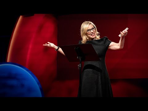
マーガレット・グールド・スチュワート
Margaret Gould Stewart
内容
Facebookの「いいね!」や「共有」ボタンは1日220億回使われ、これまで作られたデザインの中で最もよく閲覧されています。Facebookのプロダクトデザインのディレクター、マーガレット・グールド・スチュワートが大規模なデザインのための3つの法則を説明します。規模があまりに大きいので、わずかな変更が世界規模の反感を買ってしまう反面、規模があまりに大きいからこそ、わずかな改良で多くの人々にポジティブな影響を与えることができます。


字幕
SCRIPT
Script
What do you think of when I say the word "design"? You probably think of things like this, finely crafted objects that you can hold in your hand, or maybe logos and posters and maps that visually explain things, classic icons of timeless design. But I'm not here to talk about that kind of design. I want to talk about the kind that you probably use every day and may not give much thought to, designs that change all the time and that live inside your pocket. I'm talking about the design of digital experiences and specifically the design of systems that are so big that their scale can be hard to comprehend. Consider the fact that Google processes over one billion search queries every day, that every minute, over 100 hours of footage are uploaded to YouTube. That's more in a single day than all three major U.S. networks broadcast in the last five years combined. And Facebook transmitting the photos, messages and stories of over 1.23 billion people. That's almost half of the Internet population, and a sixth of humanity.
These are some of the products that I've helped design over the course of my career, and their scale is so massive that they've produced unprecedented design challenges. But what is really hard about designing at scale is this: It's hard in part because it requires a combination of two things, audacity and humility -- audacity to believe that the thing that you're making is something that the entire world wants and needs, and humility to understand that as a designer, it's not about you or your portfolio, it's about the people that you're designing for, and how your work just might help them live better lives. Now, unfortunately, there's no school that offers the course Designing for Humanity 101. I and the other designers who work on these kinds of products have had to invent it as we go along, and we are teaching ourselves the emerging best practices of designing at scale, and today I'd like share some of the things that we've learned over the years.
Now, the first thing that you need to know about designing at scale is that the little things really matter. Here's a really good example of how a very tiny design element can make a big impact. The team at Facebook that manages the Facebook "Like" button decided that it needed to be redesigned. The button had kind of gotten out of sync with the evolution of our brand and it needed to be modernized. Now you might think, well, it's a tiny little button, it probably is a pretty straightforward, easy design assignment, but it wasn't. Turns out, there were all kinds of constraints for the design of this button. You had to work within specific height and width parameters. You had to be careful to make it work in a bunch of different languages, and be careful about using fancy gradients or borders because it has to degrade gracefully in old web browsers. The truth is, designing this tiny little button was a huge pain in the butt.
Now, this is the new version of the button, and the designer who led this project estimates that he spent over 280 hours redesigning this button over the course of months. Now, why would we spend so much time on something so small? It's because when you're designing at scale, there's no such thing as a small detail. This innocent little button is seen on average 22 billion times a day and on over 7.5 million websites. It's one of the single most viewed design elements ever created. Now that's a lot of pressure for a little button and the designer behind it, but with these kinds of products, you need to get even the tiny things right.
Now, the next thing that you need to understand is how to design with data. Now, when you're working on products like this, you have incredible amounts of information about how people are using your product that you can then use to influence your design decisions, but it's not just as simple as following the numbers. Let me give you an example so that you can understand what I mean. Facebook has had a tool for a long time that allowed people to report photos that may be in violation of our community standards, things like spam and abuse. And there were a ton of photos reported, but as it turns out, only a small percentage were actually in violation of those community standards. Most of them were just your typical party photo. Now, to give you a specific hypothetical example, let's say my friend Laura hypothetically uploads a picture of me from a drunken night of karaoke. This is purely hypothetical, I can assure you. (Laughter) Now, incidentally, you know how some people are kind of worried that their boss or employee is going to discover embarrassing photos of them on Facebook? Do you know how hard that is to avoid when you actually work at Facebook? So anyway, there are lots of these photos being erroneously reported as spam and abuse, and one of the engineers on the team had a hunch. He really thought there was something else going on and he was right, because when he looked through a bunch of the cases, he found that most of them were from people who were requesting the takedown of a photo of themselves. Now this was a scenario that the team never even took into account before. So they added a new feature that allowed people to message their friend to ask them to take the photo down. But it didn't work. Only 20 percent of people sent the message to their friend. So the team went back at it. They consulted with experts in conflict resolution. They even studied the universal principles of polite language, which I didn't even actually know existed until this research happened. And they found something really interesting. They had to go beyond just helping people ask their friend to take the photo down. They had to help people express to their friend how the photo made them feel.
Here's how the experience works today. So I find this hypothetical photo of myself, and it's not spam, it's not abuse, but I really wish it weren't on the site. So I report it and I say, "I'm in this photo and I don't like it," and then we dig deeper. Why don't you like this photo of yourself? And I select "It's embarrassing." And then I'm encouraged to message my friend, but here's the critical difference. I'm provided specific suggested language that helps me communicate to Laura how the photo makes me feel. Now the team found that this relatively small change had a huge impact. Before, only 20 percent of people were sending the message, and now 60 percent were, and surveys showed that people on both sides of the conversation felt better as a result. That same survey showed that 90 percent of your friends want to know if they've done something to upset you. Now I don't know who the other 10 percent are, but maybe that's where our "Unfriend" feature can come in handy.
So as you can see, these decisions are highly nuanced. Of course we use a lot of data to inform our decisions, but we also rely very heavily on iteration, research, testing, intuition, human empathy. It's both art and science. Now, sometimes the designers who work on these products are called "data-driven," which is a term that totally drives us bonkers. The fact is, it would be irresponsible of us not to rigorously test our designs when so many people are counting on us to get it right, but data analytics will never be a substitute for design intuition. Data can help you make a good design great, but it will never made a bad design good.
The next thing that you need to understand as a principle is that when you introduce change, you need to do it extraordinarily carefully. Now I often have joked that I spend almost as much time designing the introduction of change as I do the change itself, and I'm sure that we can all relate to that when something that we use a lot changes and then we have to adjust. The fact is, people can become very efficient at using bad design, and so even if the change is good for them in the long run, it's still incredibly frustrating when it happens, and this is particularly true with user-generated content platforms, because people can rightfully claim a sense of ownership. It is, after all, their content.
Now, years ago, when I was working at YouTube, we were looking for ways to encourage more people to rate videos, and it was interesting because when we looked into the data, we found that almost everyone was exclusively using the highest five-star rating, a handful of people were using the lowest one-star, and virtually no one was using two,three or four stars. So we decided to simplify into an up-down kind of voting binary model. It's going to be much easier for people to engage with. But people were very attached to the five-star rating system. Video creators really loved their ratings. Millions and millions of people were accustomed to the old design. So in order to help people prepare themselves for change and acclimate to the new design more quickly, we actually published the data graph sharing with the community the rationale for what we were going to do, and it even engaged the larger industry in a conversation, which resulted in my favorite TechCrunch headline of all time: "YouTube Comes to a 5-Star Realization: Its Ratings Are Useless."
Now, it's impossible to completely avoid change aversion when you're making changes to products that so many people use. Even though we tried to do all the right things, we still received our customary flood of video protests and angry emails and even a package that had to be scanned by security, but we have to remember people care intensely about this stuff, and it's because these products, this work, really, really matters to them.
Now, we know that we have to be careful about paying attention to the details, we have to be cognizant about how we use data in our design process, and we have to introduce change very, very carefully. Now, these things are all really useful. They're good best practices for designing at scale. But they don't mean anything if you don't understand something much more fundamental. You have to understand who you are designing for.
Now, when you set a goal to design for the entire human race, and you start to engage in that goal in earnest, at some point you run into the walls of the bubble that you're living in. Now, in San Francisco, we get a little miffed when we hit a dead cell zone because we can't use our phones to navigate to the new hipster coffee shop. But what if you had to drive four hours to charge your phone because you had no reliable source of electricity? What if you had no access to public libraries? What if your country had no free press? What would these products start to mean to you? This is what Google, YouTube and Facebook look like to most of the world, and it's what they'll look like to most of the next five billion people to come online. Designing for low-end cell phones is not glamorous design work, but if you want to design for the whole world, you have to design for where people are, and not where you are.
So how do we keep this big, big picture in mind? We try to travel outside of our bubble to see, hear and understand the people we're designing for. We use our products in non-English languages to make sure that they work just as well. And we try to use one of these phones from time to time to keep in touch with their reality.
So what does it mean to design at a global scale? It means difficult and sometimes exasperating work to try to improve and evolve products. Finding the audacity and the humility to do right by them can be pretty exhausting, and the humility part, it's a little tough on the design ego. Because these products are always changing, everything that I've designed in my career is pretty much gone, and everything that I will design will fade away. But here's what remains: the never-ending thrill of being a part of something that is so big, you can hardly get your head around it, and the promise that it just might change the world.
Thank you.
(Applause)
「デザイン」という言葉から 何を思い浮かべますか? こういうモノですか? 手に取れる お洒落な工芸品だったり ロゴやポスター 地図など 視覚的に訴える 流行り廃りのないデザインではないでしょうか でも今日 私がお話ししたいのは そのようなデザインではなく おそらく毎日 使っているのに あまり考えたことがないモノ デザインがよく変わるのに 持ち歩いている物についてです 私がお話しするのは デジタル体験のデザイン ― 特に システムデザインについてです それらはとても大きいので 規模を把握しづらいのです 例えば Googleは毎日 10億件以上の検索を処理しており 毎分100時間以上の映像が YouTubeにアップロードされています これはアメリカの大手放送会社3社の 過去5年間の放送分を超えた映像が 1日でアップロードされている計算です Facebookでは 12億3千万人以上の 写真やメッセージやストーリーが 発信されています これはネット人口の約半数で 世界の人口の6分の1にあたります
私のキャリアを通じて デザインに携わった製品もありますが 規模がとても大きいため これまでに無い デザイン上の 課題が生じています しかし 規模が大きなデザインの 本当に難しい点とは何でしょうか 難しい部分は 2つの組み合わせで 「大胆さ」と「謙虚さ」です 大胆さとは 全世界が欲して 必要とする何かを 作っていると信じることです そして 謙虚さとは デザイナーとして 自分や自分の製品のためではなく 誰かのためにデザインすること また デザインを通じて 人々の暮らしを いかに良くするかということです 残念なことに 「人類のためのデザイン入門」を 教えてくれる学校はありません これらの製品に関与している 私や他のデザイナーは 模索しながら作品を生み出し 切磋琢磨することで 規模の大きなデザインの ベストプラクティスを 見出そうとしています 今日は私達が数年かけて 学んだことをお話ししたいと思います
規模の大きなデザインで まず知っておくべきことは 細部が本当に重要だということです これは とても小さなデザインの要素の 影響が いかに大きいかを 示した良い例です Facebookで 「いいね!」ボタンを 管理しているチームは デザインの変更を決めました ボタンは 私達のブランドの進化と共に まとまりがなくなったので 最新のものにする必要があったのです 小さなボタンに過ぎない かなり単純で簡単なデザインだと 思われるでしょう それが違うんです このボタンには デザイン上の 様々な制約がありました 縦横の決まった設定値内で 作成する必要があるのです 多言語で機能するよう 気を配る必要もありました また お洒落なグラデーションや ボーダーも要注意です 昔ながらのウェブブラウザの 優雅さを損なうからです ですから この小さなボタンのデザインには 大変苦労しました
そして これが新しいバージョンです このプロジェクトのデザイナーは 280時間以上 つまり何か月もかけて このボタンのデザイン変更に 取り組みました なぜ こんなに小さなものに 膨大な時間を費やすのでしょうか? 規模が大きなデザインを作る場合 些細なものなどないからです この他愛のない 小さなボタンが 1日に平均して220億回 750万以上のウェブサイトで 閲覧されているのです 今までに最もよく見られた デザインの1つです 小さなボタンにしては とてつもない重圧で その裏にはデザイナーがいますが この種のデザインは 細部まできちんとする必要があるのです
次に理解すべきことは データを伴うデザインの方法です このような製品を作る時は その製品がどのように使われるかという 膨大な情報を集めることが デザインを決める際に 有用になります でも数に従えばいい というものではありません ご理解いただくために 例を挙げて説明します Facebookは長い間 私達のコミュニティ基準に 違反する写真 ― スパムや嫌がらせを 報告できる ツールを持っています 報告を受けた写真は大量にありましたが 蓋を開けてみると コミュニティの基準に違反したものは 実際は わずかしかありません 大半は典型的なパーティーの写真でした ある例を紹介しましょう 私の友人のローラが ― 仮にですが ― カラオケの飲み会での 私の写真をアップロードするとします あくまで例です 念を押しておきます (笑) ちなみに Facebook上で 上司や同僚に 自分の恥ずかしい写真を見られることを 心配する人もいます Facebookで働いている人間には 避けて通れません とにかく 誤って スパムや嫌がらせと 報告された写真は多いのです チームの技術者の一人には 先見の明がありました 本当にこれから起こることを 正しく見通していたのです 彼が多くのケースを検証したところ 自分が写っている写真を 削除してほしいという 要望が大半だったのです これはチームが考えたこともない シナリオでした そこで 友人にメッセージを送って 写真の削除を依頼するという 新しい機能を追加しました でも うまく行きませんでした 20%しか友人に メッセージを送らなかったのです そのため チームは 行き詰ってしまいました そこで 調停の専門家に相談し 「遊ばせ言葉」の普遍原理についても 学びました 私は「遊ばせ言葉」というものを この研究が行われるまで 知りませんでした そして 面白いことを見つけたのです 友人に写真の削除依頼をする以上の 手助けをしたのです その写真でどんな気持ちになったかを 友人に伝えることにしたのです
その経験が今に役立っています 例えば私がこの写真を見つけたとします スパムでも嫌がらせでもありません でも 私はFacebookに載せて欲しくありません そこでFacebookに報告するのは 「この写真に自分が写っているのが好ましくない」 それから更に掘り下げます なぜこの写真が 好きではないのでしょうか? 「恥ずかしいから」を選択します すると 友達にメッセージを送るよう促されます これが大きな違いを生むのです 奨励される特定の言葉を選んで この写真によって 私がどう感じたかを ローラに伝えることができます 私のチームは このちょっとした変化の 影響力が甚大なことに気づきました 以前は20%の人しか メッセージを送らなかったのに 今では60%の人が送っています 各種の調査によると 双方の会話で 結果的に良くなったと 感じていることが分かりました 同じ調査で 友人の90%が どうして怒らせたのか 知りたいと思っていることも分かりました 残りの10%については分かりませんが 「友達解除」機能が 役立つかもしれません
ご覧の通り これらの決定は非常に微妙なのです もちろん 決定を通知するために 沢山のデータを使いますが 私達が多いに頼るのは 反復 研究 検査 直感 人情などです アートであり 科学なのです さて このような製品を作るデザイナーを 時に「データ駆動型」と呼びます 私達を完全に虜にする言葉です 私達は自分達のデザインを厳密に 検証する責任があります 多くの人々から きちんとするよう 期待されているのですから でもデータ分析は デザインのインスピレーションにはなりません データは良いデザインを 素晴らしいものにできますが 悪いデザインを良くすることは できないのです
次に原則として 理解すべきは 変更を導入する時で 非常に注意を払う必要があります 私がよく使う冗談ですが 変更自体に掛ける時間と 同じくらい 変更を紹介する時の デザインに時間を費やします それは私達がよく使う物が変化し 慣れる必要がある時と すべて繋がっているのです 実際 私達は悪いデザインを とても効率よく使うことができます 長期的には 変更が良いことであっても 変更されると 物凄くイライラします ユーザーが内容を作るものなら なおさらです 持ち主が自分のものだと 主張できるからです 事実 ユーザーが書いた内容なのですから
何年も前 YouTubeで働いていた時 もっと多くの人に ビデオを評価してもらう 方法を模索していました データを見て面白いと感じたことは 大半の人が 最高の5つ星評価だけを使い 一握りの人が 最低の1つ星評価をしたのです そして 実際 誰一人として 2つ星、3つ星、4つ星を 使いませんでした" そこで デザインを単純化し 良いか悪いかの2つで 投票するようにしました 誰でも参加できるよう 単純になりましたが ユーザーは5つ星評価の方に 馴染みがありました ビデオ製作者は 評価されるのが大好きでした 何百万人もの人が 従来のデザインに馴染んでいました そのため ユーザーに 変化に適応し もっと早く 新しいデザインに慣れてもらうため データやグラフを 地域コミュニティと共有しながら 何をしようとしているのかを 説明しました この会話を通じて 大きな業界と関わることができ 結果的に 私の一番お気に入りの TechCrunchの見出しになりました 「YouTubeが5つ星評価について 下した評価は ― 『役立たず』だった」
さて 多くの人々が使う製品のデザインを 変更する時 それに伴う反感から 完全に逃れることはできません どんなに正しいことをしたくても お決まりのビデオ抗議や 怒りのメール セキュリティチェックが必要な 小包さえ 大量に送られて来ます 私達が覚えておくべきは ユーザーが この手の変更に 非常に繊細だということです なぜなら これらの製品が この作品が ― 彼らにとって 非常に大切だからです
さて デザインの細部にわたって 気を配る必要があることを ご理解いただけたと思います デザインする過程で どのようにデータを使うのかを 認識しなければなりません そして 非常に注意深く 変更を公開しなければいけません これらは すべて役に立つのです 規模の大きなデザインをするには うってつけの手法です ただし より基本的なものを 理解していなければ 何の意味もありません 誰のためにデザインするのかを 理解しなければなりません
全人類のために デザインする目標を立てたなら 真剣にその目標に向かって 努力し始めると ある時点で 現実の壁に 突き当たります 例えば サンフランシスコで 携帯が圏外になった時 私達は少々苛立ってしまいます 携帯のナビで 新しくできた お洒落なコーヒーショップに 行けないからです でも 安定した電気がないので 携帯を充電するために 4時間運転する必要があれば どうでしょうか? 公共図書館へのアクセスがなかったら? 皆さんの国で報道の自由がなかったら? これらの製品はどんな意味を 持ち始めるのでしょうか? これが 世界の大半の人達が見る Google YouTube Facebookです そして ネットを始める 次なる50億人の大半が それを見ることになるのです 低価格の携帯のデザインは 魅力的なデザインの仕事では ありませんが 全世界のためにデザインしたいなら 自分がいる所ではなく 人々がいる所のために デザインをしなければなりません
この巨大な構想を どうやって心に留めて置きますか? 私達がデザインするための人々を 見たり 聞いたり 理解するために 外に飛び出すことです 私達の製品が これまでと同じように機能するよう 非英語圏にも対応させます 彼らの現実を把握するため 時には携帯電話で連絡を取ります
地球規模でデザインする意義は 何でしょうか? 製品を改善・発展させることは 難しく 時として腹立たしい仕事です そこに「大胆さ」と「謙虚さ」を 求めることは かなり骨が折れるでしょう 謙虚さの部分では デザインする際のエゴが 少し厄介です なぜなら これらの製品は 常に変化し 私のキャリアにおいて デザインしたモノすべてが 瞬く間に無くなり これからデザインするモノのすべてが いずれは廃れていくからです しかし 残るものもあります とても大きな 何かの一部になれるという 終わりなき感動や それをほとんど理解できないことや 世界を変えることができるという 望みです
ありがとうございました
(拍手)
品詞分類
- 主語
- 動詞
- 助動詞
- 準動詞
- 関係詞等
TED 日本語
TED Talks
関連動画

シンボルやブランドに形作られた人間性デビー・ミルマン
2020.03.06美しいグラフはシンプルに全てを伝える | TED Talkトミー・マッコール
2018.10.15子供たちの読む気を引き出す図書室のデザイン方法マイケル・ビェルート
2017.06.23注意散漫を防ぐより良い技術トリスタン・ハリス
2016.07.14デザインと日常における第一印象チップ・キッド
2015.06.23デザイン最大の秘密...気付く事トニー・ファデル
2015.06.03街の旗が、誰にも気づかれない最悪のデザインになる理由ローマン・マーズ
おすすめ 22015.05.14フォントをめぐる私の人生マシュー・カーター
2014.04.18芸術と技術を融合し、時代を超えた創造をブラン・フェレン
2014.03.25あなたの博物館ジェイク・バートン
2013.09.10五感に訴えるデザインジンソップ・リー
2013.08.06パックマンをMoMAに収蔵した理由パオラ・アントネッリ
2013.05.28マルチタスクはやめて、モノタスクをパオロ・カルディーニ
2012.11.30アート、テクノロジー、デザインから創造的リーダーが学べることジョン・マエダ
2012.10.09分かりやすい地図のデザインアリス・ヴェネティキディス
2012.10.01賞ではなく人のためのデザインをティモシー・プレステロ
2012.08.16


洋楽 おすすめ
RECOMMENDS
洋楽歌詞
ダイナマイトビーティーエス
洋楽最新ヒット2020.08.20ディス・イズ・ミーグレイテスト・ショーマン・キャスト
洋楽人気動画2018.01.11グッド・ライフGイージー、ケラーニ
洋楽人気動画2017.01.27ホワット・ドゥ・ユー・ミーン?ジャスティン・ビーバー
洋楽人気動画2015.08.28ファイト・ソングレイチェル・プラッテン
洋楽人気動画2015.05.19ラヴ・ミー・ライク・ユー・ドゥエリー・ゴールディング
洋楽人気動画2015.01.22アップタウン・ファンクブルーノ・マーズ、マーク・ロンソン
洋楽人気動画2014.11.20ブレイク・フリーアリアナ・グランデ
洋楽人気動画2014.08.12ハッピーファレル・ウィリアムス
ポップス2014.01.08カウンティング・スターズワンリパブリック
ロック2013.05.31ア・サウザンド・イヤーズクリスティーナ・ペリー
洋楽人気動画2011.10.26ユー・レイズ・ミー・アップケルティック・ウーマン
洋楽人気動画2008.05.30ルーズ・ユアセルフエミネム
洋楽人気動画2008.02.21ドント・ノー・ホワイノラ・ジョーンズ
洋楽人気動画2008.02.15オンリー・タイムエンヤ
洋楽人気動画2007.10.03ミス・ア・シングエアロスミス
ロック2007.08.18タイム・トゥ・セイ・グッバイサラ・ブライトマン
洋楽人気動画2007.06.08シェイプ・オブ・マイ・ハートスティング
洋楽人気動画2007.03.18ウィ・アー・ザ・ワールド(U.S.A. フォー・アフリカ)マイケル・ジャクソン
洋楽人気動画2006.05.14ホテル・カリフォルニアイーグルス
ロック2005.07.06