TED日本語
TED Talks(英語 日本語字幕付き動画)
TED日本語 - トミー・マッコール: 美しいグラフはシンプルに全てを伝える TED Talk
TED Talks
美しいグラフはシンプルに全てを伝える | TED Talk
The simple genius of a good graphic | TED Talk
トミー・マッコール
Tommy McCall
内容
歴史のレッスンであり、かつグラフへのラブレターでもある講演で、情報デザイナーのトミー・マッコールは数百年にわたるグラフの進化をたどります。そして、どのようにして分かり辛いデータを理解しやすい形へと変えることができるのかを説明します。「グラフによって情報を素早く理解できるようになります。本1冊分の情報もたった1ページで見ることができるのです。グラフこそ、新たな発見への扉を開く鍵なのです」と、マッコールは言います。


字幕
SCRIPT
Script
I love infographics. As an information designer, I've worked with all sorts of data over the past 25 years. I have a few insights to share, but first: a little history.
Communication is the encoding, transmission and decoding of information. Breakthroughs in communication mark turning points in human culture. Oracy, literacy and numeracy were great developments in communication. They allow us to encode ideas into words and quantities into numbers. Without communication, we'd still be stuck in the Stone Ages.
Although humans have been around for a quarter million years, it was only 8,000 years ago that proto-writings began to surface. Nearly 3,000 years later, the first proper writing systems took shape.
Maps have been around for millennia and diagrams for hundreds of years, but representing quantities through graphics is a relatively new development. It wasn't until 1786 that William Playfair invented the first bar chart, giving birth to visual display of quantitative information. Fifteen years later, he introduced the first pie and area charts. His inventions are still the most commonly used chart forms today. Florence Nightingale invented the coxcomb in 1857 for a presentation to Queen Victoria on troop mortality. Highlighted in blue, she showed how most troops' deaths could have been prevented. Shortly after, Charles Minard charted Napoleon's march on Moscow, illustrating how an army of 422,000 dwindled to just 10,000 as battles, geography and freezing temperatures took their toll. He combined a Sankey diagram with cartography and a line chart for temperature.
I get excited when I get lots of data to play with, especially when it yields an interesting chart form. Here, Nightingale's coxcomb was the inspiration to organize data on thousands of federal energy subsidies, scrutinizing the lack of investment in renewables over fossil fuels. This Sankey diagram illustrates the flow of energy through the US economy, emphasizing how nearly half of the energy used is lost as waste heat.
I love it when data can be sculpted into beautiful shapes. Here, the personal and professional connections of the women of Silicon Valley can be woven into arcs, same as the collaboration of inventors birthing patents across the globe can be mapped.
I've even made charts for me. I'm a numbers person, so I rarely win at Scrabble. I made this diagram to remember all the two- and three-letter words in the official Scrabble dictionary.
(Laughter)
Knowing these 1,168 words certainly is a game changer.
(Laughter)
Sometimes I produce code to quickly generate graphics from thousands of data points. Coding also enables me to produce interactive graphics. Now we can navigate information on our own terms.
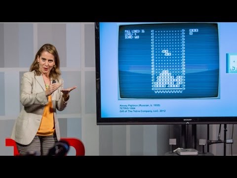
Exotic chart forms certainly look cool, but something as simple as a little dot may be all you need to solve a particular thinking task. In 2006, the "New York Times" redesigned their "Markets" section, cutting it down from eight pages of stock listings to just one and a half pages of essential market data. We listed performance metrics for the most common stocks, but I wanted to help investors see how the stocks are doing. So I added a simple little dot to show the current price relative to its one-year range. At a glance, value investors can pick out stocks trading near their lows by looking for dots to the left. Momentum investors can find stocks on an upward trajectory via dots to the right. Shortly after, the "Wall Street Journal" copied the design.
Simplicity is often the goal for most graphics, but sometimes we need to embrace complexity and show large data sets in their full glory. Alec Gallup, the former chairman of the Gallup Organization, once handed me a very thick book. It was his family's legacy: hundreds of pages covering six decades of presidential approval data. I told him the entire book could be graphed on a single page. "Impossible," he said. And here it is: 25,000 data points on a single page. At a glance,one sees that most presidents start with a high approval rating, but few keep it. Events like wars initially boost approval; scandals trigger declines. These major events were annotated in the graphic but not in the book. The point is, graphics can transmit data with incredible efficiency.
Graphicacy -- the ability to read and write graphics -- is still in its infancy. New chart forms will emerge and specialized dialects will evolve. Graphics that help us think faster or see a book's worth of information on a single page are the key to unlocking new discoveries. Our visual cortex was built to decode complex information and is a master at pattern recognition. Graphicacy enables us to harness our built-in GPU to process mountains of data and find the veins of gold hiding within.
Thank you.
私はインフォグラフィックが好きで 情報デザイナーとして 25年以上にわたり 様々なデータを扱ってきました 詳しいお話をする前に 簡単な歴史をご紹介します
情報伝達とは 情報の符号化・送信・復号です 情報伝達の飛躍的進歩により 人類の文化は大きな転換点を迎えました 声、文字、数字による表現能力の獲得で 情報伝達は大きく進歩しました それにより 思考を言語で表すことができますし 量を数字で表すこともできます 情報伝達がなければ 人類は未だに石器時代でしょう
人類の歴史は約25万年ですが 原文字の出現は ほんの8千年前です その約3千年後に 書記体系ができました
地図は1千年前 ダイヤグラムは数百年前からあり グラフを使った量の表現は さらに最近の出来事です 1786年にようやく ウィリアム・プレイフェアが棒グラフを発明し 数量情報の視覚的な表現が始まりました 15年後 彼は 円グラフと面グラフも発明しました 彼の発明は今日でも 最も広く使われています 1857年 フローレンス・ナイチンゲールが 鶏頭図を発明しました ヴィクトリア女王に兵士の死因について 説明するためです 青で強調することで いかに兵士の死のほとんどが避けられたか 説明しています すぐ後にチャールズ・ミナードが ナポレオン軍のモスクワ侵攻での兵力を図にし 422,000人から10,000人に 軍隊が減少する様子を 犠牲の原因となった戦闘、地形 低い気温との関連と共に示しています サンキー・ダイアグラムと地図製作法を 組み合わせていて 折れ線グラフは気温です
データを手に入れると興奮します 特に面白いグラフになる場合です こちらは ナイチンゲールの鶏頭図に 着想を得て 何千もの連邦政府のエネルギー助成金の データをまとめ 化石燃料と比べて再生可能エネルギーへの 投資が不足していることを表しています こちらは サンキー・ダイアグラムで示した アメリカ経済におけるエネルギー消費の流れで ほぼ半分は廃熱となり 失われていることを強調しました
美しい形に表されたデータが大好きです これはシリコンバレーの女性の 個人的または仕事上の繋がりです 円弧で表現できます 世界で特許を生み出している 発明家同士の関係も同様にして 地図に描けます
自分用のグラフまで作りました 数字ばかり扱う私は 単語ゲーム「スクラブル」が苦手で ゲームの公式辞書にある 2文字と3文字の単語をすべて覚えるため グラフにまとめました
(笑)
公式辞書の単語を1,168個も覚えると 間違いなく形勢逆転です
(笑)
何千ものデータ点から 素早くグラフを描けるように プログラムを書くこともあります プログラムによって インタラクティブなグラフも作れます 自分の思うがままに 情報を操作することができるのです
派手なグラフは確かにかっこいいです しかし 1つの小さな点のような シンプルなものだけで 理解できることもあります 2006年『ニューヨーク・タイムズ』は 株式市場の欄をデザインし直しました 8ページにおよぶ株式一覧表を 重要な市場データをまとめた 1ページ半に削りました 最も一般的な株式銘柄の 業績指標を一覧にしました しかし 私は株式の動きを 投資家にわかるようにしたかった だからシンプルな小さい点を 表に書き加えました 過去1年間の変動幅に対する 現在の株価の位置づけを示しました これで 底値に近い値段の株が すぐにわかります 点が左側にあるものがそうです 値段が上昇している株もすぐにわかります 点が右側にあるものです 『ウォール・ストリート・ジャーナル』が すぐに真似しました
シンプルなことが 多くの場合は最も良いです しかし時には複雑であることを受け入れ 巨大なデータ群を全て見せる必要があります ギャラップ社の前会長 アレック・ギャラップは かつて私に分厚い書類を手渡しました 彼の家族の遺産です 何百ページにもわたる 60年間の大統領支持率のデータでした 私は彼に 全データを 1ページの図にできると言いましたが 「無理だ」と彼は信じません ご覧ください 25,000のデータ点が 1ページにあります 一目で ほとんどの大統領が 高い支持率でスタートするものの ほぼ維持できないとわかります 戦争などの出来事は最初だけ 支持率を押し上げ スキャンダルは支持率低下を招きます このグラフにある 重要な出来事の注釈は 元の書類にはないものです つまりグラフによって データは非常に理解しやすくなるのです
グラフィカシーとは グラフを読み取ったり描いたりする 技術のことですが それはまだ生まれたばかりです 新しいグラフの型が生まれ 専門的な表現が発達するでしょう グラフによって私たちの理解が早まり 本1冊分の情報をたった1ページで 見ることもできます グラフは 新しい発見をするうえで 重要な鍵となるでしょう 私たちの視覚野は複雑な情報を 復号するために作られていて パターン認識に長けています グラフィカシーによって 私たちは脳内のGPUを活用でき 山のようなデータを処理します そして隠された金脈を発見するのです
ありがとうございました
(拍手)
品詞分類
- 主語
- 動詞
- 助動詞
- 準動詞
- 関係詞等
TED 日本語
TED Talks
関連動画

シンボルやブランドに形作られた人間性デビー・ミルマン
2020.03.06子供たちの読む気を引き出す図書室のデザイン方法マイケル・ビェルート
2017.06.23注意散漫を防ぐより良い技術トリスタン・ハリス
2016.07.14デザインと日常における第一印象チップ・キッド
2015.06.23デザイン最大の秘密...気付く事トニー・ファデル
2015.06.03街の旗が、誰にも気づかれない最悪のデザインになる理由ローマン・マーズ
おすすめ 22015.05.14あなたの(そして何十億人の)ための巨大なウェブデザインの方法マーガレット・グールド・スチュワート
2014.08.05フォントをめぐる私の人生マシュー・カーター
2014.04.18芸術と技術を融合し、時代を超えた創造をブラン・フェレン
2014.03.25あなたの博物館ジェイク・バートン
2013.09.10五感に訴えるデザインジンソップ・リー
2013.08.06パックマンをMoMAに収蔵した理由パオラ・アントネッリ
2013.05.28マルチタスクはやめて、モノタスクをパオロ・カルディーニ
2012.11.30アート、テクノロジー、デザインから創造的リーダーが学べることジョン・マエダ
2012.10.09分かりやすい地図のデザインアリス・ヴェネティキディス
2012.10.01賞ではなく人のためのデザインをティモシー・プレステロ
2012.08.16


洋楽 おすすめ
RECOMMENDS
洋楽歌詞
ステイザ・キッド・ラロイ、ジャスティン・ビーバー
洋楽最新ヒット2021.08.20スピーチレス~心の声ナオミ・スコット
洋楽最新ヒット2019.05.23シェイプ・オブ・ユーエド・シーラン
洋楽人気動画2017.01.30フェイデッドアラン・ウォーカー
洋楽人気動画2015.12.03ウェイティング・フォー・ラヴアヴィーチー
洋楽人気動画2015.06.26シー・ユー・アゲインウィズ・カリファ
洋楽人気動画2015.04.06シュガーマルーン5
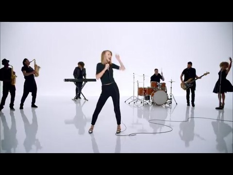
洋楽人気動画2015.01.14シェイク・イット・オフテイラー・スウィフト
ポップス2014.08.18オール・アバウト・ザット・ベースメーガン・トレイナー
ポップス2014.06.11ストーリー・オブ・マイ・ライフワン・ダイレクション
洋楽人気動画2013.11.03コール・ミー・メイビーカーリー・レイ・ジェプセン
洋楽人気動画2012.03.01美しき生命コールドプレイ
洋楽人気動画2008.08.04バッド・デイ~ついてない日の応援歌ダニエル・パウター
洋楽人気動画2008.05.14サウザンド・マイルズヴァネッサ・カールトン
洋楽人気動画2008.02.19イッツ・マイ・ライフボン・ジョヴィ
ロック2007.10.11アイ・ウォント・イット・ザット・ウェイバックストリート・ボーイズ
洋楽人気動画2007.09.14マイ・ハート・ウィル・ゴー・オンセリーヌ・ディオン
洋楽人気動画2007.07.12ヒーローマライア・キャリー
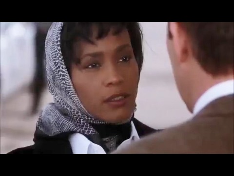
洋楽人気動画2007.03.21オールウェイズ・ラヴ・ユーホイットニー・ヒューストン
洋楽人気動画2007.02.19オネスティビリー・ジョエル
洋楽人気動画2005.09.16