TED日本語
TED Talks(英語 日本語字幕付き動画)
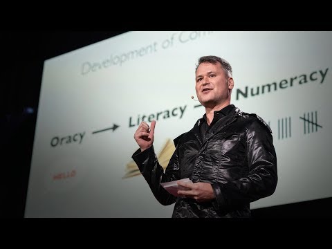
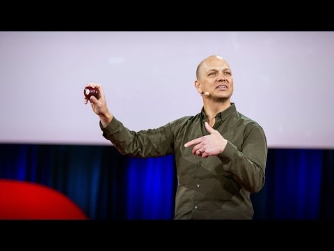
TED日本語 - マシュー・カーター: フォントをめぐる私の人生
TED Talks
フォントをめぐる私の人生
My life in typefaces
マシュー・カーター
Matthew Carter
内容
本や雑誌やコンピュータ・スクリーンを眺めると、かなりの確率でマシュー・カーターがデザインした書体を目にするはずです。ヴァーダナやジョージア、電話帳(覚えていますか?)専用のベル・センテニアルをはじめとする書体をデザインしたのが彼です。この魅力的な話では、フォントに含まれる全ての文字の1ピクセルに至るまで神経を集中してきたキャリアの全容を紹介してくれます。


字幕
SCRIPT
Script
Type is something we consume in enormous quantities. In much of the world, it's completely inescapable. But few consumers are concerned to know where a particular typeface came from or when or who designed it, if, indeed, there was any human agency involved in its creation, if it didn't just sort of materialize out of the software ether.
But I do have to be concerned with those things. It's my job. I'm one of the tiny handful of people who gets badly bent out of shape by the bad spacing of the T and the E that you see there. I've got to take that slide off. I can't stand it. Nor can Chris. There. Good.
So my talk is about the connection between technology and design of type. The technology has changed a number of times since I started work: photo, digital, desktop, screen, web. I've had to survive those changes and try to understand their implications for what I do for design. This slide is about the effect of tools on form. The two letters, the two K's, the one on your left, my right, is modern, made on a computer. All straight lines are dead straight. The curves have that kind of mathematical smoothness that the Bezier formula imposes. On the right, ancient Gothic, cut in the resistant material of steel by hand. None of the straight lines are actually straight. The curves are kind of subtle. It has that spark of life from the human hand that the machine or the program can never capture. What a contrast.
Well, I tell a lie. A lie at TED. I'm really sorry. Both of these were made on a computer, same software, same Bezier curves, same font format. The one on your left was made by Zuzana Licko at Emigre, and I did the other one. The tool is the same, yet the letters are different. The letters are different because the designers are different. That's all. Zuzana wanted hers to look like that. I wanted mine to look like that. End of story. Type is very adaptable. Unlike a fine art, such as sculpture or architecture, type hides its methods. I think of myself as an industrial designer. The thing I design is manufactured, and it has a function: to be read, to convey meaning. But there is a bit more to it than that. There's the sort of aesthetic element. What makes these two letters different from different interpretations by different designers? What gives the work of some designers sort of characteristic personal style, as you might find in the work of a fashion designer, an automobile designer, whatever?
There have been some cases, I admit, where I as a designer did feel the influence of technology. This is from the mid-'60s, the change from metal type to photo, hot to cold. This brought some benefits but also one particular drawback: a spacing system that only provided 18 discrete units for letters to be accommodated on. I was asked at this time to design a series of condensed sans serif types with as many different variants as possible within this 18-unit box. Quickly looking at the arithmetic, I realized I could only actually make three of related design. Here you see them. In Helvetica Compressed, Extra Compressed, and Ultra Compressed, this rigid 18-unit system really boxed me in. It kind of determined the proportions of the design. Here are the typefaces, at least the lower cases. So do you look at these and say, "Poor Matthew, he had to submit to a problem, and by God it shows in the results." I hope not. If I were doing this same job today, instead of having 18 spacing units, I would have 1,000. Clearly I could make more variants, but would these three members of the family be better? It's hard to say without actually doing it, but they would not be better in the proportion of 1,000 to 18, I can tell you that. My instinct tells you that any improvement would be rather slight, because they were designed as functions of the system they were designed to fit, and as I said, type is very adaptable. It does hide its methods. All industrial designers work within constraints. This is not fine art.
The question is, does a constraint force a compromise? By accepting a constraint, are you working to a lower standard? I don't believe so, and I've always been encouraged by something that Charles Eames said. He said he was conscious of working within constraints, but not of making compromises. The distinction between a constraint and a compromise is obviously very subtle, but it's very central to my attitude to work.
Remember this reading experience? The phone book. I'll hold the slide so you can enjoy the nostalgia. This is from the mid-'70s early trials of Bell Centennial typeface I designed for the U.S. phone books, and it was my first experience of digital type, and quite a baptism. Designed for the phone books, as I said, to be printed at tiny size on newsprint on very high-speed rotary presses with ink that was kerosene and lampblack. This is not a hospitable environment for a typographic designer. So the challenge for me was to design type that performed as well as possible in these very adverse production conditions. As I say, we were in the infancy of digital type. I had to draw every character by hand on quadrille graph paper -- there were four weights of Bell Centennial -- pixel by pixel, then encode them raster line by raster line for the keyboard. It took two years, but I learned a lot. These letters look as though they've been chewed by the dog or something or other, but the missing pixels at the intersections of strokes or in the crotches are the result of my studying the effects of ink spread on cheap paper and reacting, revising the font accordingly. These strange artifacts are designed to compensate for the undesirable effects of scale and production process. At the outset, AT & T had wanted to set the phone books in Helvetica, but as my friend Erik Spiekermann said in the Helvetica movie, if you've seen that, the letters in Helvetica were designed to be as similar to one another as possible. This is not the recipe for legibility at small size. It looks very elegant up on a slide. I had to disambiguate these forms of the figures as much as possible in Bell Centennial by sort of opening the shapes up, as you can see in the bottom part of that slide.
So now we're on to the mid-'80s, the early days of digital outline fonts, vector technology. There was an issue at that time with the size of the fonts, the amount of data that was required to find and store a font in computer memory. It limited the number of fonts you could get on your typesetting system at any one time. I did an analysis of the data, and found that a typical serif face you see on the left needed nearly twice as much data as a sans serif in the middle because of all the points required to define the elegantly curved serif brackets. The numbers at the bottom of the slide, by the way, they represent the amount of data needed to store each of the fonts. So the sans serif, in the middle, sans the serifs, was much more economical,81 to 151.
"Aha," I thought. "The engineers have a problem. Designer to the rescue."
I made a serif type, you can see it on the right, without curved serifs. I made them polygonal, out of straight line segments, chamfered brackets. And look, as economical in data as a sans serif. We call it Charter, on the right.
So I went to the head of engineering with my numbers, and I said proudly, "I have solved your problem."
"Oh," he said. "What problem?"
And I said, "Well, you know, the problem of the huge data you require for serif fonts and so on."
"Oh," he said. "We solved that problem last week. We wrote a compaction routine that reduces the size of all fonts by an order of magnitude. You can have as many fonts on your system as you like."
"Well, thank you for letting me know," I said.
Foiled again. I was left with a design solution for a nonexistent technical problem.
But here is where the story sort of gets interesting for me. I didn't just throw my design away in a fit of pique. I persevered. What had started as a technical exercise became an aesthetic exercise, really. In other words, I had come to like this typeface. Forget its origins. Screw that. I liked the design for its own sake. The simplified forms of Charter gave it a sort of plain-spoken quality and unfussy spareness that sort of pleased me. You know, at times of technical innovation, designers want to be influenced by what's in the air. We want to respond. We want to be pushed into exploring something new. So Charter is a sort of parable for me, really. In the end, there was no hard and fast causal link between the technology and the design of Charter. I had really misunderstood the technology. The technology did suggest something to me, but it did not force my hand, and I think this happens very often.
You know, engineers are very smart, and despite occasional frustrations because I'm less smart, I've always enjoyed working with them and learning from them. Apropos, in the mid-'90s, I started talking to Microsoft about screen fonts. Up to that point, all the fonts on screen had been adapted from previously existing printing fonts, of course. But Microsoft foresaw correctly the movement, the stampede towards electronic communication, to reading and writing onscreen with the printed output as being sort of secondary in importance.
So the priorities were just tipping at that point. They wanted a small core set of fonts that were not adapted but designed for the screen to face up to the problems of screen, which were their coarse resolution displays. I said to Microsoft, a typeface designed for a particular technology is a self-obsoleting typeface. I've designed too many faces in the past that were intended to mitigate technical problems. Thanks to the engineers, the technical problems went away. So did my typeface. It was only a stopgap. Microsoft came back to say that affordable computer monitors with better resolutions were at least a decade away. So I thought, well, a decade, that's not bad, that's more than a stopgap.
So I was persuaded, I was convinced, and we went to work on what became Verdana and Georgia, for the first time working not on paper but directly onto the screen from the pixel up. At that time, screens were binary. The pixel was either on or it was off. Here you see the outline of a letter, the cap H, which is the thin black line, the contour, which is how it is stored in memory, superimposed on the bitmap, which is the grey area, which is how it's displayed on the screen. The bitmap is rasterized from the outline. Here in a cap H, which is all straight lines, the two are in almost perfect sync on the Cartesian grid. Not so with an O. This looks more like bricklaying than type design, but believe me, this is a good bitmap O, for the simple reason that it's symmetrical in both x and y axes. In a binary bitmap, you actually can't ask for more than that. I would sometimes make, I don't know,three or four different versions of a difficult letter like a lowercase A, and then stand back to choose which was the best. Well, there was no best, so the designer's judgment comes in in trying to decide which is the least bad. Is that a compromise? Not to me, if you are working at the highest standard the technology will allow, although that standard may be well short of the ideal. You may be able to see on this slide two different bitmap fonts there. The "a" in the upper one, I think, is better than the "a" in the lower one, but it still ain't great. You can maybe see the effect better if it's reduced. Well, maybe not.
So I'm a pragmatist, not an idealist, out of necessity. For a certain kind of temperament, there is a certain kind of satisfaction in doing something that can not be perfect but can still be done to the best of your ability. Here's the lowercase H from Georgia Italic. The bitmap looks jagged and rough. It is jagged and rough. But I discovered, by experiment, that there is an optimum slant for an italic on a screen so the strokes break well at the pixel boundaries. Look in this example how, rough as it is, how the left and right legs actually break at the same level. That's a victory. That's good, right there. And of course, at the lower depths, you don't get much choice. This is an S, in case you were wondering.
Well, it's been 18 years now since Verdana and Georgia were released. Microsoft were absolutely right, it took a good 10 years, but screen displays now do have improved spatial resolution, and very much improved photometric resolution thanks to anti-aliasing and so on. So now that their mission is accomplished, has that meant the demise of the screen fonts that I designed for coarser displays back then? Will they outlive the now-obsolete screens and the flood of new web fonts coming on to the market? Or have they established their own sort of evolutionary niche that is independent of technology? In other words, have they been absorbed into the typographic mainstream? I'm not sure, but they've had a good run so far. Hey,18 is a good age for anything with present-day rates of attrition, so I'm not complaining.
Thank you.
(Applause)
私達は活字を 大量に消費しています どこにいようと 逃れられない現実です でも こんなことを 知りたがる人は ほぼゼロでしょう ある書体が どこから現れ いつ 誰がデザインしたのか そもそも人間が制作したものなのか それとも ソフトウェアが 生み出したものなのか・・・
でも私はそういうことに 関心があります 仕事だからです 「T」と「e」の 間隔が気に入らなくて 怒り狂う人達は ほんの少数でしょうが 私はその1人です スライドは消しましょう 私にもクリスにも堪え難い これでいい
さて 私がお話しするのは テクノロジーと 活字デザインとの関係です この仕事を始めてから 技術上の変革を 何度も経験してきました 写植 デジタル デスクトップ スクリーン ウェブなどです 変化を繰り返し経験して 私はデザインにおける その意味を理解しようと 努めてきました このスライドでは ツールが 形に与える影響がわかります 「K」が2つあります 向かって左の「K」は現代的です コンピュータで作りました 直線はどれもまっすぐで 曲線には数学的な なめらかさがあります ベジェ曲線が使われているためです 右は昔のゴシック体です 耐久性の高い素材である鉄に 手彫りされています どの直線もまっすぐではなく 曲線は繊細です この文字には機械や プログラムには捉えられない ― 手作りによる 生命の輝きがあります なんという違いでしょうか
でも実は全部ウソです TEDなのにウソをつきました すみません 実はどちらもコンピュータを使い 同じソフトとベジェ曲線 ― 同じフォント形式で作りました 左はエミグレ社の ズザーナ・リッコが作ったもので 右のは私が作りました ツールは同じですが 字体は異なります 字体が違う理由は デザイナーが 違うからです ズザーナは左の様に作り 私は右の様にしたかった ただ それだけです 活字には適応力があります 彫刻や建築といった 美術と違って 活字を見ても制作方法はわかりません 私は自分のことを 工業デザイナーだと思っています 私がデザインしたものは 印刷され 読まれ 意味を伝えます ただ それだけではなく 美的な要素もあります なぜ2つの文字は デザイナーそれぞれの 解釈によって 違うものになるのでしょう? なぜ 作品には デザイナーのスタイルが 現れるのでしょう? ファッションデザイナーや 自動車デザイナーの 作品でもそうですが・・・
確かに デザイナーとして テクノロジーの 影響を感じることがあります これは60年代中頃の作品です 金属活字が 写真植字に変わった時代 ― 鋳造から写真への転換期です 写植は便利でしたが 大きな欠点もありました 文字を配置する際の ユニットが18個しかない システムだったのです 当時コンデンス・サンセリフ体を シリーズでデザインする 依頼を受けたのですが その18ユニットの範囲で 可能な限り たくさんの種類を 作って欲しいというのです 計算結果を見て すぐに 3種類しか作れないことが わかりました ご覧の通りです ヘルベチカ・コンプレス エクストラコンプレス ― ウルトラコンプレスの デザインでは 18ユニットの システムに手を焼きました まるでシステムが書体の プロポーションを 決めているようでした ここには小文字の書体しか ありませんが こんな感想をもつかも知れません 「気の毒に 問題が克服できずに こんな結果になってしまった」 そうでなければいいのですが 今 同じ仕事を引き受けたら ユニットは18個どころか 千個は使えるでしょう もっといろいろな 書体を作れるはずです ただ それでこの3書体が もっとよくなるでしょうか? 実際にやってみないとわかりませんが 1,000対18の割合で よくなるとは思えません 私の直感では よくなったとしても わずかでしょう なぜなら これらの書体は システムに合わせて デザインされたもので 活字は それに適応するからです 活字を見ても制作方法はわかりません 工業デザイナーには必ず制約があります 美術ではないのです
ただ制約があるからといって 妥協する必要はあるでしょうか? 制約を受け入れると 水準は低くなるでしょうか? そんなことはありません 私はチャールズ・イームズの 言葉を励みにしています 「制作する上で 制約は意識していても 妥協はしない」 確かに制約と妥協の境界線は とても微妙です ただ 私が仕事に向き合う上で この区別はとても重要です
これを使っていた頃を 覚えていますか? 電話帳です 皆さんがノスタルジーに浸れる様に 画面はそのままにしましょう これは70年代の中頃 電話帳用に 私がデザインした ベル・センテニアルの 初期の試作です デジタル・タイプは 初体験だったので 新鮮な経験でした 電話帳は 新聞用紙に極小サイズの文字を ランプブラックと灯油のインクを使って 超高速の輪転機で印刷します 書体デザイナーにとっては 恵まれた条件ではありません 私にとって挑戦だったのは 条件が厳しくても 印刷できて きちんと読める 文字のデザインでした 当時はデジタル・タイプの黎明期で 文字はすべて方眼紙に 手書きしました ベル・センテニアルには ウエイトが 4種類ありましたが 1ピクセルずつ手書きし1行ずつ エンコードしました 作業には2年かかりましたが いろいろ学びました この文字は まるで犬か何かが かじったみたいですが ストロークが交差したり 分岐したりする部分の ピクセルが欠けているのは 安い紙でインクがにじむ様子を調べ それに従ってフォントを 改良した結果です 私は 文字のサイズと 制作過程から生じる ― 影響も考慮して この奇妙な書体を デザインしたのです 一方 AT&Tは 電話帳にヘルベチカを 使おうとしていました ただ友人の エリック・シュピーカーマンが 映画『ヘルベチカ』で言った通り この書体は それぞれの文字が できるだけ似た形になる様に デザインされています 文字が小さい場合の読みやすさが 目的ではありません スライドで見ると とてもエレガントです 一方 私は文字を 見分けやすくする必要があったので ベル・センテニアルでは 文字の形を少し広げました スライドの下にある通りです
続いて80年代の中頃 ― デジタル・アウトラインフォント ― すなわちベクター技術の 幕開けです 当時の課題はフォントの データ・サイズでした コンピュータのメモリ上で フォントの検索と記録に必要な データ量が問題になりました そのせいで 植字システムで 利用できるフォントの数に 制限があったからです 私はデータを分析して 画面の左にあるような 典型的なセリフ体は 中央のサンセリフ体と比べて 約2倍のデータが必要だと知りました 文字の末端の 優美な曲線の定義に必要な ポイントのせいです ちなみに スライドの下にある数字は それぞれのフォントを 記憶するのに必要な データ量を表しています ですから中央のサンセリフ体は データ量が81で セリフ体の151と比べて はるかに少ないのです
そこで私は考えました 「技術者は課題を抱えている それを救うのはデザイナーだ」
そこで私は右にある ― 曲線のないセリフを作りました セリフを多角形 つまり直線で構成し 曲線部分は面取りしました こうすることでサンセリフ体並に データを減らせました これをチャーターと名付けました
私はデータサイズの値を持って 得意げに技術チーフの ところに行きました 「問題を解決したよ」
するとチーフは 「問題って何だ?」と聞くのです
だから こう説明しました 「サンセリフ体に必要な データ量の問題とかだよ」
彼は こうこたえました 「問題は先週片付けたよ データ圧縮ルーチンを使って データサイズを1桁減らしたんだ もう システムに好きなだけ フォントを載せられるよ」
「なるほど ありがとう」と 言うしかありませんでした
また失敗です デザイン上の解決策を見出したのに 技術上の問題は 既になくなっていたのです
でも面白いのは ここからです 私は このデザインを ゴミ箱行きにはせずに 取っておいたのです はじめは技術上の取り組みでしたが 美学上の実践になっていたのです 要は 私はこの書体が気に入りました きっかけはどうでもいい 私はデザイン自体が 気に入りました チャーターの簡素な形には ある種の率直さと 簡潔性が表れています 私には それが心地よかったのです 技術革新のまっただ中で デザイナーは時代の空気から 影響を受けようとします 私達デザイナーは 時代の空気に反応して 新しいものを追い求めます チャーターは 私にとって一種の比喩です 結局 チャーターのデザインと テクノロジーとの間には 明確な因果関係はなかったのです 私はテクノロジーを 誤解していました 確かにヒントをくれたのは テクノロジーですが それに縛られてはいませんでした これはよくあることです
技術者はとても頭の回転が速く 私は少し鈍いので ストレスは感じますが 彼らと一緒に作業して 学ぶのは楽しいことです さて90年代の中頃になって 私はスクリーンフォントについて マイクロソフトと検討を始めました それまで画面表示用のフォントは どれも印刷用のフォントを 使い回していました 一方 マイクロソフトは 時代の流れを 正しくとらえていました つまり電子コミュニケーションや スクリーン上での読み書きへと 急速に転換することで 印刷物の重要性が 低下するという流れです
その頃 まさに 優先順位が変わろうとしていました マイクロソフトが求めたのは 使い回しのフォントではなく 新たなデザインでした 解像度が低いディスプレイという 表示上の課題に 対応できるフォントです マイクロソフトにはこう伝えました 「特定のテクノロジー用に デザインした書体は いつか古びてしまう 私はこれまで技術的な問題を 解決するために 書体をたくさんデザインしたし 技術者達のおかげで 問題は解決したけれど 同時に私の書体も消えていった つなぎの手段に 過ぎなかったからだよ」 マイクロソフト側の返答は より高解像度で価格を抑えた モニターの開発には 10年はかかるというものでした それを聞いて思いました 「10年なら悪くない つなぎで終わることはなさそうだ」
私は説得されて制作を始め ヴァーダナとジョージアが 生まれました この時 初めて紙は使わず 最後の1ピクセルまで スクリーン上で作りました 当時スクリーンは 「バイナリ」で ピクセルには オンとオフしかありませんでした これは大文字「H」の アウトラインです 黒い輪郭線ですが メモリ上ではこのように 記録されています その下にグレーで ビットマップを表示しています 画面上には これが表示されます ビットマップは アウトラインから生成されます 「H」は直線だけで構成されるので ビットマップとアウトラインは 方眼上でほぼ一致します 一方「O」の場合は そうはいきません 文字というより レンガを積んだようですが これは正しいビットマップです 理由は単純で x軸と y軸について対称だからです バイナリのビットマップで これ以上は 望めません 小文字の「a」など 難しい文字の場合は 3~4種類 作っておいて 一番よい字を選ぶため 少し下がって眺めたものです いや 「一番よい字」というより デザイナーの直感で 「最も悪くない」字を 決めようとしていました これは妥協でしょうか 私はそうは思いません その時 技術的に可能な 最高の水準に従うだけです ただ その水準が 理想とは かけ離れているだけです ご覧いただいているのは どちらもビットマップフォントです 上の「a」の方が 下のものよりは いいですが 決して最高とは言えません 文字を小さくすると 効果がもっとよく わかるかも知れません
私は理想主義者ではなく 現実主義者ですが そうなる必要がありました 私の性格だと 完ぺきには できないことにも 力の限り全力で取り組むことに 満足感を覚えます これはジョージア・イタリックの 小文字の「h」です ビットマップだとギザギザで 粗い印象を受けます でも いろいろ試してみて 画面にイタリックを表示したときに ピクセルの境界部分で ストロークがきちんと離れて見える 最適な傾きがあることがわかりました 見てください 粗いかも知れませんが 左右の脚の部分が 同じ線上にあって離れて見えます これはデザインの勝利です もちろん さらに小さくすると 選択肢は限られてきます これは「S」です わかりますか?
ヴァーダナとジョージアが リリースされて18年が経ちました マイクロソフトの予想は正しく まる10年かかりましたが 現在のディスプレイは アンチエイリアスなどのおかげで 空間解像度は高くなり 測光解像度も はるかに改善しました 彼らは目標を達成しましたが だからといって 低解像度ディスプレイ向けに かつて私がデザインした スクリーンフォントは なくなるでしょうか? それとも そのフォント群は すでに旧式になったディスプレイや 市場にあふれる 新しいウェブフォントよりも 長く存在し続けるのでしょうか? それともテクノロジーから離れた 進化上 独自の地位を 確立していくのでしょうか? 言い方を換えれば 書体デザインの主流に なっていくのでしょうか? 私にはわかりませんが 今のところはよくやっています 18年ですよ 今の消費スピードを考えれば 不満なんてありません
どうもありがとう
(拍手)
品詞分類
- 主語
- 動詞
- 助動詞
- 準動詞
- 関係詞等
TED 日本語
TED Talks
関連動画

シンボルやブランドに形作られた人間性デビー・ミルマン
2020.03.06美しいグラフはシンプルに全てを伝える | TED Talkトミー・マッコール
2018.10.15子供たちの読む気を引き出す図書室のデザイン方法マイケル・ビェルート
2017.06.23注意散漫を防ぐより良い技術トリスタン・ハリス
2016.07.14デザインと日常における第一印象チップ・キッド
2015.06.23デザイン最大の秘密...気付く事トニー・ファデル
2015.06.03街の旗が、誰にも気づかれない最悪のデザインになる理由ローマン・マーズ
おすすめ 22015.05.14あなたの(そして何十億人の)ための巨大なウェブデザインの方法マーガレット・グールド・スチュワート
2014.08.05芸術と技術を融合し、時代を超えた創造をブラン・フェレン
2014.03.25あなたの博物館ジェイク・バートン
2013.09.10五感に訴えるデザインジンソップ・リー
2013.08.06パックマンをMoMAに収蔵した理由パオラ・アントネッリ
2013.05.28マルチタスクはやめて、モノタスクをパオロ・カルディーニ
2012.11.30アート、テクノロジー、デザインから創造的リーダーが学べることジョン・マエダ
2012.10.09分かりやすい地図のデザインアリス・ヴェネティキディス
2012.10.01賞ではなく人のためのデザインをティモシー・プレステロ
2012.08.16

洋楽 おすすめ
RECOMMENDS
洋楽歌詞
ステイザ・キッド・ラロイ、ジャスティン・ビーバー
洋楽最新ヒット2021.08.20スピーチレス~心の声ナオミ・スコット
洋楽最新ヒット2019.05.23シェイプ・オブ・ユーエド・シーラン
洋楽人気動画2017.01.30フェイデッドアラン・ウォーカー
洋楽人気動画2015.12.03ウェイティング・フォー・ラヴアヴィーチー
洋楽人気動画2015.06.26シー・ユー・アゲインウィズ・カリファ
洋楽人気動画2015.04.06シュガーマルーン5
洋楽人気動画2015.01.14シェイク・イット・オフテイラー・スウィフト
ポップス2014.08.18オール・アバウト・ザット・ベースメーガン・トレイナー
ポップス2014.06.11ストーリー・オブ・マイ・ライフワン・ダイレクション
洋楽人気動画2013.11.03コール・ミー・メイビーカーリー・レイ・ジェプセン
洋楽人気動画2012.03.01美しき生命コールドプレイ
洋楽人気動画2008.08.04バッド・デイ~ついてない日の応援歌ダニエル・パウター
洋楽人気動画2008.05.14サウザンド・マイルズヴァネッサ・カールトン
洋楽人気動画2008.02.19イッツ・マイ・ライフボン・ジョヴィ
ロック2007.10.11アイ・ウォント・イット・ザット・ウェイバックストリート・ボーイズ
洋楽人気動画2007.09.14マイ・ハート・ウィル・ゴー・オンセリーヌ・ディオン
洋楽人気動画2007.07.12ヒーローマライア・キャリー
洋楽人気動画2007.03.21オールウェイズ・ラヴ・ユーホイットニー・ヒューストン
洋楽人気動画2007.02.19オネスティビリー・ジョエル
洋楽人気動画2005.09.16