TED日本語
TED Talks(英語 日本語字幕付き動画)
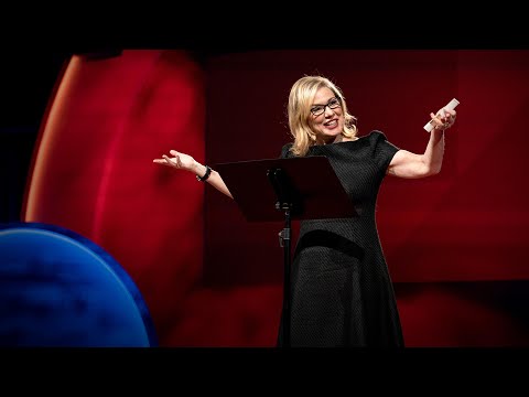
TED日本語 - チップ・キッド: デザインと日常における第一印象
TED Talks
デザインと日常における第一印象
The art of first impressions -- in design and life
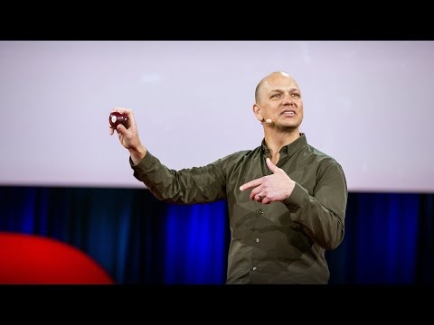
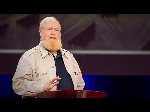
チップ・キッド
Chip Kidd
内容
装丁家のチップ・キッドは、私達が最初の見た目から判断することが、どれほど多いかよく心得ています。楽しく軽快なこの講演で、キッドはデザイナーが瞬時にメッセージを伝えるためによく使う「明快さとミステリー」の手法を伝授し、それが、いつ、どうして、どのように作用するのか解説します。美しく役立つデザインを称え、残念な作品をこき下ろし、自らの代表的な表紙デザインを生んだ思考過程を明かします。


字幕
SCRIPT
Script
Blah blah blah blah blah. Blah blah blah blah, blah blah, blah blah blah blah blah blah. Blah blah blah, blah.
So what the hell was that? Well, you don't know because you couldn't understand it. It wasn't clear. But hopefully, it was said with enough conviction that it was at least alluringly mysterious.
Clarity or mystery? I'm balancing these two things in my daily work as a graphic designer, as well as my daily life as a New Yorker every day, and there are two elements that absolutely fascinate me.
Here's an example. Now, how many people know what this is? Okay. Now how many people know what this is? Okay. Thanks to two more deft strokes by the genius Charles M. Schulz, we now have seven deft strokes that in and of themselves create an entire emotional life,one that has enthralled hundreds of millions of fans for over 50 years. This is actually a cover of a book that I designed about the work of Schulz and his art, which will be coming out this fall, and that is the entire cover. There is no other typographic information or visual information on the front, and the name of the book is "Only What's Necessary." So this is sort of symbolic about the decisions I have to make every day about the design that I'm perceiving, and the design I'm creating.
So clarity. Clarity gets to the point. It's blunt. It's honest. It's sincere. We ask ourselves this. [ "When should you be clear?" ]
Now, something like this, whether we can read it or not, needs to be really, really clear. Is it?
This is a rather recent example of urban clarity that I just love, mainly because I'm always late and I am always in a hurry. So when these meters started showing up a couple of years ago on street corners, I was thrilled, because now I finally knew how many seconds I had to get across the street before I got run over by a car. Six? I can do that. (Laughter)
So let's look at the yin to the clarity yang, and that is mystery. Mystery is a lot more complicated by its very definition. Mystery demands to be decoded, and when it's done right, we really, really want to. [ "When should you be mysterious?" ] In World War II, the Germans really, really wanted to decode this, and they couldn't.
Here's an example of a design that I've done recently for a novel by Haruki Murakami, who I've done design work for for over 20 years now, and this is a novel about a young man who has four dear friends who all of a sudden, after their freshman year of college, completely cut him off with no explanation, and he is devastated. And the friends' names each have a connotation in Japanese to a color. So there's Mr. Red, there's Mr. Blue, there's Ms. White, and Ms. Black. Tsukuru Tazaki, his name does not correspond to a color, so his nickname is Colorless, and as he's looking back on their friendship, he recalls that they were like five fingers on a hand. So I created this sort of abstract representation of this, but there's a lot more going on underneath the surface of the story, and there's more going on underneath the surface of the jacket. The four fingers are now four train lines in the Tokyo subway system, which has significance within the story. And then you have the colorless subway line intersecting with each of the other colors, which basically he does later on in the story. He catches up with each of these people to find out why they treated him the way they did.
And so this is the three-dimensional finished product sitting on my desk in my office, and what I was hoping for here is that you'll simply be allured by the mystery of what this looks like, and will want to read it to decode and find out and make more clear why it looks the way it does.
[ "The Visual Vernacular." ]
This is a way to use a more familiar kind of mystery. What does this mean? This is what it means. [ "Make it look like something else." ] The visual vernacular is the way we are used to seeing a certain thing applied to something else so that we see it in a different way.
This is an approach I wanted to take to a book of essays by David Sedaris that had this title at the time. [ "All the Beauty You Will Ever Need" ] Now, the challenge here was that this title actually means nothing. It's not connected to any of the essays in the book. It came to the author's boyfriend in a dream. Thank you very much, so -- (Laughter) -- so usually, I am creating a design that is in some way based on the text, but this is all the text there is. So you've got this mysterious title that really doesn't mean anything, so I was trying to think: Where might I see a bit of mysterious text that seems to mean something but doesn't? And sure enough, not long after,one evening after a Chinese meal, this arrived, and I thought, "Ah, bing, ideagasm!" (Laughter) I've always loved the hilariously mysterious tropes of fortune cookies that seem to mean something extremely deep but when you think about them -- if you think about them -- they really don't. This says, "Hardly anyone knows how much is gained by ignoring the future." Thank you. (Laughter) But we can take this visual vernacular and apply it to Mr. Sedaris, and we are so familiar with how fortune cookie fortunes look that we don't even need the bits of the cookie anymore. We're just seeing this strange thing and we know we love David Sedaris, and so we're hoping that we're in for a good time.
[ "'Fraud' Essays by David Rakoff" ] David Rakoff was a wonderful writer and he called his first book "Fraud" because he was getting sent on assignments by magazines to do things that he was not equipped to do. So he was this skinny little urban guy and GQ magazine would send him down the Colorado River whitewater rafting to see if he would survive. And then he would write about it, and he felt that he was a fraud and that he was misrepresenting himself. And so I wanted the cover of this book to also misrepresent itself and then somehow show a reader reacting to it.
This led me to graffiti. I'm fascinated by graffiti. I think anybody who lives in an urban environment encounters graffiti all the time, and there's all different sorts of it. This is a picture I took on the Lower East Side of just a transformer box on the sidewalk and it's been tagged like crazy. Now whether you look at this and think, "Oh, that's a charming urban affectation," or you look at it and say, "That's illegal abuse of property," the one thing I think we can all agree on is that you can not read it. Right? There is no clear message here. There is another kind of graffiti that I find far more interesting, which I call editorial graffiti. This is a picture I took recently in the subway, and sometimes you see lots of prurient, stupid stuff, but I thought this was interesting, and this is a poster that is saying rah-rah Airbnb, and someone has taken a Magic Marker and has editorialized about what they think about it. And it got my attention.
So I was thinking, how do we apply this to this book? So I get the book by this person, and I start reading it, and I'm thinking, this guy is not who he says he is; he's a fraud. And I get out a red Magic Marker, and out of frustration just scribble this across the front. Design done. (Laughter) And they went for it! (Laughter) Author liked it, publisher liked it, and that is how the book went out into the world, and it was really fun to see people reading this on the subway and walking around with it and what have you, and they all sort of looked like they were crazy. (Laughter)
[ "'Perfidia' a novel by James Ellroy" ] Okay, James Ellroy, amazing crime writer, a good friend, I've worked with him for many years. He is probably best known as the author of "The Black Dahlia" and "L.A. Confidential." His most recent novel was called this, which is a very mysterious name that I'm sure a lot of people know what it means, but a lot of people don't. And it's a story about a Japanese-American detective in Los Angeles in 1941 investigating a murder. And then Pearl Harbor happens, and as if his life wasn't difficult enough, now the race relations have really ratcheted up, and then the Japanese-American internment camps are quickly created, and there's lots of tension and horrible stuff as he's still trying to solve this murder. And so I did at first think very literally about this in terms of all right, we'll take Pearl Harbor and we'll add it to Los Angeles and we'll make this apocalyptic dawn on the horizon of the city. And so that's a picture from Pearl Harbor just grafted onto Los Angeles. My editor in chief said, "You know, it's interesting but I think you can do better and I think you can make it simpler." And so I went back to the drawing board, as I often do. But also, being alive to my surroundings, I work in a high-rise in Midtown, and every night, before I leave the office, I have to push this button to get out, and the big heavy glass doors open and I can get onto the elevator. And one night, all of a sudden, I looked at this and I saw it in a way that I hadn't really noticed it before. Big red circle, danger. And I thought this was so obvious that it had to have been done a zillion times, and so I did a Google image search, and I couldn't find another book cover that looked quite like this, and so this is really what solved the problem, and graphically it's more interesting and creates a bigger tension between the idea of a certain kind of sunrise coming up over L.A. and America.
[ "'Gulp' A tour of the human digestive system by Mary Roach." ]
Mary Roach is an amazing writer who takes potentially mundane scientific subjects and makes them not mundane at all; she makes them really fun. So in this particular case, it's about the human digestive system. So I'm trying to figure out what is the cover of this book going to be. This is a self-portrait. (Laughter) Every morning I look at myself in the medicine cabinet mirror to see if my tongue is black. And if it's not, I'm good to go. (Laughter) I recommend you all do this. But I also started thinking, here's our introduction. Right? Into the human digestive system. But I think what we can all agree on is that actual photographs of human mouths, at least based on this, are off-putting. (Laughter) So for the cover, then, I had this illustration done which is literally more palatable and reminds us that it's best to approach the digestive system from this end. (Laughter) I don't even have to complete the sentence. All right.
[ "Unuseful mystery" ] What happens when clarity and mystery get mixed up? And we see this all the time. This is what I call unuseful mystery. I go down into the subway -- I take the subway a lot -- and this piece of paper is taped to a girder. Right? And now I'm thinking, uh-oh, and the train's about to come and I'm trying to figure out what this means, and thanks a lot. Part of the problem here is that they've compartmentalized the information in a way they think is helpful, and frankly, I don't think it is at all. So this is mystery we do not need. What we need is useful clarity, so just for fun, I redesigned this. This is using all the same elements. (Applause) Thank you. I am still waiting for a call from the MTA. (Laughter) You know, I'm actually not even using more colors than they use. They just didn't even bother to make the 4 and the 5 green, those idiots. (Laughter) So the first thing we see is that there is a service change, and then, in two complete sentences with a beginning, a middle and an end, it tells us what the change is and what's going to be happening. Call me crazy! (Laughter)
[ "Useful mystery" ] All right. Now, here is a piece of mystery that I love: packaging. This redesign of the Diet Coke can by Turner Duckworth is to me truly a piece of art. It's a work of art. It's beautiful. But part of what makes it so heartening to me as a designer is that he's taken the visual vernacular of Diet Coke -- the typefaces, the colors, the silver background -- and he's reduced them to their most essential parts, so it's like going back to the Charlie Brown face. It's like, how can you give them just enough information so they know what it is but giving them the credit for the knowledge that they already have about this thing? It looks great, and you would go into a delicatessen and all of a sudden see that on the shelf, and it's wonderful. Which makes the next thing -- [ "Unuseful clarity" ] -- all the more disheartening, at least to me. So okay, again, going back down into the subway, after this came out, these are pictures that I took. Times Square subway station: Coca-Cola has bought out the entire thing for advertising. Okay? And maybe some of you know where this is going. Ahem.
"You moved to New York with the clothes on your back, the cash in your pocket, and your eyes on the prize. You're on Coke." (Laughter) "You moved to New York with an MBA,one clean suit, and an extremely firm handshake. You're on Coke." (Laughter) These are real! (Laughter) Not even the support beams were spared, except they switched into Yoda mode. (Laughter) "Coke you're on." (Laughter) [ "Excuse me, I'm on WHAT??" ] This campaign was a huge misstep. It was pulled almost instantly due to consumer backlash and all sorts of unflattering parodies on the web -- (Laughter) -- and also that dot next to "You're on," that's not a period, that's a trademark. So thanks a lot.
So to me, this was just so bizarre about how they could get the packaging so mysteriously beautiful and perfect and the message so unbearably, clearly wrong. It was just incredible to me.
So I just hope that I've been able to share with you some of my insights on the uses of clarity and mystery in my work, and maybe how you might decide to be more clear in your life, or maybe to be a bit more mysterious and not so over-sharing. (Laughter)
And if there's just one thing that I leave you with from this talk, I hope it's this: Blih blih blih blah. Blah blah blih blih. [ "'Judge This,' Chip Kidd" ] Blih blih blah blah blah. Blah blah blah.
Blah blah.
(Applause)
ぺらぺらぺらぺらぺら ぺらぺらぺらぺら ぺらぺら ぺらぺらぺらぺらぺらぺら ぺらぺらぺら ぺら
これは一体なんでしょう? もちろん 分からないでしょう 不明瞭で理解できませんから でも願わくば 十分自信を持って語られたので 少なくともミステリアスで 引きつけるものはあったのではないでしょうか
明快か ミステリアスか? 私は日々 グラフィック・デザイナーとして そしてまたニューヨーカーとして 両者のバランスを取ろうとしています これは私の心を引きつけてやみません
例をあげてみましょう これが何だか分かる方は? では こうしたら 何か分かりますか? 巧みな2筆を加えてくれた 天才チャールズ・M・シュルツのおかけで この散りばめられた 7つの巧みな線が 感情に富んだ命を生み出し 半世紀にわたって 何億人ものファンを 魅了してきました 実はこちらは本の表紙で シュルツの作品と技法についての 本の表紙デザインを手掛けました この秋に出版予定で これが表紙のすべてです 他の文字や視覚情報は 表紙には一切ありません この本のタイトルは 『必要なものだけ』です これは私が デザインを 理解したり 生み出したりする上で 日々行っている選択を 象徴するものです
明快さ 明快なものは要点をつきます 単刀直入で 率直で 嘘偽りがありません ご自身に問うてみましょう [いつ 明快であるべきか?]
さて このようなものは 読める読めないに関わらず 非常に明快であるべきですが いかがでしょうか?
こちらは 最近の都会的明快さの例で 私が大好きなものです その理由は 私が遅刻魔で いつも急いでいるからです 数年前に こんな数字表示を 通りで見かけるようになったとき ワクワクしたものです 車に轢かれずに道を渡るには 何秒で行けばよいか 分かるようになったからです 6秒? それならいける!(笑)
それでは明快な陽に対する 陰を見て見ましょう 陰とはミステリーです ミステリーとは その定義上 ずっと込み入ったものです ミステリーは解明されることを求めます 上手く作られた謎は どうしても解明したくなります [いつ ミステリアスになるべきか?] 第二次世界大戦時のドイツは どうしても これを解読したかったのですが できませんでした
これは 私が最近手がけたデザインです 村上春樹の小説で 彼の表紙デザインは これまで20年間ずっと手がけてきました この小説の若い主人公は 4人の親友がいますが 大学1年を過ぎると 突然何の説明もなしに 一方的に絶縁を言い渡され 絶望感に胸をさいなまれます 友人たちの名字にはみんな 色が含まれていて アカ、アオ、シロ、クロと 呼ばれていますが 主人公の多崎つくるだけは 名前に色が入っておらず いわば「色なし」です 自分たちの関係を振り返って 5本の指のようだったと思う くだりがあるので それを表現できるような 抽象的なデザインを作りました でも物語の表面下には もっと複雑なものがあり この表紙の奥にも 沢山のメッセージがあります ここでは4本の指が 東京の地下鉄の 4本の路線になっていて それが物語の中で 重要な意味を持っています 色のない路線が 他の色のそれぞれと交わっており 彼が物語の後半でやることを 示唆しています 当時 親友だった 一人ひとりと対峙して なぜ絶交をつきつけられたのか 探し求めます
こちらは3次元的な完成品で 私の机に飾ってあります 私が願うのは 皆さんがこのような ミステリアスなデザインに魅了され なぜこのような表紙なのか 知りたいと思い 中身を読みたくなるということです
[視覚の言葉]
こちらはもっと馴染みのある謎を使います どういうことでしょうか? こういうことです [別の何かのように見せる] 視覚の言葉とは 何か見慣れたものを 別のものに使うことで 違う視点で見せる方法です
私がこの方法をとりたかったのは デビッド・セダリスのエッセイ集を手掛けた時で 当時はこんなタイトルでした [『貴方に必要な美のすべて』] ここで頭を抱えたのは このタイトルには何の意味もないこと 本の中のどのエッセイとも 関連していません 著者の彼氏が夢で見たんだそうです さようでございますか・・・(笑) 普段 私が生み出すデザインは たいてい文章を元にしていますが その時はこの文章しかありません 特に何の意味もなさない ミステリアスなタイトルだけ 頭をひねりました 意味がありそうで 実はそうではない 謎めいた文章が何かなかったか? すると案の定 しばらくして 夕飯に中華料理を食べた後のことです テーブルに これが出てきたんです 「ああ これだ アイデアで悶えそう!」(笑) 私はフォーチュンクッキーの 可笑しいくらいに謎めいた文言が好きで とても深い意味が ありそうに見えますが よく考えると 何の意味もないことが分かるでしょう 例えば こちら 「未来を考えないことで得られるものを知る人は少ない」 そうですか(笑) でも この視覚の言葉は セダリス氏の本に適用できます 私たちはフォーチュンクッキーの おみくじはすごく見慣れているので もう あの小さなクッキーが なくとも分かるでしょう この奇妙なものを目にし 大好きなデビッド・セダリスのことなので きっと楽しいものに違いない と思うわけです
デイビッド・ラコフは素晴らしい作家で [デイビッド ・ラコフ著『Fraud(インチキ)』] 最初の作品を『インチキ』と名づけました なぜなら彼は自分に できそうもない仕事を 雑誌社から依頼されたからです ラコフは小柄で華奢な 都会の男性でしたが 雑誌GQは彼にコロラド川で 急流下りをさせて どうなるか試そうとしたんです 自分のことを偽って伝えていると 感じたのでした ですから この本の表紙も 内容を偽って伝え それに読者が異を唱えているように 見せたいと思いました
この考えからグラフィティにたどり着きました グラフィティには魅力を感じます 都会に住んでいる人なら グラフィティはよく目にしているでしょう いろんな種類があります こちらの写真は ロウアー・イースト・サイドで撮影した 歩道にある変圧器で めちゃくちゃ落書きされています 皆さんは これを見て 「素敵で都会的なものだな」と思うかもしれないし 「公共財を違法に汚している」と 思うかもしれませんが 一つだけ誰もが同意するのは これが読めない ということでしょう そうでしょう? 明快なメッセージはありません これとは別種のグラフィティで ずっと面白いのがあって 私は校閲グラフィティと呼んでいます こちらは私が最近 地下鉄駅で撮った写真です よく卑わいなのや くだらないのを目にしますが これは面白いなと思いました エアビーアンドビーを 持ち上げるポスターなんですが 誰かがマジックペンを手に これについてどう思うか 校注として書き込んでいます これは私の注意を引きました
これを本の表紙に使えないかと 考えたのです 彼の本を手にとり 読み始めて思ったのは 彼は主張しているような人物ではない インチキだということ そこで赤のマジックペンを手に 表紙に思いっきり書きなぐりました [FRAUD(インチキ)] デザインの出来上がりです(笑) なんとこれが好評だったんです!(笑) 著者も出版社も気に入り それでこんな本が 世に出ることになりました 見ていて楽しかったですね この本を地下鉄で読んでいる人とか この本を持ち歩いている人とか 頭がおかしいんじゃないかと映りました (笑)
ジェイムズ・エルロイは類まれなる犯罪小説作家で [ジェイムズ・エルロイ著『Perfidia(背信)』] 良き友でもあります 長年 一緒に仕事をしてきました 彼の代表作といえば 『ブラック・ダリア』と 『L.A.コンフィデンシャル』でしょう 彼の最新作が『背信』 とてもミステリアスなタイトルで 多くの方がその意味をご存知でしょうが 知らない方も多いと思います 小説の舞台は 1941年のロサンゼルスで 日系人の探偵が 殺人事件を捜査します そこに真珠湾攻撃が起こり ただでさえ大変な彼の人生に 人種間の軋轢が加わります 日系人収容所が瞬く間にでき 緊張が走り 災難が降りかかる中 主人公は犯罪事件を解決しようとします 最初に考えたのは そのまんまのデザインで 真珠湾攻撃にロサンゼルスを足して 街の地平線に訪れる 黙示録的な夜明けを描こうとしました 言ってみれば 真珠湾攻撃の画を ロサンゼルスに接木したわけです 編集長は 「うーん 面白いけど もっと良いのができるだろう シンプルにできるはずだ」と それでいつもするように はじめから考え直しました 私は周りのものに 注意を払っています 職場はミッドタウンの高層ビルにあって 毎晩オフィスから出る時にやっているのが このボタンを押すことで 大きくて重たいガラスのドアが開いて エレベーターに乗ることができます ある晩のことですが ふと これがいつもとは違って見えたのです 大きな赤い丸 危険を意味しています このシンボルはあまりに明らかで 何度も使われてきたに違いないと思い Googleで画像検索したところ このようなデザインの表紙は ついぞ見つからず 結局 このデザインを使用することになり 視覚的にも面白く より大きな緊張感を 生み出すことができました ロサンゼルスとアメリカの頭上に ある種の日が昇るというアイデアです
[メアリー・ローチ著 『ごっくん ― ヒトの消化器系について』]
メアリー・ローチは素晴らしい作家で 退屈になりがちな科学テーマを取り上げて 退屈とは正反対の とても面白いものに 変えてしまいます こちらの本は ヒトの消化器官の話です この本の表紙について 思いを巡らせました これは私の自撮り写真です(笑) 毎朝 自分の姿を 洗面台の鏡に映しながら 自分の舌が黒くないか確認します もし黒くなければ バッチリです (笑) 皆さんにもお勧めしますよ 私が考え始めたのは そこは入り口だということ でしょう? 消化器系への入り口です ただ皆さんも同意すると思いますが 実際のヒトの口の写真というのは これで見る限り 美しくありません(笑) ですから表紙には イラストを使い 口当たり良くしました それに消化器系へと案内するには こっち側の入り口の方が いいのは確かです (笑) その理由は お分りいただけますよね
[無用なミステリー] 明快さとミステリーが 混在したらどうなるでしょうか? これはよくあるケースです 私は無用なミステリーと呼んでいます 地下鉄駅に行くと ― 私はよく地下鉄を使いますが ― こんな紙が柱に張り出されています ありますよね? 私は「まずいぞ」と思い 電車は近づいてくるし 何が書かれているのか理解しようとしますが 大変厄介です ここでの問題は 分かりやすく 情報を細分化しているつもりが 全然役に立っていないということです これは必要ないミステリーと言えます 必要なのは明快で役に立つものですから 遊び半分で ちょっと変えてみました 全く同じ内容を使っています (拍手) どうも 都市交通局からのお誘い お待ちしています(笑) 使っている色は 元のより少ないんですよ 路線の4番と5番を 緑色にしないなんて 頭が悪いですね(笑) 最初に目に付くのは 何か運行に変更があることで それから2つの完結した文があり 冒頭・中盤・終盤という構成で 変更が何で 何が起こるか伝えています こんなに簡単なんです!(笑)
[有用なミステリー] 次は私が愛してやまない ミステリー作品です パッケージです ダイエット・コーラの新デザインは ターナー・ダックワースが手掛けたものですが 芸術の域だと思います まさに芸術品で 美しいです デザイナーとしての私に 強く訴えかけるのは ダイエット・コーラの 視覚の言葉である 書体と色と 銀色の背景を取り出し 最も本質的なところまで そぎ落としているところです ちょうどあのチャーリー・ブラウンの 顔のように それが何か理解できる 最低限の情報は何かと考え 人々が既に持っている 商品の知識を うまく利用しています 素敵です 食料品店に行くと 棚にこの缶が並んでいるというのは 本当に素晴らしいです そして お次はこちら ― がっかりさせられるものだと [無用な明快さ] 私は思います また地下鉄に戻りますが あのコーラが発売された後に 撮った写真があるんですが 場所は地下鉄タイムズ・スクエア駅 コカ・コーラ社が広告スペースを 買い占めています 皆さんの中には 何の話か 分かる人もいるでしょう エヘン
「ニューヨークにやってきた あるのは背負った着替えと ポケットのお金と 胸に抱いた夢だけ さあ出番だ コーク」 (おまえコカインやってるな) 「ニューヨークにやってきた あるのはMBAの資格と 1着のきれいなスーツと かたい握手だけ さあ出番だ コーク」 (おまえコカインやってるだろ) これ本物の広告ですよ!(笑) 柱すら犠牲になっていますが こちらはヨーダ調になっています(笑) 「コーク さあ出番だ」 (やってるよな コカイン) [はい? 私が何をやってるって?] この広告は大失敗でした 消費者からの反発で すみやかに撤去され ネットには ありとあらゆる パロディが溢れています (笑) ちなみに「出番だ(YOU'RE ON)」の横にある点は ピリオドではなく 商標の印です やれやれ
私にとって 不思議でならないのは 缶のパッケージをこんなにも ミステリアスで見事に仕上げたのに 付随するメッセージが耐え難いほど 明らかに間違っていることです 信じられませんでしたね
本日は皆さんに 明快さとミステリーを 私が仕事でどのように使っているか お話しさせていただきました 皆さんの判断のお役に立てば幸いです もっと明快にしようというとき あるいは もう少しミステリアスになって 「シェア」しすぎないようにしようというときに (笑)
今日の話で皆さんに覚えていただきたいものを 一つだけあげるなら こちらです ペラペラペラぺら ぺらぺらペラペラ [チップ・キッド著『Judge This』] ペラペラぺらぺらぺら ぺらぺらぺら [チップ・キッド著『Judge This』]
ぺらぺら
(拍手)
品詞分類
- 主語
- 動詞
- 助動詞
- 準動詞
- 関係詞等
TED 日本語
TED Talks
関連動画

シンボルやブランドに形作られた人間性デビー・ミルマン
2020.03.06美しいグラフはシンプルに全てを伝える | TED Talkトミー・マッコール
2018.10.15子供たちの読む気を引き出す図書室のデザイン方法マイケル・ビェルート
2017.06.23注意散漫を防ぐより良い技術トリスタン・ハリス
2016.07.14デザイン最大の秘密...気付く事トニー・ファデル
2015.06.03街の旗が、誰にも気づかれない最悪のデザインになる理由ローマン・マーズ
おすすめ 22015.05.14あなたの(そして何十億人の)ための巨大なウェブデザインの方法マーガレット・グールド・スチュワート
2014.08.05フォントをめぐる私の人生マシュー・カーター
2014.04.18芸術と技術を融合し、時代を超えた創造をブラン・フェレン
2014.03.25あなたの博物館ジェイク・バートン
2013.09.10五感に訴えるデザインジンソップ・リー
2013.08.06パックマンをMoMAに収蔵した理由パオラ・アントネッリ
2013.05.28マルチタスクはやめて、モノタスクをパオロ・カルディーニ
2012.11.30アート、テクノロジー、デザインから創造的リーダーが学べることジョン・マエダ
2012.10.09分かりやすい地図のデザインアリス・ヴェネティキディス
2012.10.01賞ではなく人のためのデザインをティモシー・プレステロ
2012.08.16
洋楽 おすすめ
RECOMMENDS
洋楽歌詞
ステイザ・キッド・ラロイ、ジャスティン・ビーバー
洋楽最新ヒット2021.08.20スピーチレス~心の声ナオミ・スコット
洋楽最新ヒット2019.05.23シェイプ・オブ・ユーエド・シーラン
洋楽人気動画2017.01.30フェイデッドアラン・ウォーカー
洋楽人気動画2015.12.03ウェイティング・フォー・ラヴアヴィーチー
洋楽人気動画2015.06.26シー・ユー・アゲインウィズ・カリファ
洋楽人気動画2015.04.06シュガーマルーン5
洋楽人気動画2015.01.14シェイク・イット・オフテイラー・スウィフト
ポップス2014.08.18オール・アバウト・ザット・ベースメーガン・トレイナー
ポップス2014.06.11ストーリー・オブ・マイ・ライフワン・ダイレクション
洋楽人気動画2013.11.03コール・ミー・メイビーカーリー・レイ・ジェプセン
洋楽人気動画2012.03.01美しき生命コールドプレイ
洋楽人気動画2008.08.04バッド・デイ~ついてない日の応援歌ダニエル・パウター
洋楽人気動画2008.05.14サウザンド・マイルズヴァネッサ・カールトン
洋楽人気動画2008.02.19イッツ・マイ・ライフボン・ジョヴィ
ロック2007.10.11アイ・ウォント・イット・ザット・ウェイバックストリート・ボーイズ
洋楽人気動画2007.09.14マイ・ハート・ウィル・ゴー・オンセリーヌ・ディオン
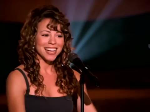
洋楽人気動画2007.07.12ヒーローマライア・キャリー
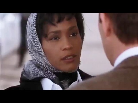
洋楽人気動画2007.03.21オールウェイズ・ラヴ・ユーホイットニー・ヒューストン
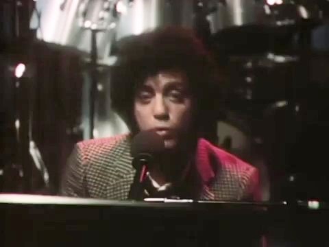
洋楽人気動画2007.02.19オネスティビリー・ジョエル
洋楽人気動画2005.09.16