TED日本語
TED Talks(英語 日本語字幕付き動画)
TED日本語 - ジョージア・ルピ: データの中に自分を見つけるには
TED Talks
データの中に自分を見つけるには
How we can find ourselves in data
ジョージア・ルピ
Giorgia Lupi
内容
ジョージア・ルピは人々がもつ物語を伝えるためにデータを利用し、数字に繊細さを加えます。このチャーミングな話では、彼女がデータに個性を与え、普段の何気ない細部まで視覚化し、抽象的で数えられないものを見えるもの、触れられるものに変えて、生活に直接つなぐ方法を教えてくれます。


字幕
SCRIPT
Script
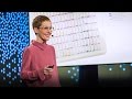
This is what my last week looked like. What I did, who I was with, the main sensations I had for every waking hour ... If the feeling came as I thought of my dad who recently passed away, or if I could have just definitely avoided the worries and anxieties. And if you think I'm a little obsessive, you're probably right. But clearly, from this visualization, you can learn much more about me than from this other one, which are images you're probably more familiar with and which you possibly even have on your phone right now. Bar charts for the steps you walked, pie charts for the quality of your sleep -- the path of your morning runs.
In my day job, I work with data. I run a data visualization design company, and we design and develop ways to make information accessible through visual representations. What my job has taught me over the years is that to really understand data and their true potential, sometimes we actually have to forget about them and see through them instead. Because data are always just a tool we use to represent reality. They're always used as a placeholder for something else, but they are never the real thing.
But let me step back for a moment to when I first understood this personally. In 1994, I was 13 years old. I was a teenager in Italy. I was too young to be interested in politics, but I knew that a businessman, Silvio Berlusconi, was running for president for the moderate right. We lived in a very liberal town, and my father was a politician for the Democratic Party. And I remember that no one thought that Berlusconi could get elected -- that was totally not an option. But it happened. And I remember the feeling very vividly. It was a complete surprise, as my dad promised that in my town he knew nobody who voted for him.
This was the first time when the data I had gave me a completely distorted image of reality. My data sample was actually pretty limited and skewed, so probably it was because of that, I thought, I lived in a bubble, and I didn't have enough chances to see outside of it.
Now, fast-forward to November 8,2016 in the United States. The internet polls, statistical models, all the pundits agreeing on a possible outcome for the presidential election. It looked like we had enough information this time, and many more chances to see outside the closed circle we lived in -- but we clearly didn't. The feeling felt very familiar. I had been there before. I think it's fair to say the data failed us this time -- and pretty spectacularly. We believed in data, but what happened, even with the most respected newspaper, is that the obsession to reduce everything to two simple percentage numbers to make a powerful headline made us focus on these two digits and them alone. In an effort to simplify the message and draw a beautiful, inevitable red and blue map, we lost the point completely. We somehow forgot that there were stories -- stories of human beings behind these numbers.
In a different context, but to a very similar point, a peculiar challenge was presented to my team by this woman. She came to us with a lot of data, but ultimately she wanted to tell one of the most humane stories possible. She's Samantha Cristoforetti. She has been the first Italian woman astronaut, and she contacted us before being launched on a six-month-long expedition to the International Space Station. She told us, "I'm going to space, and I want to do something meaningful with the data of my mission to reach out to people." A mission to the International Space Station comes with terabytes of data about anything you can possibly imagine -- the orbits around Earth, the speed and position of the ISS and all of the other thousands of live streams from its sensors. We had all of the hard data we could think of -- just like the pundits before the election -- but what is the point of all these numbers? People are not interested in data for the sake of it, because numbers are never the point. They're always the means to an end. The story we needed to tell is that there is a human being in a teeny box flying in space above your head, and that you can actually see her with your naked eye on a clear night. So we decided to use data to create a connection between Samantha and all of the people looking at her from below. We designed and developed what we called "Friends in Space," a web application that simply lets you say "hello" to Samantha from where you are, and "hello" to all the people who are online at the same time from all over the world. And all of these "hellos" left visible marks on the map as Samantha was flying by and as she was actually waving back every day at us using Twitter from the ISS.
This made people see the mission's data from a very different perspective. It all suddenly became much more about our human nature and our curiosity, rather than technology. So data powered the experience, but stories of human beings were the drive. The very positive response of its thousands of users taught me a very important lesson -- that working with data means designing ways to transform the abstract and the uncountable into something that can be seen, felt and directly reconnected to our lives and to our behaviors, something that is hard to achieve if we let the obsession for the numbers and the technology around them lead us in the process. But we can do even more to connect data to the stories they represent. We can remove technology completely.
A few years ago, I met this other woman, Stefanie Posavec -- a London-based designer who shares with me the passion and obsession about data. We didn't know each other, but we decided to run a very radical experiment, starting a communication using only data, no other language, and we opted for using no technology whatsoever to share our data. In fact, our only means of communication would be through the old-fashioned post office. For "Dear Data," every week for one year, we used our personal data to get to know each other -- personal data around weekly shared mundane topics, from our feelings to the interactions with our partners, from the compliments we received to the sounds of our surroundings. Personal information that we would then manually hand draw on a postcard-size sheet of paper that we would every week send from London to New York, where I live, and from New York to London, where she lives. The front of the postcard is the data drawing, and the back of the card contains the address of the other person, of course, and the legend for how to interpret our drawing. The very first week into the project, we actually chose a pretty cold and impersonal topic. How many times do we check the time in a week? So here is the front of my card, and you can see that every little symbol represents all of the times that I checked the time, positioned for days and different hours chronologically -- nothing really complicated here. But then you see in the legend how I added anecdotal details about these moments. In fact, the different types of symbols indicate why I was checking the time -- what was I doing? Was I bored? Was I hungry? Was I late? Did I check it on purpose or just casually glance at the clock? And this is the key part -- representing the details of my days and my personality through my data collection. Using data as a lens or a filter to discover and reveal, for example, my never-ending anxiety for being late, even though I'm absolutely always on time.
Stefanie and I spent one year collecting our data manually to force us to focus on the nuances that computers can not gather -- or at least not yet -- using data also to explore our minds and the words we use, and not only our activities. Like at week number three, where we tracked the "thank yous" we said and were received, and when I realized that I thank mostly people that I don't know. Apparently I'm a compulsive thanker to waitresses and waiters, but I definitely don't thank enough the people who are close to me.
Over one year, the process of actively noticing and counting these types of actions became a ritual. It actually changed ourselves. We became much more in tune with ourselves, much more aware of our behaviors and our surroundings. Over one year, Stefanie and I connected at a very deep level through our shared data diary, but we could do this only because we put ourselves in these numbers, adding the contexts of our very personal stories to them. It was the only way to make them truly meaningful and representative of ourselves.
I am not asking you to start drawing your personal data, or to find a pen pal across the ocean. But I'm asking you to consider data -- all kind of data -- as the beginning of the conversation and not the end. Because data alone will never give us a solution. And this is why data failed us so badly -- because we failed to include the right amount of context to represent reality -- a nuanced, complicated and intricate reality. We kept looking at these two numbers, obsessing with them and pretending that our world could be reduced to a couple digits and a horse race, while the real stories, the ones that really mattered, were somewhere else.
What we missed looking at these stories only through models and algorithms is what I call "data humanism." In the Renaissance humanism, European intellectuals placed the human nature instead of God at the center of their view of the world. I believe something similar needs to happen with the universe of data. Now data are apparently treated like a God -- keeper of infallible truth for our present and our future.
The experiences that I shared with you today taught me that to make data faithfully representative of our human nature and to make sure they will not mislead us anymore, we need to start designing ways to include empathy, imperfection and human qualities in how we collect, process, analyze and display them. I do see a place where, ultimately, instead of using data only to become more efficient, we will all use data to become more humane.
Thank you.
(Applause)
これは先週の私を表しています 何をしたのか 誰といたのか 起きている間 感じた 主な感情… 最近亡くなった父のことを考えた時の 感情なのか それとも不安や心配を避けようと 思っただけなのか 「こだわりが強い」と言われると その通りかもしれません でも明らかに このように視覚化すると 他のやり方よりも ずっとよく 私のことがわかります ただ こちらの図の方が 馴染みがあるでしょうし 実際スマホに こういうアプリを 入れている人もいるでしょう 歩数を記録した棒グラフ 睡眠の質を表す円グラフ 朝のジョギングの経路です
私は仕事で データを扱っています データを視覚的にデザインする 会社を経営していて 視覚的表現を通して 情報をわかりやすくする方法の 設計や開発をしています 長年この仕事に携わってきて わかったことは データと その可能性を 本当の意味で理解するには データのことは忘れて その向こう側に目を向けなければ ならない場合があるということです データとは常に 現実を表すための 手段に過ぎませんから データは常に 何かを 表す入れ物として使われますが 決して本物にはなりません
ここで少しの間 一歩引いたところから 私自身が初めて それに気づいた時の話をしましょう 1994年 13歳の時です ティーンだった私は イタリアに住んでいました 若かったので政治に関心は ありませんでしたが シルヴィオ・ベルルスコーニという 実業家が 中道右派として大統領選に 出馬したことは知っていました 私の家族は かなりリベラルな 地域に住んでいて 父は民主党の政治家でした ベルルスコーニが選ばれるとは 誰も思っていなかったのを覚えています あってはならないことでした でも そうなってしまったのです その時の気持ちを鮮明に思い出せます まさに寝耳に水でした 彼に投票する人など この町には 一人もいないと 父は断言していましたから
この時が 自分が見ていたデータが 現実を完全に歪めていた最初の例でした 実際は私のデータ・サンプルが とても少なく 偏っていて 多分そのせいで 世間知らずで 外の世界に目を向ける機会が 足りなかったのだろうと 思っていました
時は移って 2016年11月8日 アメリカ合衆国 インターネットの世論調査も 統計モデルも あらゆる専門家も 大統領選の 予想では一致していました 今回は 私たちには十分情報があり 小さな世界の外に目を向ける機会も はるかに多い そう思っていました でも 明らかに違っていたのです この感覚には覚えがありました 私には経験がありました 今度は データが私たちを裏切ったと 言ってもいいでしょう それも ものの見事にです 私たちはデータを信頼していましたが 実際に起こったことは 最も権威のある新聞でさえ パーセントを示す2つの数字に すべてをまとめようと腐心し インパクトのある見出しを書いて 誰もがその2つの数字だけに 注目するように 仕向けたのです メッセージを単純化して その必然的な結果である 美しい赤と青の地図を 描くことに力を入れたせいで 私たちは重要な点を見失いました なぜか私たちは この2つの数字の裏に 人間の物語があることを 忘れてしまっていたのです
その後 状況は違いましたが よく似た切り口で この女性が私のチームに ユニークな難問を出してきました 彼女は大量のデータを持ってきましたが 最終的に 考えつく限り最も人間的な ストーリーを伝えようとしていました 彼女の名はサマンサ・クリストフォレッティ 初のイタリア人女性宇宙飛行士で 彼女が連絡してきたのは 国際宇宙ステーション(ISS)での 半年間の滞在に飛び立つ前のことでした 彼女は こう言いました 「私は宇宙に行くけれど ミッションのデータを使って 意味のあることをして 人々に訴えたいの」 ISSのミッションでは 思いつく限りあらゆることに関する 何テラバイトにも及ぶ データが集まります 地球の周回軌道データ ISSの速度と位置 備え付けのセンサーからライブで送られる 何千ものデータ 私たちが思いつく あらゆる 信頼性の高いデータがありました ちょうど選挙前の 専門家たちと同じでした ただ そんな数字の どこが重要なのでしょう? データ自体に 人々は 関心を持ちません 数字は論点にならないからです 数字は常に ある目的に至る手段です 私たちが語るべきストーリーとは 頭上の宇宙空間を飛ぶ小さな箱の中に 一人の人間がいること そして夜空が澄んでいれば 実際に肉眼でも見えるということでした そこで私たちは サマンサと 地上から見上げるすべての人々を 結ぶためにデータを 使うことにしたのです 私たちは『Friends in Space(宇宙の友達)』の デザインと開発を手がけました これはウェブ・アプリケーションで 自分がいる場所から サマンサや その時オンラインにいる 世界中の人々 全員に 「ハロー」と言うための 仕組みでした そして みんなの「ハロー」は サマンサが上空を飛び ISSからTwitterで 毎日 実際に返事をするたびに 地図上に印として残ります
これにより人々はミッションのデータを まったく別の視点から見ることになります すべてが急に テクノロジーから 人間性や好奇心に関するものへと 変化したのです つまりデータは経験に力を与えますが 人間の物語が その原動力に なったのです 数千人のユーザーの とても前向きな反応を見て 私はとても大切な教訓を得ました データを扱うということは 抽象的なものや数えられないものを 可視化し 感じられるものにし 私たちの暮らしや行動に 直接 結びつける方法を デザインすることであり その過程で私たちが 数字やそれに関わるテクノロジーに こだわってしまうと そういうものは 見えにくくなるのです 一方 データと その物語を 結ぶためにできることがたくさんあります テクノロジーを全部 取り払えるのです
数年前 もう一人の女性に 出会いました ステファニー・ポサヴェクです ロンドンを拠点とするデザイナーで 私と同様 データへの情熱とこだわりがあります 私たちは見知らぬ同士でしたが すごく先進的な実験を することにしました 言葉を使わず データだけで やりとりを始めたのです また データを共有する時は 一切テクノロジーを使わないことにしました 実は私たちにとって 唯一の伝達手段は 昔ながらの郵便局を通じたものでした 書籍『Dear Data』のために 1年間に渡って毎週 お互いを知るために 個人データを利用しました ほぼ毎週 共有したのは 平凡な日常に関する個人データです 自分の感情や パートナーとのやりとり 褒められたことや 周囲の音です 次に その個人情報を ハガキ大の紙に手描きして 毎週 ロンドンから 私の住むニューヨークへ そして ニューヨークから 彼女の住むロンドンへと 送り合いました ハガキの表には データを描いたもの そして裏面には 当然 相手の住所と 図を解釈するための 説明を書きました このプロジェクトを始めて 最初の1週間は ごく淡々とした感情を交えないトピックを 選んでいました 1週間に何度 時間を確認すると思いますか? これは私のカードの表側ですが 小さな印一つ一つが 私が時間を確認した場面を全部 表しているのがわかるでしょう 印は日ごと 時間ごとに 順番に並んでいます 何も複雑なところはありません 一方 説明の中には それぞれの瞬間にまつわる 細かいエピソードを どう含めたかを書きました マークの種類が示しているのは なぜ時間を確認していたのか 私が何をしていたか 退屈していたか お腹が空いていたか 遅刻しそうだったか 意識して時間を確認したのか ただ何となく時計を見たのか そして ここで核心になるのは 自分のデータを集めることで 私の日常や人となりの細部を 表現することなのです データをレンズやフィルターとして 使うことで 例えば 私につきまとう 遅刻への不安が 明らかになります たとえ私が絶対 時間を守るとしてもです
ステファニーと私は1年間かけて 手書きでデータを集め続け 今のところはコンピュータでは 捉えられない ニュアンスに焦点を当て データを使って 自分たちの活動だけでなく 心の中や使っている言葉を調べました 例えば 第3週には 自分が言ったり 言われたりした 「ありがとう」をたどったところ 私が知らない人にばかり 「ありがとう」と言うことがわかりました ウェイトレスやウェイターには 言わずにいられないのに 身近な人には 明らかに あまり言っていません
1年に渡って こういった行為に 意識的に目を向け 回数を数えることが 儀式のようになりました この儀式は 私たちを実際に変えました 自分に統制が とれるようになりましたし 自分の行動や周囲の環境に よく気づくようになりました 1年に渡ってステファニーと私は データの交換日記を通して とても深い部分でつながっていましたが 続けられたのは数字の中に とても個人的な背景を加えることで 自分自身を数字に込めていたからです それが 数字を真に意味あるもの 自分を表すものにする唯一の方法でした
私はみなさんに 個人のデータを描いてみてはとか 海の向こうに文通相手を見つけるべきと 言うつもりはありません ただ みなさんがデータを ― あらゆる形のデータを 対話の終わりではなく始まりとして 捉えて欲しいのです データだけで解決策が 見えてくることはないからです だからこそ私たちは データに失望するのです データに十分な背景を 込められなかったせいで 現実の繊細で 複雑で 緻密な面を表せなかったからです 私たちは この2つの数字を見続け それにこだわり まるで この世界が 2つの数字や競争へと 単純化できると 自分を偽りました でも一方で本物の物語 ― 本当に重要な物語は ここにはありません
モデルやアルゴリズムだけを通して 物語を見ていると見逃してしまうものを 私は「データ人文主義」と呼んでいます ルネサンスの人文主義では ヨーロッパの知識人たちが 神ではなく人間性を 世界観の中心に据えました 私はデータの世界でも 同じことが 起こるべきだと考えています 今 データは 明らかに 神のように扱われています 現在と未来の 絶対確実な真理の守護神のようにです
今日みなさんに お話しした 経験から学んだのは データが人間性を正しく表し これ以上 人を惑わせないようにするには 共感や不完全さや人間の性質を データ収集や 処理、分析、提示の方法に 取り込んでデザインする 必要があるということです そして究極的には 将来 効率を高めるためだけに データを使うのではなく 誰もが 人間性を高めるために データを使うようになるでしょう
ありがとう
(拍手)
品詞分類
- 主語
- 動詞
- 助動詞
- 準動詞
- 関係詞等
TED 日本語
TED Talks
関連動画

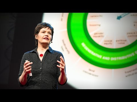
実証実験が示す週4日勤務制の恩恵ジュリエット・ショアー
おすすめ 12022.05.27経済的価値とは何か、そして誰がそれを生み出すのか?マリアナ・マッツカート
2020.01.10教師のこころの健康をどうすればサポートできるかシドニー・ジェンセン
2019.12.13資本主義の不都合な秘密と進むべき道ニック・ハノーアー
2019.10.18新しい言語を学ぶ秘訣 - TED Talkリディア・マホヴァ
2019.01.24人口が100億人に達する地球でどう生き延びるか?チャールズ・C・マン
2018.11.16漫画は教室にふさわしい | TED Talkジーン・ヤン
2018.06.15健全な経済は成長ではなく繁栄を目指しデザインされるべき | TED Talkケイト・ラワース
2018.06.04データで見ると、世界は良くなっているのか、悪くなっているのか?スティーブン・ピンカー
おすすめ 12018.05.21言語はいかに我々の考えを形作るのかレラ・ボロディツキー
2018.05.02公的資金による学術研究の成果を自由に見られないのはなぜか?エリカ・ストーン
2018.04.19子ども達が生涯の読書家になるためにアルヴィン・アービー
2018.04.04人間の感情の歴史ティファニー・ワット・スミス
2018.01.31世帯収入ごとの世界の暮らしを覗いてみようアンナ・ロスリング・ロンランド
おすすめ 12018.01.18職が無くなる未来社会でのお金の稼ぎ方マーティン・フォード
おすすめ 12017.11.16多様な考え方が持つ革命的な力エリフ・シャファク
2017.10.27
洋楽 おすすめ
RECOMMENDS
洋楽歌詞
ダイナマイトビーティーエス
洋楽最新ヒット2020.08.20ディス・イズ・ミーグレイテスト・ショーマン・キャスト
洋楽人気動画2018.01.11グッド・ライフGイージー、ケラーニ
洋楽人気動画2017.01.27ホワット・ドゥ・ユー・ミーン?ジャスティン・ビーバー
洋楽人気動画2015.08.28ファイト・ソングレイチェル・プラッテン
洋楽人気動画2015.05.19ラヴ・ミー・ライク・ユー・ドゥエリー・ゴールディング
洋楽人気動画2015.01.22アップタウン・ファンクブルーノ・マーズ、マーク・ロンソン
洋楽人気動画2014.11.20ブレイク・フリーアリアナ・グランデ
洋楽人気動画2014.08.12ハッピーファレル・ウィリアムス
ポップス2014.01.08カウンティング・スターズワンリパブリック
ロック2013.05.31ア・サウザンド・イヤーズクリスティーナ・ペリー
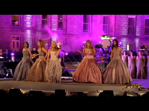
洋楽人気動画2011.10.26ユー・レイズ・ミー・アップケルティック・ウーマン
洋楽人気動画2008.05.30ルーズ・ユアセルフエミネム
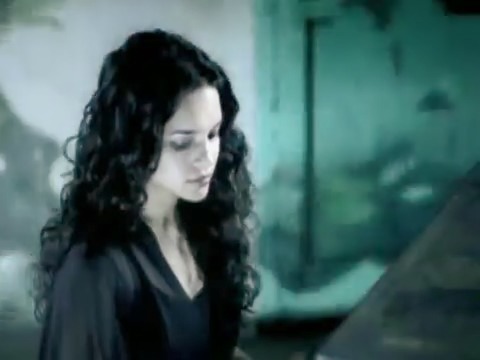
洋楽人気動画2008.02.21ドント・ノー・ホワイノラ・ジョーンズ
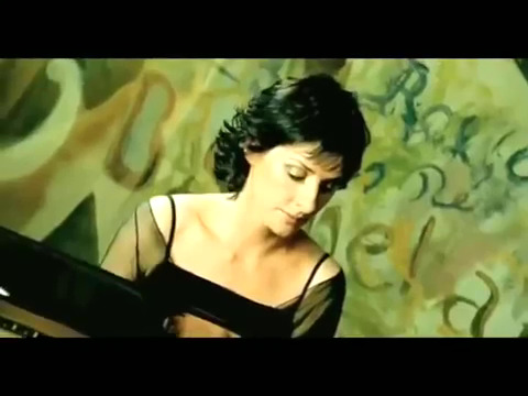
洋楽人気動画2008.02.15オンリー・タイムエンヤ
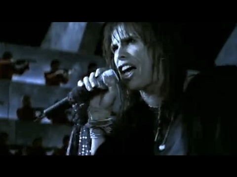
洋楽人気動画2007.10.03ミス・ア・シングエアロスミス
ロック2007.08.18タイム・トゥ・セイ・グッバイサラ・ブライトマン
洋楽人気動画2007.06.08シェイプ・オブ・マイ・ハートスティング
洋楽人気動画2007.03.18ウィ・アー・ザ・ワールド(U.S.A. フォー・アフリカ)マイケル・ジャクソン
洋楽人気動画2006.05.14ホテル・カリフォルニアイーグルス
ロック2005.07.06