TED日本語
TED Talks(英語 日本語字幕付き動画)
TED日本語 - ハンス・ロスリング: 最高の統計を披露
TED Talks
最高の統計を披露
The best stats you've ever seen
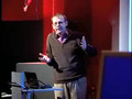
ハンス・ロスリング
Hans Rosling
内容
統計データをこんな風に見せられたことはないでしょう。スポーツ実況者張りのドラマ性と緊迫感を込めて、統計の達人ハンス・ロスリングが「発展途上国」の神話を打ち崩します。


字幕
SCRIPT
Script
About 10 years ago, I took on the task to teach global development to Swedish undergraduate students. That was after having spent about 20 years together with African institutions studying hunger in Africa, so I was sort of expected to know a little about the world. And I started in our medical university, Karolinska Institute, an undergraduate course called Global Health. But when you get that opportunity, you get a little nervous. I thought, these students coming to us actually have the highest grade you can get in Swedish college systems -- so, I thought, maybe they know everything I'm going to teach them about. So I did a pre-test when they came. And one of the questions from which I learned a lot was this one: "Which country has the highest child mortality of these five pairs?"
And I put them together, so that in each pair of country,one has twice the child mortality of the other. And this means that it's much bigger a difference than the uncertainty of the data. I won't put you at a test here, but it's Turkey, which is highest there, Poland, Russia, Pakistan and South Africa. And these were the results of the Swedish students. I did it so I got the confidence interval, which is pretty narrow, and I got happy, of course: a 1.8 right answer out of five possible. That means that there was a place for a professor of international health -- (Laughter) and for my course.
But one late night, when I was compiling the report I really realized my discovery. I have shown that Swedish top students know statistically significantly less about the world than the chimpanzees. (Laughter) Because the chimpanzee would score half right if I gave them two bananas with Sri Lanka and Turkey. They would be right half of the cases.
But the students are not there. The problem for me was not ignorance; it was preconceived ideas.
I did also an unethical study of the professors of the Karolinska Institute (Laughter) -- that hands out the Nobel Prize in Medicine, and they are on par with the chimpanzee there. (Laughter) This is where I realized that there was really a need to communicate, because the data of what's happening in the world and the child health of every country is very well aware.
We did this software which displays it like this: every bubble here is a country. This country over here is China. This is India. The size of the bubble is the population, and on this axis here I put fertility rate. Because my students, what they said when they looked upon the world, and I asked them, "What do you really think about the world?" Well, I first discovered that the textbook was Tintin, mainly. (Laughter) And they said, "The world is still 'we' and 'them.' And we is Western world and them is Third World." "And what do you mean with Western world?" I said. "Well, that's long life and small family, and Third World is short life and large family."
So this is what I could display here. I put fertility rate here: number of children per woman: one,two,three,four, up to about eight children per woman. We have very good data since 1962 -- 1960 about -- on the size of families in all countries. The error margin is narrow. Here I put life expectancy at birth, from 30 years in some countries up to about 70 years. And 1962, there was really a group of countries here that was industrialized countries, and they had small families and long lives. And these were the developing countries: they had large families and they had relatively short lives. Now what has happened since 1962? We want to see the change. Are the students right? Is it still two types of countries? Or have these developing countries got smaller families and they live here? Or have they got longer lives and live up there?
Let's see. We stopped the world then. This is all U.N. statistics that have been available. Here we go. Can you see there? It's China there, moving against better health there, improving there. All the green Latin American countries are moving towards smaller families. Your yellow ones here are the Arabic countries, and they get larger families, but they -- no, longer life, but not larger families. The Africans are the green down here. They still remain here. This is India. Indonesia's moving on pretty fast. (Laughter) And in the '80s here, you have Bangladesh still among the African countries there. But now, Bangladesh -- it's a miracle that happens in the '80s: the imams start to promote family planning. They move up into that corner. And in '90s, we have the terrible HIV epidemic that takes down the life expectancy of the African countries and all the rest of them move up into the corner, where we have long lives and small family, and we have a completely new world. (Applause)
Let me make a comparison directly between the United States of America and Vietnam. 1964: America had small families and long life; Vietnam had large families and short lives. And this is what happens: the data during the war indicate that even with all the death, there was an improvement of life expectancy. By the end of the year, the family planning started in Vietnam and they went for smaller families. And the United States up there is getting for longer life, keeping family size. And in the '80s now, they give up communist planning and they go for market economy, and it moves faster even than social life. And today, we have in Vietnam the same life expectancy and the same family size here in Vietnam,2003, as in United States,1974, by the end of the war. I think we all -- if we don't look in the data -- we underestimate the tremendous change in Asia, which was in social change before we saw the economical change.
Let's move over to another way here in which we could display the distribution in the world of the income. This is the world distribution of income of people. One dollar,10 dollars or 100 dollars per day. There's no gap between rich and poor any longer. This is a myth. There's a little hump here. But there are people all the way. And if we look where the income ends up -- the income -- this is 100 percent the world's annual income. And the richest 20 percent, they take out of that about 74 percent. And the poorest 20 percent, they take about two percent. And this shows that the concept of developing countries is extremely doubtful. We think about aid, like these people here giving aid to these people here. But in the middle, we have most the world population, and they have now 24 percent of the income.
We heard it in other forms. And who are these? Where are the different countries? I can show you Africa. This is Africa. 10 percent the world population, most in poverty. This is OECD. The rich country. The country club of the U.N. And they are over here on this side. Quite an overlap between Africa and OECD. And this is Latin America. It has everything on this Earth, from the poorest to the richest, in Latin America. And on top of that, we can put East Europe, we can put East Asia, and we put South Asia. And how did it look like if we go back in time, to about 1970? Then there was more of a hump. And we have most who lived in absolute poverty were Asians. The problem in the world was the poverty in Asia. And if I now let the world move forward, you will see that while population increase, there are hundreds of millions in Asia getting out of poverty and some others getting into poverty, and this is the pattern we have today. And the best projection from the World Bank is that this will happen, and we will not have a divided world. We'll have most people in the middle.
Of course it's a logarithmic scale here, but our concept of economy is growth with percent. We look upon it as a possibility of percentile increase. If I change this, and I take GDP per capita instead of family income, and I turn these individual data into regional data of gross domestic product, and I take the regions down here, the size of the bubble is still the population. And you have the OECD there, and you have sub-Saharan Africa there, and we take off the Arab states there, coming both from Africa and from Asia, and we put them separately, and we can expand this axis, and I can give it a new dimension here, by adding the social values there, child survival. Now I have money on that axis, and I have the possibility of children to survive there. In some countries,99.7 percent of children survive to five years of age; others, only 70. And here it seems there is a gap between OECD, Latin America, East Europe, East Asia, Arab states, South Asia and sub-Saharan Africa. The linearity is very strong between child survival and money.
But let me split sub-Saharan Africa. Health is there and better health is up there. I can go here and I can split sub-Saharan Africa into its countries. And when it burst, the size of its country bubble is the size of the population. Sierra Leone down there. Mauritius is up there. Mauritius was the first country to get away with trade barriers, and they could sell their sugar -- they could sell their textiles -- on equal terms as the people in Europe and North America.
There's a huge difference between Africa. And Ghana is here in the middle. In Sierra Leone, humanitarian aid. Here in Uganda, development aid. Here, time to invest; there, you can go for a holiday. It's a tremendous variation within Africa which we rarely often make -- that it's equal everything. I can split South Asia here. India's the big bubble in the middle. But a huge difference between Afghanistan and Sri Lanka. I can split Arab states. How are they? Same climate, same culture, same religion -- huge difference. Even between neighbors. Yemen, civil war. United Arab Emirate, money which was quite equally and well used. Not as the myth is. And that includes all the children of the foreign workers who are in the country. Data is often better than you think. Many people say data is bad. There is an uncertainty margin, but we can see the difference here: Cambodia, Singapore. The differences are much bigger than the weakness of the data. East Europe: Soviet economy for a long time, but they come out after 10 years very, very differently. And there is Latin America. Today, we don't have to go to Cuba to find a healthy country in Latin America. Chile will have a lower child mortality than Cuba within some few years from now. And here we have high-income countries in the OECD.
And we get the whole pattern here of the world, which is more or less like this. And if we look at it, how it looks -- the world, in 1960, it starts to move. 1960. This is Mao Tse-tung. He brought health to China. And then he died. And then Deng Xiaoping came and brought money to China, and brought them into the mainstream again. And we have seen how countries move in different directions like this, so it's sort of difficult to get an example country which shows the pattern of the world. But I would like to bring you back to about here at 1960. I would like to compare South Korea, which is this one, with Brazil, which is this one. The label went away for me here. And I would like to compare Uganda, which is there. And I can run it forward, like this. And you can see how South Korea is making a very, very fast advancement, whereas Brazil is much slower.
And if we move back again, here, and we put on trails on them, like this, you can see again that the speed of development is very, very different, and the countries are moving more or less in the same rate as money and health, but it seems you can move much faster if you are healthy first than if you are wealthy first. And to show that, you can put on the way of United Arab Emirate. They came from here, a mineral country. They cached all the oil; they got all the money; but health can not be bought at the supermarket. You have to invest in health. You have to get kids into schooling. You have to train health staff. You have to educate the population. And Sheikh Sayed did that in a fairly good way. In spite of falling oil prices, he brought this country up here. So we've got a much more mainstream appearance of the world, where all countries tend to use their money better than they used in the past. Now, this is, more or less, if you look at the average data of the countries -- they are like this.
Now that's dangerous, to use average data, because there is such a lot of difference within countries. So if I go and look here, we can see that Uganda today is where South Korea was 1960. If I split Uganda, there's quite a difference within Uganda. These are the quintiles of Uganda. The richest 20 percent of Ugandans are there. The poorest are down there. If I split South Africa, it's like this. And if I go down and look at Niger, where there was such a terrible famine, lastly, it's like this. The 20 percent poorest of Niger is out here, and the 20 percent richest of South Africa is there, and yet we tend to discuss on what solutions there should be in Africa. Everything in this world exists in Africa. And you can't discuss universal access to HIV [ medicine ] for that quintile up here with the same strategy as down here. The improvement of the world must be highly contextualized, and it's not relevant to have it on regional level. We must be much more detailed. We find that students get very excited when they can use this.
And even more policy makers and the corporate sectors would like to see how the world is changing. Now, why doesn't this take place? Why are we not using the data we have? We have data in the United Nations, in the national statistical agencies and in universities and other non-governmental organizations. Because the data is hidden down in the databases. And the public is there, and the Internet is there, but we have still not used it effectively.
All that information we saw changing in the world does not include publicly-funded statistics. There are some web pages like this, you know, but they take some nourishment down from the databases, but people put prices on them, stupid passwords and boring statistics. (Laughter) (Applause)
And this won't work. So what is needed? We have the databases. It's not the new database you need. We have wonderful design tools, and more and more are added up here. So we started a nonprofit venture which we called -- linking data to design -- we call it Gapminder, from the London underground, where they warn you, "mind the gap." So we thought Gapminder was appropriate. And we started to write software which could link the data like this. And it wasn't that difficult. It took some person years, and we have produced animations. You can take a data set and put it there. We are liberating U.N. data, some few U.N. organization.
Some countries accept that their databases can go out on the world, but what we really need is, of course, a search function. A search function where we can copy the data up to a searchable format and get it out in the world. And what do we hear when we go around? I've done anthropology on the main statistical units. Everyone says, "It's impossible. This can't be done. Our information is so peculiar in detail, so that can not be searched as others can be searched. We can not give the data free to the students, free to the entrepreneurs of the world." But this is what we would like to see, isn't it? The publicly-funded data is down here. And we would like flowers to grow out on the Net. And one of the crucial points is to make them searchable, and then people can use the different design tool to animate it there. And I have a pretty good news for you. I have a good news that the present, new Head of U.N. Statistics, he doesn't say it's impossible. He only says, "We can't do it." (Laughter) And that's a quite clever guy, huh? (Laughter)
So we can see a lot happening in data in the coming years. We will be able to look at income distributions in completely new ways. This is the income distribution of China,1970. the income distribution of the United States,1970. Almost no overlap. Almost no overlap. And what has happened? What has happened is this: that China is growing, it's not so equal any longer, and it's appearing here, overlooking the United States. Almost like a ghost, isn't it, huh? (Laughter)
It's pretty scary. But I think it's very important to have all this information. We need really to see it. And instead of looking at this, I would like to end up by showing the Internet users per 1,000. In this software, we access about 500 variables from all the countries quite easily. It takes some time to change for this, but on the axises, you can quite easily get any variable you would like to have. And the thing would be to get up the databases free, to get them searchable, and with a second click, to get them into the graphic formats, where you can instantly understand them. Now, statisticians doesn't like it, because they say that this will not show the reality; we have to have statistical, analytical methods. But this is hypothesis-generating.
I end now with the world. There, the Internet is coming. The number of Internet users are going up like this. This is the GDP per capita. And it's a new technology coming in, but then amazingly, how well it fits to the economy of the countries. That's why the 100 dollar computer will be so important. But it's a nice tendency. It's as if the world is flattening off, isn't it? These countries are lifting more than the economy and will be very interesting to follow this over the year, as I would like you to be able to do with all the publicly funded data. Thank you very much. (Applause)
10年ほど前 私はスウェーデンの学生に 世界の発展について 教える仕事に就きました 私がアフリカの機関と一緒に 20年ほどアフリカの飢餓の研究をしていたので 世界のことを少しは知っていると期待したのでしょう 医科大であるカロリンスカ研究所で「世界保健」という 学部の授業を持つことになりました しかしやる段になって 不安になりました スウェーデンでも最も成績優秀な 学生たちが相手です 私が教える事なんか みんな知っているのではないかと思いました そこで最初に小テストをやることにしました その時の質問は 私に多くのことを教えてくれました “この5組のそれぞれについて 乳幼児死亡率が高い方を選べ”
各組は 一方が他方よりも2倍以上 乳幼児死亡率が高くなるように選んであります 差異が データの誤差よりずっと大きくなるようにしたのです 別に皆さんをテストはしません 答えは トルコ、ポーランド、ロシア、パキスタン、南アフリカです これがスウェーデンの学生の成績です 信頼区間はごく狭く 私にはありがたい結果でした 5点満点で平均1.8です これなら 世界保健の教授の居場所があります 私の授業も安泰です (笑)
しかしその結果について 本当に理解したのは 夜遅く その答案をまとめている時でした スウェーデンの学生の世界の知識は 統計的有意に チンパンジーより低い ということです (笑) チンパンジーはバナナを2本もやれば スリランカかトルコか 半分の場合は正しい方を選ぶでしょう
スウェーデンの学生はもっと下です 問題は無知ではなく 先入観です
私はカロリンスカ研究所の教授にも 非倫理的な調査を行いました (笑) ノーベル医学賞を授与する人たちが チンパンジー並みだったのです (笑) コミュニケーションの必要性を実感しました 世界各国の子供の健康水準については よく整ったデータがあるからです
それで ご覧のようなソフトを作りました 丸はそれぞれ国を表しています これは中国で これはインドです 円の大きさは人口を表し 横軸は出生率です 学生たちが 世界をどう捉えているのか 彼らに聞いてみました “世界を実際どう思っているの?” 彼らの知識は「タンタンの冒険旅行」から来ているのが分かりました (笑) 学生たちは いまだ世界を「我々」と「彼ら」に分け 我々「西欧世界」 彼ら「第三世界」と考えています 私は聞きました “その「西欧世界」というのは何?” “長生きで小家族なのがそうです 短命で大家族なのが第三世界です”
これをご覧ください 横軸は出生率 女性1人当たりの子どもの数です 1人、2人、3人、4人から8人まで 1962年以降の 各国の家族の大きさについては とても良いデータがあります 誤差はわずかです 縦軸は出生時平均余命です 30歳くらいから 上は70歳くらいまであります 1962年には 実際こういう国のグループがありました 工業国は 小家族で長寿です そしてこっちは発展途上国 大家族で比較的短命でした そして1962年以降何が起きたのか? 変化を見てみましょう 学生たちは正しく 今も2種類の国があるのでしょうか? それとも発展途上国が小家族になって この辺にいるのか? あるいは長寿になって この上にいるのか?
見てみましょう データには利用可能な 国連の 統計を使っています では見てみましょう これは中国 より健康な社会へと改善していきます 緑のラテンアメリカ諸国が 小家族に向かっています 黄色いのはアラブ諸国です 寿命が延びています 緑色のアフリカは この場に留まったままです インドに インドネシア とても速く動いています (笑) 80年代に入ります バングラデシュはずっと アフリカ諸国と一緒でしたが ここで奇跡が起きます イマームが家族計画を推進し 左上に上がっていきます 90年代にひどいHIVの流行があり アフリカ諸国の平均余命が下がります 残りの国はみな 左上へと進んでいきます 長寿で小家族 私たちの世界は全く違ったものになったのです (拍手)
米国とベトナムとを比較してみましょう 1964年 米国は小家族で長寿 一方ベトナムは大家族で短命です その後こうなります 戦争中のデータを見ると 戦争による多くの死者にも関わらず 平均余命が伸びています 戦争が終わる頃に ベトナムで家族計画が始まり 小家族に向かいます 米国は長寿で小さな家族を保っています ベトナムは80年代に 計画経済を捨てて市場経済になり 社会水準の向上が加速します そして今日 2003年のベトナムの平均余命と 家族の大きさは ベトナム戦争末 1974年の米国と同じ水準になりました データを見なければ 我々は アジアの著しい変化を 過小評価することになります アジアでは 経済の変化の前に 社会の変化が現れています
別な見方をしてみましょう 世界の所得の分布です これは世界の人々の所得の分配を示しています 世帯1日当たり 1ドル、10ドル、100ドルです もはや豊かな国と貧しい国の間にギャップはありません 神話です 小さな谷がありますが ずっと途切れなく分布しています 所得がどういう配分になっているか見てみましょう これが世界の年間所得の100%です 最も豊かな20%が 74%を手にしています そして最も貧しい20%が 2%を手にしています これを見ると 発展途上国という概念は 非常に疑わしいことが分かります 援助について考えるとき 私たちは ここの人たちが ここの人たちを助けていると思っています しかし真ん中の 最も人口の多い部分が 今や24%の所得を得ているのです
この人たちは誰なのでしょう? それぞれの国はどこにあたるのでしょう? まずアフリカです これがアフリカ 世界の人口の10%で 大部分が貧困です これはOECD諸国 豊かな国々 国連のカントリークラブです この部分で アフリカとOECDの間に 結構重なりがあります これは南アメリカ 最貧から最富裕まで 全部そろっています さらに重ねて 東欧、東アジア、 南アジア 時間を1970年までを戻します 谷が深くなっています 極貧生活をしている人はアジアに多くいました 世界の問題はアジアの貧困だったのです 時間を進めていくと 人口が増加していき アジアでは 何億という人々が貧困から抜け出し 別なところで 貧困が進みます これが現在のパターンです 世界銀行による最良の予測では この後こうなります 世界は分断されておらず ほとんどの人が真ん中にいます
これはもちろん対数目盛です 私たちの経済の概念では 成長をパーセントで計ります 発展の割合として見るのです 横軸を世帯収入から 1人当たりのGDPに変えましょう それぞれのデータを 地域のGDPに変えます 円の大きさは人口です OECDがここで サハラ以南のアフリカがここです アラブ諸国を アフリカやアジアと分けて別にしましょう 横軸を引き伸ばし 次元をもう1つ追加します 子供の生存率です 横軸がお金で 縦軸が子どもの生き残る可能性です ある国々では99.7%の子どもが5歳以上まで生きられます 一方70%の国々もあります ここにギャップがあるように見えます OECD、南アメリカ、東欧、東アジア アラブ諸国、南アジア、サハラ以南のアフリカ 子どもの生存率とお金の間には強い相関があります
サハラ以南のアフリカをバラしてみましょう 縦軸が保健の水準で 上に行くほど良いということです サハラ以南アフリカを国に分けました それぞれの円の大きさは国の人口を表しています シエラレオネがここ モーリシャスがあそこにあります モーリシャスは貿易障壁を最初に解除した国で 砂糖や繊維製品を 欧米と対等な条件で売ることができます
アフリカの国の間にも大きな差があるのです ガーナは真ん中あたり シエラネオネは人道的支援を受けています ウガンダは開発支援を受けています この辺は投資できます ここでは休暇を過ごせます アフリカには大きな幅があるのに 私たちは一緒くたにしています 南アジアを分割してみましょう 真ん中の大きな円がインドです アフガニスタンとスリランカでは 大変大きな違いがあります アラブ諸国を分割してみましょう どうなるでしょう? 気候、文化、宗教が同じでも 大きな違いがあります 隣国同士でも イエメンは内戦 アラブ首長国連邦では 外国人労働者の子どもも含め お金が平等にうまく使われています 私たちが信じているのとは異なっています データはみんなが思うより有効なのです 不確実な部分があるにしても はっきりした差が見られます このカンボジアとシンガポールの差は データの問題を はるかに超えています 東欧は長い間ソビエト経済下にありましたが 離脱して10年 大きく変わっています 南米も 今や健康な国はキューバだけではありません チリは数年のうちに 子供の死亡率の低さでキューバを抜きそうです こちらは高所得なOECD諸国です
これが世界全体のパターンです だいたいこんな感じになっています 1960年の世界を見てみましょう 動き始めます これは毛沢東です 中国に健康をもたらしました 彼の死後 鄧小平が出てきて 中国にお金をもたらし 中国を本流に引き戻しました このようにそれぞれの国が違った方向に動いています ですから 世界の典型的なパターンを示す 国の例を挙げるというのは難しいのです また1960年に戻しましょう ここにある韓国と こちらにあるブラジルを比較してみましょう 比較のためウガンダも入れましょう ここにあります 時間を進めます 韓国がいかに速く進歩しているか 分かるでしょう それに比べるとブラジルはずっとゆっくりです
また最初に戻って 航跡表示をオンにして もう一度実行すると 発展の速度が 大きく異なるのが分かります そして経済と保健は だいたいのところ同じ割合で変化しています しかし経済より保健が先に来る場合に 動きがずっと速いのが分かります それが良くわかるように アラブ首長国連邦を加えてみましょう 資源の豊かな国です 石油でお金はできましたが 健康をスーパーマーケットで買うことはできません 健康に投資し 子どもたちを学校で教えなければなりません 医療スタッフを育て 国民を教育しなければなりません 首長ザーイドはこれをかなりうまくやりました 石油価格の下落にも関わらず この国をここまで引き上げたのです だから世界の主流の状況としては 各国は昔に比べて お金をうまく使うようになっています これは各国をその平均で見た場合です
でも平均データを使うのは危険があります 国の中にも大きな差があるからです これを見ると 現在のウガンダは 1960年に韓国がいた場所にいます ウガンダを分けると 国内に大きな差があります ウガンダで最も富裕な20%がここ 最も貧しい層はここです 南アフリカを分けるとこんな感じです 最近ひどい飢饉のあったニジェールを見てみましょう ニジェールの最貧の20%はここで 南アフリカの最も豊かな20%はここです それなのに私たちは アフリカに対する解決策は どうあるべきかと議論しています アフリカには世界の全てがあります HIV対策について こっちの20%と一緒の議論を こっちの20%にはできないのです 世界の改善は それぞれのコンテキストに合わせる必要があり 大きな地域でくくるのは不適切です 細かくやらなきゃいけません このツールを使わせると 学生がとてもワクワクするのに気づきました
政策立案者や企業もまた 世界の変化を知りたがっています ではなぜ それが実現しないのでしょう? なぜ 既に持っているデータを使おうとしないのか? 国連も 国の統計機関も 大学も その他の非政府組織も データを持っているというのに それはデータが隠されているからです 一般の人々が使えるインターネットがあるというのに データは有効に使われていません
私たちが見てきた 世界の変化を示す情報に 公的にアクセスできるものはありません ある種のウェブページはあります データベースから養分を取っているわけですが 高い値段を付け 変なパスワードをかけ 退屈な統計データを表示するだけです (笑と拍手)これではうまくいきません
何が必要なのか? データベースはあります 新しいデータベースが 必要なわけではありません 素晴らしいデザインツールもあり どんどん増えています ですから私たちは データをデザインに結び付ける 非営利のベンチャーを始めました Gapminderです ロンドン地下鉄の“MIND THE GAP” (隙間にご注意ください)から名前を取りました 私たちはデータをつなげられる ソフトを作り始めました そんなに難しくはありません 数人年です それでデータを引き出し アニメーションできるようになりました いくつか国連機関のデータも解放しました
いくつかの国は データを世界に公開することに同意しています しかし本当に必要なのは検索機能です データを検索可能な形にして公開し 自由に検索できるようにしなければなりません そのために世界を回って どんな言葉を耳にするでしょう? 私は統計機関の人類学に詳しくなりました みんな同じことを言います “不可能です うちの情報は特殊ですから” “よそのデータのように検索可能にするのは無理です” “学生や世界の起業家に データを無料で提供はできません” しかし私はそうしたいのです 公的資金によるデータがここにあり それがネット上で花開くのを見たいのです 肝心なのは データを検索可能にし 様々なデザインツールを使い 絵として見られるようにすることです 良い報せがあります 国連統計局の新局長は 不可能だとは言いません 彼はただ “我々には無理です”と言うだけです (笑) なかなか頭の良い人ですよね? (笑)
今後数年で データの方面で 多くのことが起こるでしょう 所得分布を まったく違った方法で見られるようになるでしょう 紫は1970年の中国の所得分布で 水色は1970年の米国の所得分布です ほとんど重なりはありません その後どうなったでしょう? こうなります 中国は成長し 平等ではなくなっていきます そしてこのような位置に 米国のすぐ背後に迫っています なんだか お化けのようですね (笑)
結構怖い感じです このような情報を持つのは大変重要だと思います 本当に見る必要があります 最後に 1000人当たりの インターネットユーザ数を ご覧いただきましょう このソフトを使うと 世界の国々の500種のデータに 容易にアクセスできます 画面の切り替えに若干時間がかかりますが 縦軸と横軸に 好きなデータを選択できます 必要なのはデータベースを無料化し 検索可能にすることで そうすれば クリックするだけで グラフに変えて 即座に理解できるようになります 統計学者はこういうのを気に入りません 現実を表していないと言います 統計的 分析的手法を使うべきだと言います しかし これで仮説生成ができるのです
インターネットが現れ インターネットにアクセスする ユーザ数が増えていきます 横軸は1人当たりのGDPです 新しく登場した技術ですが それが驚くほど 国の経済力に対応しています だからこそ100ドルPCが 重要なのです ここには良い傾向が見えます 世界がフラットになっているかのようです これらの国々は 経済以上に上昇しており 今後どうなるか興味深いところです みんながすべての公的データを 使えるようになることを願っています (拍手)
品詞分類
- 主語
- 動詞
- 助動詞
- 準動詞
- 関係詞等
TED 日本語
TED Talks
関連動画

実証実験が示す週4日勤務制の恩恵ジュリエット・ショアー
おすすめ 12022.05.27経済的価値とは何か、そして誰がそれを生み出すのか?マリアナ・マッツカート
2020.01.10教師のこころの健康をどうすればサポートできるかシドニー・ジェンセン
2019.12.13資本主義の不都合な秘密と進むべき道ニック・ハノーアー
2019.10.18新しい言語を学ぶ秘訣 - TED Talkリディア・マホヴァ
2019.01.24人口が100億人に達する地球でどう生き延びるか?チャールズ・C・マン
2018.11.16漫画は教室にふさわしい | TED Talkジーン・ヤン
2018.06.15健全な経済は成長ではなく繁栄を目指しデザインされるべき | TED Talkケイト・ラワース
2018.06.04データで見ると、世界は良くなっているのか、悪くなっているのか?スティーブン・ピンカー
おすすめ 12018.05.21言語はいかに我々の考えを形作るのかレラ・ボロディツキー
2018.05.02公的資金による学術研究の成果を自由に見られないのはなぜか?エリカ・ストーン
2018.04.19子ども達が生涯の読書家になるためにアルヴィン・アービー
2018.04.04人間の感情の歴史ティファニー・ワット・スミス
2018.01.31世帯収入ごとの世界の暮らしを覗いてみようアンナ・ロスリング・ロンランド
おすすめ 12018.01.18職が無くなる未来社会でのお金の稼ぎ方マーティン・フォード
おすすめ 12017.11.16多様な考え方が持つ革命的な力エリフ・シャファク
2017.10.27

洋楽 おすすめ
RECOMMENDS
洋楽歌詞
ダイナマイトビーティーエス
洋楽最新ヒット2020.08.20ディス・イズ・ミーグレイテスト・ショーマン・キャスト
洋楽人気動画2018.01.11グッド・ライフGイージー、ケラーニ
洋楽人気動画2017.01.27ホワット・ドゥ・ユー・ミーン?ジャスティン・ビーバー
洋楽人気動画2015.08.28ファイト・ソングレイチェル・プラッテン
洋楽人気動画2015.05.19ラヴ・ミー・ライク・ユー・ドゥエリー・ゴールディング
洋楽人気動画2015.01.22アップタウン・ファンクブルーノ・マーズ、マーク・ロンソン
洋楽人気動画2014.11.20ブレイク・フリーアリアナ・グランデ
洋楽人気動画2014.08.12ハッピーファレル・ウィリアムス
ポップス2014.01.08カウンティング・スターズワンリパブリック
ロック2013.05.31ア・サウザンド・イヤーズクリスティーナ・ペリー
洋楽人気動画2011.10.26ユー・レイズ・ミー・アップケルティック・ウーマン
洋楽人気動画2008.05.30ルーズ・ユアセルフエミネム
洋楽人気動画2008.02.21ドント・ノー・ホワイノラ・ジョーンズ
洋楽人気動画2008.02.15オンリー・タイムエンヤ
洋楽人気動画2007.10.03ミス・ア・シングエアロスミス
ロック2007.08.18タイム・トゥ・セイ・グッバイサラ・ブライトマン
洋楽人気動画2007.06.08シェイプ・オブ・マイ・ハートスティング
洋楽人気動画2007.03.18ウィ・アー・ザ・ワールド(U.S.A. フォー・アフリカ)マイケル・ジャクソン
洋楽人気動画2006.05.14ホテル・カリフォルニアイーグルス
ロック2005.07.06