TED日本語
TED Talks(英語 日本語字幕付き動画)
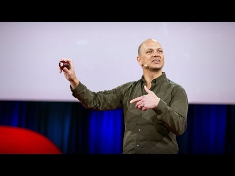
TED日本語 - チップ・キッド: 笑い事ではないけど笑える本のデザインの話
TED Talks
笑い事ではないけど笑える本のデザインの話
Designing books is no laughing matter. OK, it is
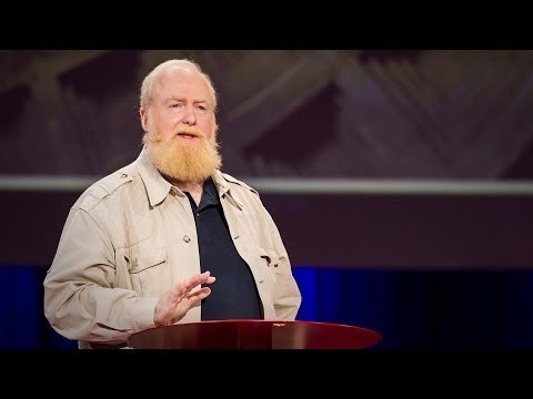
チップ・キッド
Chip Kidd
内容
チップ・キッドは本を表紙では判断しません。本を体現する表紙を作るのです。それもお茶目なユーモアをもって。TED2012で一番可笑しかったこの講演で、彼は表紙デザインの芸術と深い思索を披露しています(チー・パールマンとデビッド・ロックウェルがゲストキュレーターを務めたTED2012のセッション「デザインスタジオ」から)。


字幕
SCRIPT
Script
Hi. (Laughter) I did that for two reasons. First of all, I wanted to give you a good visual first impression. But the main reason I did it is that that's what happens to me when I'm forced to wear a Lady Gaga skanky mic. (Laughter) I'm used to a stationary mic. It's the sensible shoe of public address. (Laughter) But you clamp this thing on my head, and something happens. I just become skanky. (Laughter) So I'm sorry about that. And I'm already off-message. (Laughter) Ladies and gentlemen, I have devoted the past 25 years of my life to designing books. "Yes, BOOKS. You know, the bound volumes with ink on paper. You can not turn them off with a switch. Tell your kids." It all sort of started as a benign mistake, like penicillin. (Laughter) What I really wanted was to be a graphic designer at one of the big design firms in New York City. But upon arrival there, in the fall of 1986, and doing a lot of interviews, I found that the only thing I was offered was to be Assistant to the Art Director at Alfred A. Knopf, a book publisher. Now I was stupid, but not so stupid that I turned it down. I had absolutely no idea what I was about to become part of, and I was incredibly lucky. Soon, it had occurred to me what my job was. My job was to ask this question: "What do the stories look like?" Because that is what Knopf is. It is the story factory,one of the very best in the world. We bring stories to the public. The stories can be anything, and some of them are actually true. But they all have one thing in common: They all need to look like something. They all need a face. Why? To give you a first impression of what you are about to get into. A book designer gives form to content, but also manages a very careful balance between the two. Now, the first day of my graphic design training at Penn State University, the teacher, Lanny Sommese, came into the room and he drew a picture of an apple on the blackboard, and wrote the word "Apple" underneath, and he said, "OK. Lesson one. Listen up." And he covered up the picture and he said, "You either say this," and then he covered up the word, "or you show this. But you don't do this." Because this is treating your audience like a moron. (Laughter) And they deserve better. And lo and behold, soon enough, I was able to put this theory to the test on two books that I was working on for Knopf. The first was Katharine Hepburn's memoirs, and the second was a biography of Marlene Dietrich. Now the Hepburn book was written in a very conversational style, it was like she was sitting across a table telling it all to you. The Dietrich book was an observation by her daughter; it was a biography. So the Hepburn story is words and the Dietrich story is pictures, and so we did this. So there you are. Pure content and pure form, side by side. No fighting, ladies. "What's a Jurassic Park?" Now, what is the story here? Someone is re-engineering dinosaurs by extracting their DNA from prehistoric amber. Genius! (Laughter) Now, luckily for me, I live and work in New York City, where there are plenty of dinosaurs. (Laughter) So, I went to the Museum of Natural History, and I checked out the bones, and I went to the gift shop, and I bought a book. And I was particularly taken with this page of the book, and more specifically the lower right-hand corner. Now I took this diagram, and I put it in a Photostat machine, (Laughter) and I took a piece of tracing paper, and I taped it over the Photostat with a piece of Scotch tape -- stop me if I'm going too fast -- (Laughter) and then I took a Rapidograph pen -- explain it to the youngsters -- (Laughter) and I just started to reconstitute the dinosaur. I had no idea what I was doing, I had no idea where I was going, but at some point, I stopped -- when to keep going would seem like I was going too far. And what I ended up with was a graphic representation of us seeing this animal coming into being. We're in the middle of the process. And then I just threw some typography on it. Very basic stuff, slightly suggestive of public park signage. (Laughter) Everybody in house loved it, and so off it goes to the author. And even back then, Michael was on the cutting edge. "Michael Crichton responds by fax:" "Wow! Fucking Fantastic Jacket" (Laughter) (Applause) That was a relief to see that pour out of the machine. (Laughter) I miss Michael. And sure enough, somebody from MCA Universal calls our legal department to see if they can maybe look into buying the rights to the image, just in case they might want to use it. Well, they used it. (Laughter) (Applause) And I was thrilled. We all know it was an amazing movie, and it was so interesting to see it go out into the culture and become this phenomenon and to see all the different permutations of it. But not too long ago, I came upon this on the Web. No, that is not me. But whoever it is, I can't help but thinking they woke up one day like, "Oh my God, that wasn't there last night. Ooooohh! I was so wasted." (Laughter) But if you think about it, from my head to my hands to his leg. (Laughter) That's a responsibility. And it's a responsibility that I don't take lightly. The book designer's responsibility is threefold: to the reader, to the publisher and, most of all, to the author. I want you to look at the author's book and say, "Wow! I need to read that." David Sedaris is one of my favorite writers, and the title essay in this collection is about his trip to a nudist colony. And the reason he went is because he had a fear of his body image, and he wanted to explore what was underlying that. For me, it was simply an excuse to design a book that you could literally take the pants off of. But when you do, you don't get what you expect. You get something that goes much deeper than that. And David especially loved this design because at book signings, which he does a lot of, he could take a magic marker and do this. (Laughter) Hello! (Laughter) Augusten Burroughs wrote a memoir called [ "Dry" ], and it's about his time in rehab. In his 20s, he was a hotshot ad executive, and as Mad Men has told us, a raging alcoholic. He did not think so, however, but his coworkers did an intervention and they said, "You are going to rehab, or you will be fired and you will die." Now to me, this was always going to be a typographic solution, what I would call the opposite of Type 101. What does that mean? Usually on the first day of Introduction to Typography, you get the assignment of, select a word and make it look like what it says it is. So that's Type 101, right? Very simple stuff. This is going to be the opposite of that. I want this book to look like it's lying to you, desperately and hopelessly, the way an alcoholic would. The answer was the most low-tech thing you can imagine. I set up the type, I printed it out on an Epson printer with water-soluble ink, taped it to the wall and threw a bucket of water at it. Presto! Then when we went to press, the printer put a spot gloss on the ink and it really looked like it was running. Not long after it came out, Augusten was waylaid in an airport and he was hiding out in the bookstore spying on who was buying his books. And this woman came up to it, and she squinted, and she took it to the register, and she said to the man behind the counter, "This one's ruined." (Laughter) And the guy behind the counter said, "I know, lady. They all came in that way." (Laughter) Now, that's a good printing job. A book cover is a distillation. It is a haiku, if you will, of the story. This particular story by Osama Tezuka is his epic life of the Buddha, and it's eight volumes in all. But the best thing is when it's on your shelf, you get a shelf life of the Buddha, moving from one age to the next. All of these solutions derive their origins from the text of the book, but once the book designer has read the text, then he has to be an interpreter and a translator. This story was a real puzzle. This is what it's about. "Intrigue and murder among 16th century Ottoman court painters." (Laughter) All right, so I got a collection of the paintings together and I looked at them and I deconstructed them and I put them back together. And so, here's the design, right? And so here's the front and the spine, and it's flat. But the real story starts when you wrap it around a book and put it on the shelf. Ahh! We come upon them, the clandestine lovers. Let's draw them out. Huhh! They've been discovered by the sultan. He will not be pleased. Huhh! And now the sultan is in danger. And now, we have to open it up to find out what's going to happen next. Try experiencing that on a Kindle. (Laughter) Don't get me started. Seriously. Much is to be gained by eBooks: ease, convenience, portability. But something is definitely lost: tradition, a sensual experience, the comfort of thingy-ness -- a little bit of humanity. Do you know what John Updike used to do the first thing when he would get a copy of one of his new books from Alfred A. Knopf? He'd smell it. Then he'd run his hand over the rag paper, and the pungent ink and the deckled edges of the pages. All those years, all those books, he never got tired of it. Now, I am all for the iPad, but trust me -- smelling it will get you nowhere. (Laughter) Now the Apple guys are texting, "Develop odor emission plug-in." (Laughter) And the last story I'm going to talk about is quite a story. A woman named Aomame in 1984 Japan finds herself negotiating down a spiral staircase off an elevated highway. When she gets to the bottom, she can't help but feel that, all of a sudden, she's entered a new reality that's just slightly different from the one that she left, but very similar, but different. And so, we're talking about parallel planes of existence, sort of like a book jacket and the book that it covers. So how do we show this? We go back to Hepburn and Dietrich, but now we merge them. So we're talking about different planes, different pieces of paper. So this is on a semi-transparent piece of velum. It's one part of the form and content. When it's on top of the paper board, which is the opposite, it forms this. So even if you don't know anything about this book, you are forced to consider a single person straddling two planes of existence. And the object itself invited exploration interaction, consideration and touch. This debuted at number two on the New York Times Best Seller list. This is unheard of, both for us the publisher, and the author. We're talking a 900-page book that is as weird as it is compelling, and featuring a climactic scene in which a horde of tiny people emerge from the mouth of a sleeping girl and cause a German Shepherd to explode. (Laughter) Not exactly Jackie Collins. Fourteen weeks on the Best Seller list,eight printings, and still going strong. So even though we love publishing as an art, we very much know it's a business too, and that if we do our jobs right and get a little lucky, that great art can be great business. So that's my story. To be continued. What does it look like? Yes. It can, it does and it will, but for this book designer, page-turner, dog-eared place-holder, notes in the margins-taker, ink-sniffer, the story looks like this. Thank you. (Applause)
ハーイ (笑) これをやったのには2つ理由があります 第一に 視覚的に 良い第一印象を与えたかったこと でももっと大きいのは レディー・ガガみたいなチャラチャラした マイクを付けさせられたためです (笑) 私は固定マイクに慣れていて あれはスピーチ向きの履きやすい靴だと思います (笑) でもこんなものを頭に取り付けられたら変なことになって 私自身チャラチャラしてしまいます その点申し訳なく思います すでに党の方針から逸脱しています (笑) 皆さん 私はこれまでの人生の25年を 本のデザインに捧げてきました “そう 本です ? あのインクで書いた紙の束 スイッチは付いていません 子どもたちに教えてあげてください” “そう 本です ? あのインクで書いた紙の束 スイッチは付いていません 子どもたちに教えてあげてください” “そう 本です ? あのインクで書いた紙の束 スイッチは付いていません 子どもたちに教えてあげてください” すべては悪意のない間違いから始まりました ペニシリンのように (笑) 私が本当になりたかったのは ニューヨークの大手デザイン会社の グラフィックデザイナーでした 1986年の秋に ニューヨークに行き たくさんの面接を受けましたが 採用すると言われたのは 出版社クノッフのアートディレクター助手の 仕事だけでした 私は馬鹿ですが これを蹴るほどの馬鹿ではありませんでした 何をやることになるのか 全然分かっていませんでしたが 実はものすごくラッキーだったのです 私はすぐに自分の仕事が何か理解するようになりました それはこう問うことです ? “この物語はどう見えるか?” それはこう問うことです ? “この物語はどう見えるか?” なぜなら それがクノッフだからです クノッフは物語工場であり それも世界最高のです 私達は物語を人々に届けます 物語はどんなものでもあり得ます 事実であるものもあります しかしすべてに共通しているのは 何かに見える必要があるということです 顔が必要なのです なぜか? 読者に対し どんな所に入り込むことになるのか 第一印象を与えるためです ブックデザイナーは内容に形を与えますが 両者のバランスを うまく取るよう努めます ペンシルベニア州立大学で グラフィックデザインを学ぶ最初の日に 講師のラニー・スミスは教室に入ってくると 黒板にリンゴの絵を描き その下に“リンゴ”と書いてから言いました 「ではレッスン1です よく聞いて」 絵を隠して「こう言ってもいいし」 それから言葉の方を隠して 「あるいはこう見せてもいい」 「でもこうしてはいけません」と言いました なぜなら これは見る人をマヌケ扱いすることになるからです (笑) 彼らはもっとちゃんとした扱いを受けるに値します 私はすぐにこの理論を クノッフで取り組んだ2冊の本で 確かめることになりました 1冊目はキャサリン・ヘプバーンの自伝で もう1冊はマレーネ・ディートリッヒの伝記です ヘップバーンの本は 会話的に書かれ テーブルの向かいに座って読者に語りかけるようでした ディートリッヒの本は娘による観察であり 伝記です ヘップバーンの物語は言葉であり ディートリッヒの物語は絵です だからこんな風にしました ご覧のように 純粋な内容と純粋な形が 並んでいます ご婦人方 喧嘩しないようにお願いします “ジュラシックパークとは何か?” ここでの物語は何でしょう? 誰かが 古代の琥珀から DNAを抽出することによって 恐竜を再生したのです 天才だ! (笑) さて 幸運なことに 私が暮らし 働いているニューヨークは 恐竜ならたんとあります (笑) だから 自然史博物館に行って 恐竜の骨を見 お土産ショップで 本を買いました とくに本のこのページに惹かれました より具体的に言うなら その右下隅にです この図を取り フォトスタットコピーにかけ (笑) トレーシングぺーバーを取り出して フォトスタットの上に スコッチテープで留め・・・速すぎるようなら止めてくださいよ (笑) それから製図ペンを取り出し・・・ 若い人たちに説明してあげてくださいね (笑) 恐竜を再構成し始めたのです 自分で何をやろうとしているのか どこへ向かっているのか 分かっていませんでしたが ある時点で止めました それ以上やると やり過ぎと思える時点で 結果として得られたのは この生き物が 命を吹き込まれたところのグラフィック表現です これはまだ制作途中です それからタイポグラフィを加えました ごく基本的なもので どこか 公園の看板を思わせます (笑) 会社のみんなが気に入ってくれたので 著者に送りました その当時から マイケルは最先端でした “マイケル・クライトンからファックスで返事が・・・” “ワオ! すごくいかした表紙だね” (笑いと拍手) ファックスからこれが出てきたときには ホッとしましたよ (笑) マイケルが懐かしいです 案の定 MCAユニバーサルが うちの法務に電話してきて この画像に対する権利を買いたい もしかしたら使うかもしれないからと言いました 実際 彼らは使いました (笑いと拍手) すごくワクワクしましたね ご存じの通り素晴らしい映画でしたから それが1つの文化になり 一大現象になり あらゆるバリエーションが現れるのを見るのは興味深いものでした しかし最近ネットで こんなのを見つけました いいえ 私の足じゃありませんよ それが誰の足であるにせよ 心配せざるを得ません ある日目を覚まして 「うわっ 昨日の夜はこんなのなかったのに! ひでーっ! すごい酔っ払ってたもんな」 (笑) しかしこれについて考えてみると 私の頭から 私の手へ さらに彼の足へ (笑) 責任重大だよね 私は責任というものを軽く考えてはいません ブックデザイナーは三者に責任を負っています 読者 出版社 そして何よりも著者に対してです 私はみんなに 著者の本を見て 「すごい これ読まなくっちゃ」と思わせたいのです デビッド・セダリスは私のお気に入りの作家です このエッセイ集の表題作は 彼がヌーディスト村に行ったときのことが書かれています 彼がそこに行った理由は 自分の体のイメージに怖れを抱いていて その背後にあるのが何なのか探求しようと思ったからでした 私にとってこれは 文字通りパンツを脱がすような 本のデザインをやれる良い口実になりました しかし実際取ったときに出てくるのは 予想とは違うものです もっと深いところのものが出てきます デビッドはこのデザインがことのほか気に入りました それというのも 彼はよく本のサイン会をやりますが マジックでこんな風に書けるからです (笑) やあ! (笑) オーガステン・バロウズは『ドライ』という回顧録を書き それは彼がリハビリをしていた時の話です 20代のとき 彼はやり手の広告会社幹部で 『マッドメン』にあるような ひどいアルコール依存症でした 自分ではそう思っていませんでしたが 同僚が介入して 「リハビリ受けないんだったら クビになってのたれ死ぬことになるぞ」と言いました これはタイポグラフィ的に解決することになりましたが やったのはタイポグラフィ入門の逆です どういうことかと申しますと タイポグラフィ入門の初日には通常 言葉を選び それが表すもの通りに見えるようにする? という課題が与えられます それがタイポグラフィ入門です ごく単純な話です この時はその逆をやったのです この本は 読者に嘘をつく? 絶望的で自棄的な アル中みたいに見せたかったのです 答えはすごくローテクなものになりました 活字を組み エプソンのプリンタで 水性インクを使って印刷し 壁にテープで留め バケツで水をかけたのです この通り! 印刷所に送り 印刷所ではインクにグロスをかけたので 本当に流れ出しているように見えました 本が出たばかりの頃 オーガステンが空港の書店で どんな人が自分の本を買うか 物陰から見ていると ある女性が本を取り上げ 目を細めて見たあと レジに持って行って カウンタの男に言ったのです「これ痛んでるじゃない!」 (笑) カウンタの男は答えました「存じています 届いたときからそうなっていたんです」 (笑) いい仕事だぜ 印刷屋さん 本の表紙というのは エキスのようなものです 物語の「俳句」と 言ってもいいでしょう この手塚治虫による 物語は ブッダの大いなる人生を描いたもので 8巻からなっています これのいいところは 本棚に全部収めたとき ブッダの1つの年代から次の年代への移り変わりを見ることができることです これらの解はすべて 本のテキストから導き出されたものですが ブックデザイナーは本を読んだとき 解釈し翻訳する 必要があります 例えば この物語はすごい謎に満ちています こんな話です? “16世紀オスマン帝国の宮廷画家の間の策謀と殺人” “16世紀オスマン帝国の宮廷画家の間の策謀と殺人” 私は一連の絵を集め 眺め 分解し 再構成しました これがそのデザインです 表表紙と背表紙を平らにして見ていますが 本当の物語が? 始まるのは これを本に付け 本棚に入れたときです おや 秘めた恋人たちがいる 引き出してみよう ああっ! サルタンに見つかってしまった きっとお怒りに違いない ハッ! サルタンに危険が迫っている さあもう 本を取り出して 次に何が起こるのか 見ずにはいられなくなります Kindleでこれをやってみろって言うんです (笑) この話はさせんでくれ! 真面目な話 電子書籍で得られるものは たくさんあります 使いやすさ 利便性 携帯性 しかし失われるものもあります 伝統 感覚的な体験 モノのもつ快さ ちょっとした人間味です ジョン・アップダイクが クノッフから 自分の新しい本が届いたとき 最初にしていたことが何か分かりますか? においを嗅ぐんです それからラグペーパーに指を走らせ 鋭いインクの臭いと 紙のへりの感触を確かめます 長年にわたり たくさんの本を出した後も 決して飽きることがありませんでした iPadは大変結構だと思いますが 1つ言わせてもらうと においを嗅いでもどうにもなりませんから (笑) アップルの誰かが今メッセージを送っていることでしょう 「香り発生プラグインを開発すること」 (笑) 今回最後に取り上げる物語は 並外れた物語です 「青豆」という女性が 1984年の日本で 高速道路の螺旋階段を下りていて 下にたどり着いたとき 突如として彼女は 別な現実に入ったと感じます 元いた現実と微かに違う とても似ているけれど でも違うのです 存在の並行する次元の話ですから 本のカバーと本の関係のようです これをどう表現できるでしょうか? ヘップバーンとディートリッヒに立ち戻り ただし今回はそれを1つにまとめました 異なる次元に 異なる紙 カバーは半透明のベラム紙に印刷されていて 形と内容の一部がここにあります 中では それが逆になっていて こうなっています だからこの本について何も知らなかったとしても 存在の2つの次元にまたがっている 1人の人物について考えざるを得なくなります もの自体が誘っているのです 探求へ 作用へ 考察へ そして感触へ ニューヨークタイムズのベストセラーリストで 初登場2位になりました これは私達の出版社にとっても 著者にとっても初めてのことでした 900ページの 奇妙でありながら 有無を言わさぬ本で クライマックスの場面では 小さな人の群れが 眠っている女性の口から現れ シェパード犬を爆発させるのです (笑) そこらのベストセラーとはわけが違うんだよ! 14週間ベストセラーリスト入りし 8刷を数え 今もよく売れています 私達は芸術としての出版を愛していますが それがビジネスであることも理解しています 私達が自分の仕事を正しくやり 少しばかりの幸運があれば 素晴らしい芸術が素晴らしいビジネスになり得るのです これが私の物語です 続きがあります それはどんなものでしょう? ええ そうあり得ますし そうなるでしょうが しかしこのブックデザイナーの 読書魔の ページの隅を折り 行間に書き込みをし インクのにおいを嗅ぐ人間には 物語とはこういう形をしているのです ありがとうございました (拍手)
品詞分類
- 主語
- 動詞
- 助動詞
- 準動詞
- 関係詞等
TED 日本語
TED Talks
関連動画

シンボルやブランドに形作られた人間性デビー・ミルマン
2020.03.06美しいグラフはシンプルに全てを伝える | TED Talkトミー・マッコール
2018.10.15子供たちの読む気を引き出す図書室のデザイン方法マイケル・ビェルート
2017.06.23注意散漫を防ぐより良い技術トリスタン・ハリス
2016.07.14デザインと日常における第一印象チップ・キッド
2015.06.23デザイン最大の秘密...気付く事トニー・ファデル
2015.06.03街の旗が、誰にも気づかれない最悪のデザインになる理由ローマン・マーズ
おすすめ 22015.05.14あなたの(そして何十億人の)ための巨大なウェブデザインの方法マーガレット・グールド・スチュワート
2014.08.05フォントをめぐる私の人生マシュー・カーター
2014.04.18芸術と技術を融合し、時代を超えた創造をブラン・フェレン
2014.03.25あなたの博物館ジェイク・バートン
2013.09.10五感に訴えるデザインジンソップ・リー
2013.08.06パックマンをMoMAに収蔵した理由パオラ・アントネッリ
2013.05.28マルチタスクはやめて、モノタスクをパオロ・カルディーニ
2012.11.30アート、テクノロジー、デザインから創造的リーダーが学べることジョン・マエダ
2012.10.09分かりやすい地図のデザインアリス・ヴェネティキディス
2012.10.01
洋楽 おすすめ
RECOMMENDS
洋楽歌詞
ステイザ・キッド・ラロイ、ジャスティン・ビーバー
洋楽最新ヒット2021.08.20スピーチレス~心の声ナオミ・スコット
洋楽最新ヒット2019.05.23シェイプ・オブ・ユーエド・シーラン
洋楽人気動画2017.01.30フェイデッドアラン・ウォーカー
洋楽人気動画2015.12.03ウェイティング・フォー・ラヴアヴィーチー
洋楽人気動画2015.06.26シー・ユー・アゲインウィズ・カリファ
洋楽人気動画2015.04.06シュガーマルーン5
洋楽人気動画2015.01.14シェイク・イット・オフテイラー・スウィフト
ポップス2014.08.18オール・アバウト・ザット・ベースメーガン・トレイナー
ポップス2014.06.11ストーリー・オブ・マイ・ライフワン・ダイレクション
洋楽人気動画2013.11.03コール・ミー・メイビーカーリー・レイ・ジェプセン
洋楽人気動画2012.03.01美しき生命コールドプレイ
洋楽人気動画2008.08.04バッド・デイ~ついてない日の応援歌ダニエル・パウター
洋楽人気動画2008.05.14サウザンド・マイルズヴァネッサ・カールトン
洋楽人気動画2008.02.19イッツ・マイ・ライフボン・ジョヴィ
ロック2007.10.11アイ・ウォント・イット・ザット・ウェイバックストリート・ボーイズ
洋楽人気動画2007.09.14マイ・ハート・ウィル・ゴー・オンセリーヌ・ディオン
洋楽人気動画2007.07.12ヒーローマライア・キャリー
洋楽人気動画2007.03.21オールウェイズ・ラヴ・ユーホイットニー・ヒューストン
洋楽人気動画2007.02.19オネスティビリー・ジョエル
洋楽人気動画2005.09.16