TED日本語
TED Talks(英語 日本語字幕付き動画)
TED日本語 - モナ・チャラビ: 誤った統計を見抜く3つの方法
TED Talks
誤った統計を見抜く3つの方法
3 ways to spot a bad statistic
モナ・チャラビ
Mona Chalabi
内容
信じる価値のある統計を見分けるのは時に難しいものです。しかし統計のすべてを一緒くたにして排除すべきではありません。それよりも、統計の裏側を見ることを学ぶべきなのです。データ・ジャーナリストのモナ・チャラビはこの楽しく愉快なトークで、数値が示していることに疑問をもったり、解釈したり、その意味を理解したりするのに役立つコツを教えてくれます。


字幕
SCRIPT
Script
I'm going to be talking about statistics today. If that makes you immediately feel a little bit wary, that's OK, that doesn't make you some kind of crazy conspiracy theorist, it makes you skeptical. And when it comes to numbers, especially now, you should be skeptical. But you should also be able to tell which numbers are reliable and which ones aren't. So today I want to try to give you some tools to be able to do that. But before I do, I just want to clarify which numbers I'm talking about here. I'm not talking about claims like, "9 out of 10 women recommend this anti-aging cream." I think a lot of us always roll our eyes at numbers like that. What's different now is people are questioning statistics like, "The US unemployment rate is five percent." What makes this claim different is it doesn't come from a private company, it comes from the government.
About 4 out of 10 Americans distrust the economic data that gets reported by government. Among supporters of President Trump it's even higher; it's about 7 out of 10. I don't need to tell anyone here that there are a lot of dividing lines in our society right now, and a lot of them start to make sense, once you understand people's relationships with these government numbers. On the one hand, there are those who say these statistics are crucial, that we need them to make sense of society as a whole in order to move beyond emotional anecdotes and measure progress in an [ objective ] way. And then there are the others, who say that these statistics are elitist, maybe even rigged; they don't make sense and they don't really reflect what's happening in people's everyday lives.
It kind of feels like that second group is winning the argument right now. We're living in a world of alternative facts, where people don't find statistics this kind of common ground, this starting point for debate. This is a problem. There are actually moves in the US right now to get rid of some government statistics altogether. Right now there's a bill in congress about measuring racial inequality. The draft law says that government money should not be used to collect data on racial segregation. This is a total disaster. If we don't have this data, how can we observe discrimination, let alone fix it? In other words: How can a government create fair policies if they can't measure current levels of unfairness? This isn't just about discrimination, it's everything -- think about it. How can we legislate on health care if we don't have good data on health or poverty? How can we have public debate about immigration if we can't at least agree on how many people are entering and leaving the country? Statistics come from the state; that's where they got their name. The point was to better measure the population in order to better serve it. So we need these government numbers, but we also have to move beyond either blindly accepting or blindly rejecting them. We need to learn the skills to be able to spot bad statistics.
I started to learn some of these when I was working in a statistical department that's part of the United Nations. Our job was to find out how many Iraqis had been forced from their homes as a result of the war, and what they needed. It was really important work, but it was also incredibly difficult. Every single day, we were making decisions that affected the accuracy of our numbers -- decisions like which parts of the country we should go to, who we should speak to, which questions we should ask. And I started to feel really disillusioned with our work, because we thought we were doing a really good job, but the one group of people who could really tell us were the Iraqis, and they rarely got the chance to find our analysis, let alone question it. So I started to feel really determined that the one way to make numbers more accurate is to have as many people as possible be able to question them.
So I became a data journalist. My job is finding these data sets and sharing them with the public. Anyone can do this, you don't have to be a geek or a nerd. You can ignore those words; they're used by people trying to say they're smart while pretending they're humble. Absolutely anyone can do this.
I want to give you guys three questions that will help you be able to spot some bad statistics. So, question number one is: Can you see uncertainty? One of things that's really changed people's relationship with numbers, and even their trust in the media, has been the use of political polls. I personally have a lot of issues with political polls because I think the role of journalists is actually to report the facts and not attempt to predict them, especially when those predictions can actually damage democracy by signaling to people: don't bother to vote for that guy, he doesn't have a chance. Let's set that aside for now and talk about the accuracy of this endeavor.
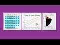
Based on national elections in the UK, Italy, Israel and of course, the most recent US presidential election, using polls to predict electoral outcomes is about as accurate as using the moon to predict hospital admissions. No, seriously, I used actual data from an academic study to draw this. There are a lot of reasons why polling has become so inaccurate. Our societies have become really diverse, which makes it difficult for pollsters to get a really nice representative sample of the population for their polls. People are really reluctant to answer their phones to pollsters, and also, shockingly enough, people might lie. But you wouldn't necessarily know that to look at the media. For one thing, the probability of a Hillary Clinton win was communicated with decimal places. We don't use decimal places to describe the temperature. How on earth can predicting the behavior of 230 million voters in this country be that precise? And then there were those sleek charts. See, a lot of data visualizations will overstate certainty, and it works -- these charts can numb our brains to criticism. When you hear a statistic, you might feel skeptical. As soon as it's buried in a chart, it feels like some kind of objective science, and it's not.
So I was trying to find ways to better communicate this to people, to show people the uncertainty in our numbers. What I did was I started taking real data sets, and turning them into hand-drawn visualizations, so that people can see how imprecise the data is; so people can see that a human did this, a human found the data and visualized it. For example, instead of finding out the probability of getting the flu in any given month, you can see the rough distribution of flu season. This is --
(Laughter)
a bad shot to show in February. But it's also more responsible data visualization, because if you were to show the exact probabilities, maybe that would encourage people to get their flu jabs at the wrong time.
The point of these shaky lines is so that people remember these imprecisions, but also so they don't necessarily walk away with a specific number, but they can remember important facts. Facts like injustice and inequality leave a huge mark on our lives. Facts like Black Americans and Native Americans have shorter life expectancies than those of other races, and that isn't changing anytime soon. Facts like prisoners in the US can be kept in solitary confinement cells that are smaller than the size of an average parking space.
The point of these visualizations is also to remind people of some really important statistical concepts, concepts like averages. So let's say you hear a claim like, "The average swimming pool in the US contains 6.23 fecal accidents." That doesn't mean every single swimming pool in the country contains exactly 6.23 turds. So in order to show that, I went back to the original data, which comes from the CDC, who surveyed 47 swimming facilities. And I just spent one evening redistributing poop. So you can kind of see how misleading averages can be.
(Laughter)
OK, so the second question that you guys should be asking yourselves to spot bad numbers is: Can I see myself in the data? This question is also about averages in a way, because part of the reason why people are so frustrated with these national statistics, is they don't really tell the story of who's winning and who's losing from national policy. It's easy to understand why people are frustrated with global averages when they don't match up with their personal experiences. I wanted to show people the way data relates to their everyday lives. I started this advice column called "Dear Mona," where people would write to me with questions and concerns and I'd try to answer them with data. People asked me anything. questions like, "Is it normal to sleep in a separate bed to my wife?" "Do people regret their tattoos?" "What does it mean to die of natural causes?"
All of these questions are great, because they make you think about ways to find and communicate these numbers. If someone asks you, "How much pee is a lot of pee?" which is a question that I got asked, you really want to make sure that the visualization makes sense to as many people as possible. These numbers aren't unavailable. Sometimes they're just buried in the appendix of an academic study. And they're certainly not inscrutable; if you really wanted to test these numbers on urination volume, you could grab a bottle and try it for yourself.
(Laughter)
The point of this isn't necessarily that every single data set has to relate specifically to you. I'm interested in how many women were issued fines in France for wearing the face veil, or the niqab, even if I don't live in France or wear the face veil. The point of asking where you fit in is to get as much context as possible. So it's about zooming out from one data point, like the unemployment rate is five percent, and seeing how it changes over time, or seeing how it changes by educational status -- this is why your parents always wanted you to go to college -- or seeing how it varies by gender. Nowadays, male unemployment rate is higher than the female unemployment rate. Up until the early '80s, it was the other way around. This is a story of one of the biggest changes that's happened in American society, and it's all there in that chart, once you look beyond the averages. The axes are everything; once you change the scale, you can change the story.
OK, so the third and final question that I want you guys to think about when you're looking at statistics is: How was the data collected? So far, I've only talked about the way data is communicated, but the way it's collected matters just as much. I know this is tough, because methodologies can be opaque and actually kind of boring, but there are some simple steps you can take to check this.
I'll use one last example here. One poll found that 41 percent of Muslims in this country support jihad, which is obviously pretty scary, and it was reported everywhere in 2015. When I want to check a number like that, I'll start off by finding the original questionnaire. It turns out that journalists who reported on that statistic ignored a question lower down on the survey that asked respondents how they defined "jihad." And most of them defined it as, "Muslims' personal, peaceful struggle to be more religious." Only 16 percent defined it as, "violent holy war against unbelievers." This is the really important point: based on those numbers, it's totally possible that no one in the survey who defined it as violent holy war also said they support it. Those two groups might not overlap at all.
It's also worth asking how the survey was carried out. This was something called an opt-in poll, which means anyone could have found it on the internet and completed it. There's no way of knowing if those people even identified as Muslim. And finally, there were 600 respondents in that poll. There are roughly three million Muslims in this country, according to Pew Research Center. That means the poll spoke to roughly one in every 5,000 Muslims in this country.
This is one of the reasons why government statistics are often better than private statistics. A poll might speak to a couple hundred people, maybe a thousand, or if you're L'Oreal, trying to sell skin care products in 2005, then you spoke to 48 women to claim that they work.
(Laughter)
Private companies don't have a huge interest in getting the numbers right, they just need the right numbers. Government statisticians aren't like that. In theory, at least, they're totally impartial, not least because most of them do their jobs regardless of who's in power. They're civil servants. And to do their jobs properly, they don't just speak to a couple hundred people. Those unemployment numbers I keep on referencing come from the Bureau of Labor Statistics, and to make their estimates, they speak to over 140,000 businesses in this country.
I get it, it's frustrating. If you want to test a statistic that comes from a private company, you can buy the face cream for you and a bunch of friends, test it out, if it doesn't work, you can say the numbers were wrong. But how do you question government statistics? You just keep checking everything. Find out how they collected the numbers. Find out if you're seeing everything on the chart you need to see. But don't give up on the numbers altogether, because if you do, we'll be making public policy decisions in the dark, using nothing but private interests to guide us.
Thank you.
(Applause)
今日は統計について お話しします 即座に身構えてしまう方も 大丈夫ですよ 統計を疑うのは 狂気の陰謀論者というわけではありません 疑い深いだけです 数字について 特に今は 疑い深くあるべきです でも どの数値が信頼できて どれは信頼できないのか 区別もできるべきです 今日はそれを可能にする いくつかのヒントをお教えします でもその前に 私の言う数値とは どんなものか 明確にしましょう こういうものではありません 「10人中9人の女性が この美容クリームを勧めています」 この類の数値に いつも呆れている人は多いでしょう でも今 疑問が呈されているのは こんな統計なんです 「米国の失業率は5%」 どこが違うかというと これは民間企業ではなく 政府が出した数値だという点です
米国人の10人中4人は 政府が報告する経済データを 信用していません トランプ大統領の支持者だと この割合は更に高く 10人中7人です 皆さんもご存知のように 目下 社会の分断が いくつも起こっており そういった多くの分断の意味が 人々と 政府の出す数値との 関係を理解すれば 見えてきます 一方には このような統計は 欠かせないと言う人たちもいます 統計値は社会全体を 把握するために必要で 感情的な逸話を超えて 客観的に物事の推移を 見定めるために必要だと 他方では こんな統計は エリート主義的で 操作されていると 言う人々もいます 統計の数値は辻褄が合わず 人々の日常生活の状況を あまり反映していないというのです
今は 2番目のグループの主張が 優勢であるように感じます 「もう一つの事実」の世界に 私たちは生きています 人々は統計が 世界を捉える際の 共通の土台だとか 議論の出発点だとは考えていません これは問題です ちょうど今 米国で実際に見られるのが 一部の政府統計を まるごと削除しようとする動きです 今まさに開会中の議会に 人種的不平等の調査に関する法案が出ています その草案によると 政府のお金は人種差別のデータ収集に 使うべきでないそうです そんなことになったら 大惨事です このデータ無しで 差別の是正はおろか どうやれば差別を 把握できるのでしょう? 言い換えると 現状の不公平さを測定できないなら どうやれば公平な政策を 政府は作れるのでしょう? これは差別についてだけではなく 全てに言えることです いいですか 健康や貧困に関するきちんとしたデータ無しで どうやれば医療政策を立案できるのでしょう? 出入国者数について 共通理解にさえ 達していないなら どうやれば公に移民に関する議論が できるというのでしょう? statistics(統計)という語の由来は state(国)です つまり より良い公共サービスを 提供するために 国民をより正確に測定するのです だから 政府の統計は必要なんです でも それを盲目的に受け入れたり 拒絶したりする態度も 改めねばなりません 誤った統計を見抜くスキルを 身に付ける必要があります
私がそのスキルを学び始めたのは 国連にある統計部門で 働いていた頃でした 私達の仕事は何人のイラク人が 戦争の結果 家を追われ また彼らに何が必要なのか 見いだすことでした 非常に重要な仕事でしたが 信じられないほど難しくもありました 私達の日々下す決断が 数値の正確さに影響を及ぼしました イラクのどの地域に行くべきか 誰と話をするべきか どんな質問をするべきかなどです そして私は自分達の仕事に 幻滅を覚えるようになりました 自分達は非常に良い仕事を していると思っていましたが それが いちばん分かるはずの 当のイラクの人達が 分析結果を目にする機会は稀で 検証する機会は尚更なかったからです それで私は強い確信を持つようになりました より正確な数値を得る方法の1つは できるだけ多くの人々がそれを 検証できるようにすることだと
それでデータ・ジャーナリストになったんです 私の仕事はこのようなデータを見つけ 公に広めることです 誰でもできることです オタクでなくていいんです そんな言葉 無視して結構 そういう言い方をするのは 謙虚なふりをして 自分が賢いのだと言いたい人達です 本当に誰でもできます
問うべき3つの質問を 皆さんにお教えします 誤った統計を見抜くのを 助けてくれる質問です では質問1 データの不確実さが分かるか? 人々の統計値との関係や メディアへの信頼さえも変えた 事柄の1つは 政治に関する世論調査です 政治関連の世論調査には 個人的に思うところが多々あります なぜなら記者の役割は 事実を報道することであって 予測を試みることではないからです 特にそういった予測は 民主主義を損ないかねません 人々にシグナルを送ることになるからです 「彼へ投票する価値はない」 「彼には勝ち目がないよ」と それはさておき この試みの正確性について話しましょう
イギリス、イタリア、イスラエルの 国政選挙や それにもちろん 最近の アメリカ大統領選を見る限り 選挙予測に世論調査を用いるのは 月を見て入院数を予測する程度の 正確さしかありません 本当ですよ このグラフを描くのには ある学術研究のデータを使っています 世論調査が非常に不正確になったのには 多くの理由があります 私達の社会は 多様性を著しく増しており 世論調査員が 適切な代表的サンプルを得るのが 難しくなっています 電話で世論調査に答えることに 人々は本当に消極的ですし ショックなことですが 嘘をつく人までいるんです でも報道を見ていて 必ずしもそういうことは分かりません 例えば ヒラリー・クリントンの勝率は 小数の位まで報道されていました 気温を示すとき 小数の位は使いませんね この国の2億3千万人いる 有権者の行動予測が そんなに正確にできるでしょうか? そして しゃれた図表がありました データの視覚化は 多くの場合 確実性を誇張してしまいます そうした図表は 脳の批判的思考力を 麻痺させるんです 統計データを耳から聞くと 疑い深くなるかもしれませんが それが図表にされるや否や 客観的な科学の類に思えてしまうんです 実際は違います
それで私は人々に 数値のこうした不確実性について うまく伝える方法を探していました 私がしたのは 現実のデータセットを入手して それを手描きで 視覚化するということでした データの不正確さを 分かってもらうためです 統計は人間が集計していて 人間がデータを見いだし 視覚化しているのだと分かるように 例えば インフルエンザに かかる確率を 月ごとに算出するのではなく 流行シーズンがいつかという分布を 示してもいいんです こんな風に ―
(笑)
2月の今 見るものではないですね でもこれはより責任感のある データの視覚化です もし正確な確率だけ見せたら 人々が予防接種を受けるのに 誤ったタイミングを促しかねません
このような震えた線を使うポイントは 人々にこれの不正確さを 思い出させるだけでなく 特定の数値だけ見ておしまいにせず 重要な事実を 覚えておいてもらえるようにです 不公平や不平等が私達の生活に 大きな痕を残しているような事実です アフリカ系やネイティブアメリカン達の 平均余命は 他の人種に比べ短く それがすぐには 変わりそうにないという事実や 米国の受刑者は 平均的な駐車スペースより 狭い独房に収監されかねない という事実があります
これらの視覚化がまた 人々に思い出させてくれるのは いくつかの非常に重要な統計の概念 ― 平均値といったものです こんなことを耳にしたとしましょう 「米国のプールが含む 粗相(大)の平均は6.23」 だからといって この国のあらゆるプールに ウンチがちょうど6.23個 浮いている訳ではありません これを示すために 元のデータに戻りました CDC(米国疾病予防管理センター)の 47の水泳施設対象の調査でした 一晩を費やして ウンチの分布をやり直しました 平均値がいかに誤解を招き得るか お分かりになるでしょう
(笑)
では 第2の質問です 誤った数値を見抜くには 自分にこう尋ねましょう そのデータに自分を当てはめられるか? この質問もある意味 平均値に関するものです なぜなら人々が 国によるこのような統計に 大変不満を覚える理由の一部は それが国の政策によって 誰が損や得をしているのかを 伝えていないからです なぜ人々が 自分の経験と一致しない 全体から算出された平均値に 不満を感じるかは 容易に理解できます 私は日常生活と関連のある形で 統計値を示したいと思い 『親愛なるモナへ』という 助言コラムを始めました 人々が質問や懸念を私に書いて送り 私がそれに統計値を使って 答えるというものです あらゆる質問が来ました 「妻と別々のベッドで眠るのは 正常ですか?」 「タトゥーは後悔するものですか?」 「自然死の意味するところは?」
どれも素晴らしい質問です なぜならこれらに関する統計を見つけ それを伝える方法を 考えさせてくれるからです 「おしっこの量が多いとは どのくらいのこと?」 そんな質問がありましたが できるだけ多くの人が 理解しやすいような視覚化を 工夫することが大切です これらの数値は 入手不可能ではありません 時には学術研究の付録の中に埋もれています それに突き止められないような ものでもありません もし本当に排尿量の 数値を検証したければ 瓶を用意して自分で試せばいいんです
(笑)
ここで大事なことですが 必ずしも 1つ1つのデータは 自分に特に関係なくてもいいんです フランスで何人の女性が ニカブ(顔のヴェール)の着用で 罰金を科せられたのか 興味がありますが 私はフランス住まいでもないし ヴェールもしません 自分に当てはまるかを考えるうえで 大事なのは 極力 文脈を知ることです そのためには 1つのデータ点から視野を広げてみることです 失業率が5%であるという点から 時間的変化を見ていったり 教育水準によってどう変わるか 見たりするんです だから親御さんは皆さんに 大学へ行って欲しがったんですね あるいは 性別でどう違うかを見たりします 最近では 男性の失業率は 女性より高くなっています 80年代初めまでは逆だったんです これはアメリカ社会で起きた 最大の変化の1つです 平均値以上のことに目を向ければ すべて図表の中に読み取れるのです XY軸が重要です 尺度を変えれば 物語られることも変わるのです
いいでしょう では皆さんが統計を見るときに考えてもらいたい 最後の3番目の質問です そのデータは どうやって集められたのか? これまでの話は データの伝えられ方についてだけです でもデータの収集方法も 同じくらい重要です これは難しいことです 手法は不透明かもしれず 実際退屈なものです でも これを確かめる 簡単なステップがあります
1つ 例を使います 最後の例です ある世論調査では この国のムスリムのうち 41%がジハードを支持するという結果でした 明らかに恐ろしいことです 2015年 この結果は あらゆるところで報道されました 私がこのような数値を確認したいとき 元のアンケートを 探すことから始めます 分かったことは その統計を報告した記者達は アンケートの 後ろの方にあった 質問を無視していたことです それは回答者の「ジハード」の 定義についてでした 大半の回答者の定義は 「ムスリムが より信心深くあろうと 個人的・平和的に努力すること」で 「不信心者に対する聖なる暴力的戦い」 と定義したのは たった16%でした これは実に重要な点です このような数値に基づけば ジハードを「聖なる暴力的戦い」と定義し かつジハードを支持するという回答者は 皆無だった可能性が十分あります この2グループは 全く重ならないかもしれないのです
調査方法を尋ねることも大事です このケースはオプトイン世論調査と 呼ばれるもので 誰でもネット上で調査を見つけ 回答を完了できるものでした 回答者が本当にムスリムかさえ 知る方法はありません 最後に この調査には 600名が回答しました この国にはだいたい 300万人のムスリムがいます ピュー研究所のデータです つまりその世論調査に回答したのは この国のムスリムの5000人に1人だけ ということです
政府の統計が民間の統計よりも しばしば優れている理由の1つが ここにあります 世論調査のサンプルは200人とか 1000人かもしれません 2005年にスキンケア製品を売ろうとした ロレアル社の場合は 効果を主張するために 調査した女性は48名でした
(笑)
民間企業は正しい数値を得ることに 強い関心を持ってはいません 都合のいい数値がほしいだけです 政府の統計家達は違います 少なくとも理屈の上では 政府の統計は完全に公平です 権力者が誰かには関係なしに 働いている人が大半だからです 彼らは公僕なんです そして仕事を適切に行うために 200人から回答を得るだけで 済ませたりしません 私が引用し続けている あの失業率の数値は 労働統計局によるものです この推計値を算出するために 米国の14万の企業を 調査しています
分かります 厄介でしょう 民間企業による統計の正確さを 検証するには フェイスクリームを 自分や友達に買って 試してみて 効かなければ 数値は間違いだと言えるでしょう でも政府の統計の正確さを問う方法は? 全てをチェックし続けることです 政府がどうやって 数値を収集したか知り 図表に 知るべきことが 全て表されているか確かめるのです でも全部の数値を一緒くたに見限ってはいけません そんなことをしたら 公的な政策決定は 闇の中で行われることになり 私益に左右されてしまうでしょう
ありがとうございました
(拍手)
品詞分類
- 主語
- 動詞
- 助動詞
- 準動詞
- 関係詞等
TED 日本語
TED Talks
関連動画

実証実験が示す週4日勤務制の恩恵ジュリエット・ショアー
おすすめ 12022.05.27経済的価値とは何か、そして誰がそれを生み出すのか?マリアナ・マッツカート
2020.01.10教師のこころの健康をどうすればサポートできるかシドニー・ジェンセン
2019.12.13資本主義の不都合な秘密と進むべき道ニック・ハノーアー
2019.10.18新しい言語を学ぶ秘訣 - TED Talkリディア・マホヴァ
2019.01.24人口が100億人に達する地球でどう生き延びるか?チャールズ・C・マン
2018.11.16漫画は教室にふさわしい | TED Talkジーン・ヤン
2018.06.15健全な経済は成長ではなく繁栄を目指しデザインされるべき | TED Talkケイト・ラワース
2018.06.04データで見ると、世界は良くなっているのか、悪くなっているのか?スティーブン・ピンカー
おすすめ 12018.05.21言語はいかに我々の考えを形作るのかレラ・ボロディツキー
2018.05.02公的資金による学術研究の成果を自由に見られないのはなぜか?エリカ・ストーン
2018.04.19子ども達が生涯の読書家になるためにアルヴィン・アービー
2018.04.04人間の感情の歴史ティファニー・ワット・スミス
2018.01.31世帯収入ごとの世界の暮らしを覗いてみようアンナ・ロスリング・ロンランド
おすすめ 12018.01.18職が無くなる未来社会でのお金の稼ぎ方マーティン・フォード
おすすめ 12017.11.16多様な考え方が持つ革命的な力エリフ・シャファク
2017.10.27


洋楽 おすすめ
RECOMMENDS
洋楽歌詞
ステイザ・キッド・ラロイ、ジャスティン・ビーバー
洋楽最新ヒット2021.08.20スピーチレス~心の声ナオミ・スコット
洋楽最新ヒット2019.05.23シェイプ・オブ・ユーエド・シーラン
洋楽人気動画2017.01.30フェイデッドアラン・ウォーカー
洋楽人気動画2015.12.03ウェイティング・フォー・ラヴアヴィーチー
洋楽人気動画2015.06.26シー・ユー・アゲインウィズ・カリファ
洋楽人気動画2015.04.06シュガーマルーン5
洋楽人気動画2015.01.14シェイク・イット・オフテイラー・スウィフト
ポップス2014.08.18オール・アバウト・ザット・ベースメーガン・トレイナー
ポップス2014.06.11ストーリー・オブ・マイ・ライフワン・ダイレクション
洋楽人気動画2013.11.03コール・ミー・メイビーカーリー・レイ・ジェプセン
洋楽人気動画2012.03.01美しき生命コールドプレイ
洋楽人気動画2008.08.04バッド・デイ~ついてない日の応援歌ダニエル・パウター
洋楽人気動画2008.05.14サウザンド・マイルズヴァネッサ・カールトン
洋楽人気動画2008.02.19イッツ・マイ・ライフボン・ジョヴィ
ロック2007.10.11アイ・ウォント・イット・ザット・ウェイバックストリート・ボーイズ
洋楽人気動画2007.09.14マイ・ハート・ウィル・ゴー・オンセリーヌ・ディオン
洋楽人気動画2007.07.12ヒーローマライア・キャリー
洋楽人気動画2007.03.21オールウェイズ・ラヴ・ユーホイットニー・ヒューストン
洋楽人気動画2007.02.19オネスティビリー・ジョエル
洋楽人気動画2005.09.16