TED日本語
TED Talks(英語 日本語字幕付き動画)
TED日本語 - ナタリー・ミーバック: 嵐から生まれた芸術
TED Talks
嵐から生まれた芸術
Art made of storms
ナタリー・ミーバック
Nathalie Miebach
内容
芸術家ナタリー・ミーバックは巨大な嵐から気象データを取り出し、自然や時間の力を具現化する複雑な立体像に変換します。そして立体像は楽譜となって弦楽四重奏団に演奏されるのです。


字幕
SCRIPT
Script
(Music)
What you just heard are the interactions of barometric pressure, wind and temperature readings that were recorded of Hurricane Noel in 2007. The musicians played off a three-dimensional graph of weather data like this. Every single bead, every single colored band, represents a weather element that can also be read as a musical note. I find weather extremely fascinating. Weather is an amalgam of systems that is inherently invisible to most of us. So I use sculpture and music to make it, not just visible, but also tactile and audible.
All of my work begins very simple. I extract information from a specific environment using very low-tech data collecting devices -- generally anything I can find in the hardware store. I then compare my information to the things I find on the Internet -- satellite images, weather data from weather stations as well as offshore buoys. That's both historical as well as real data. And then I compile all of these numbers on these clipboards that you see here. These clipboards are filled with numbers. And from all of these numbers, I start with only two or three variables. That begins my translation process.
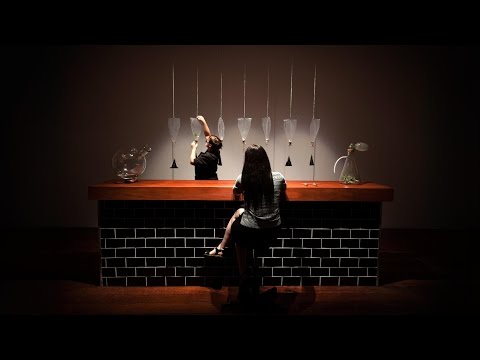
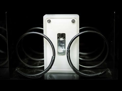
My translation medium is a very simple basket. A basket is made up of horizontal and vertical elements. When I assign values to the vertical and horizontal elements, I can use the changes of those data points over time to create the form. I use natural reed, because natural reed has a lot of tension in it that I can not fully control. That means that it is the numbers that control the form, not me. What I come up with are forms like these. These forms are completely made up of weather data or science data. Every colored bead, every colored string, represents a weather element. And together, these elements, not only construct the form, but they also reveal behavioral relationships that may not come across through a two-dimensional graph.
When you step closer, you actually see that it is indeed all made up of numbers. The vertical elements are assigned a specific hour of the day. So all the way around, you have a 24-hour timeline. But it's also used to assign a temperature range. On that grid, I can then weave the high tide readings, water temperature, air temperature and Moon phases. I also translate weather data into musical scores. And musical notation allows me a more nuanced way of translating information without compromising it.
So all of these scores are made up of weather data. Every single color, dot, every single line, is a weather element. And together, these variables construct a score. I use these scores to collaborate with musicians. This is the 1913 Trio performing one of my pieces at the Milwaukee Art Museum. Meanwhile, I use these scores as blueprints to translate into sculptural forms like this, that function still in the sense of being a three-dimensional weather visualization, but now they're embedding the visual matrix of the musical score, so it can actually be read as a musical score.
What I love about this work is that it challenges our assumptions of what kind of visual vocabulary belongs in the world of art, versus science. This piece here is read very differently depending on where you place it. You place it in an art museum, it becomes a sculpture. You place it in a science museum, it becomes a three-dimensional visualization of data. You place it in a music hall, it all of a sudden becomes a musical score. And I really like that, because the viewer is really challenged as to what visual language is part of science versus art versus music.
The other reason why I really like this is because it offers an alternative entry point into the complexity of science. And not everyone has a Ph.D. in science. So for me, that was my way into it.
Thank you.
(Applause)
(音楽)
今みなさんが聞いたのは 2007年 ハリケーン・ノエルが起きた時に 記録した気圧・風・気温の測定値を混ぜて作った音楽です 音楽家たちが気象データの3Dグラフを基に演奏しました それぞれの数珠・色帯が 気象要素を象徴していて さらに楽譜としても読むことができます 私は気象に魅せられています 気象は多くの人にとって 本質的に見えない要素の集まりです だから私は立体像と音楽を使って ただ可視化するだけでなく 聞けて触れるものにします
作品は全てシンプルに始まります 簡単なデータ収集機器を使って 特定の環境から情報を集めます 通常は工具店で見つけた機器を使います それから私は得た情報をインターネット上の 観測所・浮標の気象データや 衛星写真などと比較します キチンと記録された情報なんです 得た数値をこんな感じでクリップボードに集めます クリップボードは数値尽くしです これらの数値を使い 最初は2~3の変数で始めました 私の気象翻訳の始まりです
翻訳媒体はとてもシンプルな籠です 籠は縦横の軸からできています 数値データを縦横の軸に割り振って データ点を徐々に変えていき 外形を作っていきます 私は自然のアシを使います 自然のアシは張力が大きくて 完全には制御できないからです つまり私ではなく 数値が外形を制御しています こんなのが出来上がります こういった形は完全に 気象・科学データを基にしています それぞれの数珠や色帯が 気象要素を象徴しています その集まりは形を作るだけでなく 作用関係を明らかにしています 2Dグラフでは その関係に気づかないでしょう
近づいてみると それが全て 数値でできていると分かります 縦軸には1日の 「ある1時間」を割り振りました 周りには24時間の時流がありますが 実は温度範囲も記されています グリッド上では高潮の数値・水温・気温・ 月相を紡ぐことができます そして気象データを楽譜に変換します 楽譜によって私はもっと繊細に 情報を翻訳することができます 妥協することもありません
楽譜は全て気象データが基です それぞれの色・点・線が 気象要素であり 変数が束になって楽譜を構成しているのです 音楽家と協力して楽譜を使います 彼らは「1913年トリオ」です ミルウォーキー芸術博物館で 私の曲の1つを演奏しています 一方で私は楽譜を設計図として使って このような立体像に変形させます 目的は気象データの3D視覚化 という感じがしますが 一方で楽譜の立体像への 変換とも言えます だから楽譜としても読めます
この研究が大好きなのは 人々の芸術作品に対する思い込みに 科学をぶつけるからです この作品は置く場所によって 異なる解釈が施されます 美術館に置くと立体像になります 科学館に置けば データの3D視覚化となります ミュージック・ホールに置くと とつぜん楽譜になります 私はこれが大好きです なぜなら閲覧者に 視覚言語が科学・芸術・音楽の どれにあたるかを問うからです
これが好きなもう一つの理由は 複雑な科学への別の導入口を与えてくれるからです 科学分野の博士号を 誰もが持っているわけではありません これが私のやり方なのです
ありがとうございました
(拍手)
品詞分類
- 主語
- 動詞
- 助動詞
- 準動詞
- 関係詞等
TED 日本語
TED Talks
関連動画

人工知能の時代におけるアートレフィック・アナドル
2020.08.19現実の捉え方を追求する想像的な彫刻アリーシャ・エガート
2020.03.0340種の実をつける1本の樹 - TED Talkサム・ヴァン・アーケン
2019.10.01バーニング・マンでアートが芽吹く理由ノラ・アトキンソン
2018.08.28あなたはこの言語の上級者 ― しかもそれに気づいてさえいないクリストフ・ニーマン
2018.08.22呼吸する空気で作るアートエミリー・パーソンズ=ロード
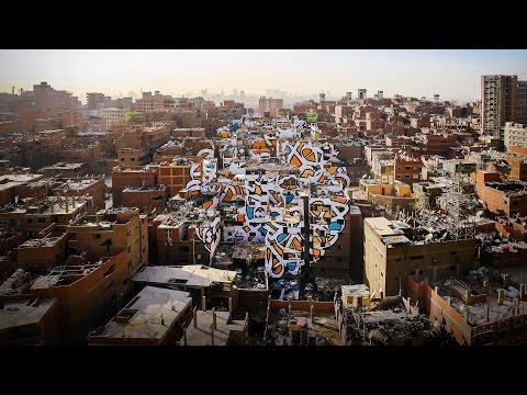
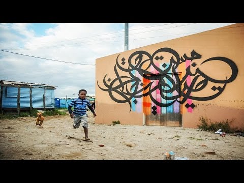
2017.02.0850軒の建物に描いた平和のプロジェクトエル・シード
2016.08.25人種間暴力を正視するアーティストの眼サンフォード・ビガーズ
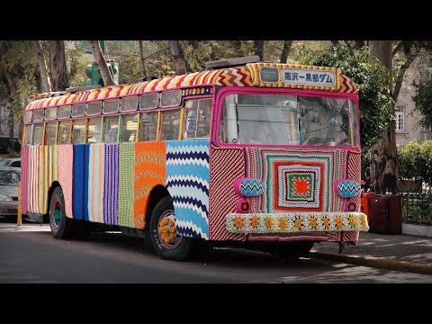
2016.06.06毛糸テロ(ヤーン・ボミング)がどのように世界中に広がったのかマグダ・セイエグ
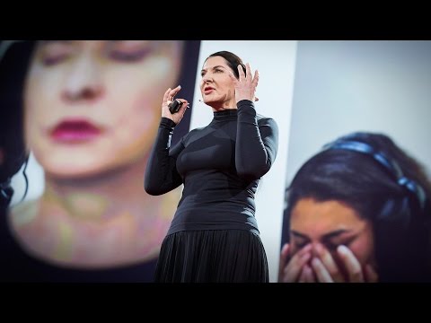
2016.03.22信頼、弱さ、絆から生まれるアートマリーナ・アブラモヴィッチ
2015.12.22アートでNSAのスパイに話しかけようマティアス・ユード
2015.11.20希望と平和を訴えるストリートアートエル・シード
2015.07.23海底にすんでいそうな生物たちシンチェン・ファン
2014.07.16僕の「DNA自動販売機」ガブリエル・バルシア=コロンボ
2014.03.06注目を集めようとするアートアパルナ・ラオ
2014.02.07今そこにしかない音楽ライアン・ホラデイ
2014.01.10
洋楽 おすすめ
RECOMMENDS
洋楽歌詞
ダイナマイトビーティーエス
洋楽最新ヒット2020.08.20ディス・イズ・ミーグレイテスト・ショーマン・キャスト
洋楽人気動画2018.01.11グッド・ライフGイージー、ケラーニ
洋楽人気動画2017.01.27ホワット・ドゥ・ユー・ミーン?ジャスティン・ビーバー
洋楽人気動画2015.08.28ファイト・ソングレイチェル・プラッテン
洋楽人気動画2015.05.19ラヴ・ミー・ライク・ユー・ドゥエリー・ゴールディング
洋楽人気動画2015.01.22アップタウン・ファンクブルーノ・マーズ、マーク・ロンソン
洋楽人気動画2014.11.20ブレイク・フリーアリアナ・グランデ
洋楽人気動画2014.08.12ハッピーファレル・ウィリアムス
ポップス2014.01.08カウンティング・スターズワンリパブリック
ロック2013.05.31ア・サウザンド・イヤーズクリスティーナ・ペリー
洋楽人気動画2011.10.26ユー・レイズ・ミー・アップケルティック・ウーマン
洋楽人気動画2008.05.30ルーズ・ユアセルフエミネム
洋楽人気動画2008.02.21ドント・ノー・ホワイノラ・ジョーンズ
洋楽人気動画2008.02.15オンリー・タイムエンヤ
洋楽人気動画2007.10.03ミス・ア・シングエアロスミス
ロック2007.08.18タイム・トゥ・セイ・グッバイサラ・ブライトマン
洋楽人気動画2007.06.08シェイプ・オブ・マイ・ハートスティング
洋楽人気動画2007.03.18ウィ・アー・ザ・ワールド(U.S.A. フォー・アフリカ)マイケル・ジャクソン
洋楽人気動画2006.05.14ホテル・カリフォルニアイーグルス
ロック2005.07.06