TED日本語
TED Talks(英語 日本語字幕付き動画)
TED日本語 - ティム・バーナーズ=リー: オープンデータとマッシュアップで変わる世界
TED Talks
オープンデータとマッシュアップで変わる世界
The year open data went worldwide
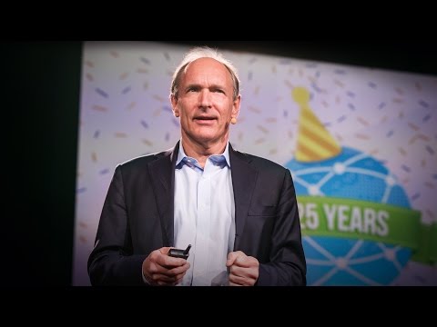
ティム・バーナーズ=リー
Tim Berners-Lee
内容
TED2009で、ティム・バーナーズ=リーは「生のデータを今すぐに」と呼びかけ、政府や科学者や各種機関に対して、データをWebで自由にアクセスできるようにすることを求めました。2010年のTED Universityで、彼はデータがつなぎ合わされたことによる興味深い結果の幾つかを紹介しています。


字幕
SCRIPT
Script
Last year here at TED I asked you to give me your data, to put your data on the web, on the basis that if people put data onto the web -- government data, scientific data, community data, whatever it is -- it will be used by other people to do wonderful things, in ways that they never could have imagined.
So, today I'm back just to show you a few things, to show you, in fact, there is an open data movement afoot, now, around the world. The cry of "Raw data now!" which I made people make in the auditorium, was heard around the world. So, let's roll the video.
A classic story, the first one which lots of people picked up, was when in March -- on March 10th in fact, soon after TED -- Paul Clarke, in the U.K. government, blogged, "Oh, I've just got some raw data. Here it is, it's about bicycle accidents." Two days it took the Times Online to make a map, a mashable map -- we call these things mash-ups -- a mashed-up user interface that allows you to go in there and have a look and find out whether your bicycle route to work was affected.
Here's more data, traffic survey data, again, put out by the U.K. government, and because they put it up using the Linked Data standards, then a user could just make a map, just by clicking.
Does this data affect things? Well, let's get back to 2008. Look at Zanesville, Ohio. Here's a map a lawyer made. He put on it the water plant, and which houses are there, which houses have been connected to the water. And he got, from other data sources, information to show which houses are occupied by white people. Well, there was too much of a correlation, he felt, between which houses were occupied by white people and which houses had water, and the judge was not impressed either. The judge was not impressed to the tune of 10.9 million dollars. That's the power of taking one piece of data, another piece of data, putting it together, and showing the result.
Let's look at some data from the U.K. now. This is U.K. government data, a completely independent site, Where Does My Money Go. It allows anybody to go there and burrow down. You can burrow down by a particular type of spending, or you can go through all the different regions and compare them. So, that's happening in the U.K. with U.K. government data.
Yes, certainly you can do it over here. Here's a site which allows you to look at recovery spending in California. Take an arbitrary example, Long Beach, California, you can go and have a look at what recovery money they've been spending on different things such as energy.
In fact, this is the graph of the number of data sets in the repositories of data.gov, and data.gov.uk. And I'm delighted to see a great competition between the U.K. in blue, and the U.S. in red.
How can you use this stuff? Well, for example, if you have lots of data about places you can take, from a postcode -- which is like a zip plus four -- for a specific group of houses, you can make paper, print off a paper which has got very, very specific things about the bus stops, the things specifically near you.
On a larger scale, this is a mash-up of the data which was released about the Afghan elections. It allows you to set your own criteria for what sort of things you want to look at. The red circles are polling stations, selected by your criteria. And then you can select also other things on the map to see what other factors, like the threat level. So, that was government data.
I also talked about community-generated data -- in fact I edited some. This is the wiki map, this is the Open Street Map. "Terrace Theater" I actually put on the map because it wasn't on the map before TED last year. I was not the only person editing the open street map. Each flash on this visualization -- put together by ITO World -- shows an edit in 2009 made to the Open Street Map. Let's now spin the world during the same year. Every flash is an edit. Somebody somewhere looking at the Open Street Map, and realizing it could be better. You can see Europe is ablaze with updates. Some places, perhaps not as much as they should be.
Here focusing in on Haiti. The map of Port au-Prince at the end of 2009 was not all it could be, not as good as the map of California. Fortunately, just after the earthquake, GeoEye, a commercial company, released satellite imagery with a license, which allowed the open-source community to use it. This is January, in time lapse, of people editing ... that's the earthquake. After the earthquake, immediately, people all over the world, mappers who wanted to help, and could, looked at that imagery, built the map, quickly building it up.
We're focusing now on Port-au-Prince. The light blue is refugee camps these volunteers had spotted from the [ satellite images ] . So, now we have, immediately, a real-time map showing where there are refugee camps -- rapidly became the best map to use if you're doing relief work in Port-au-Prince. Witness the fact that it's here on this Garmin device being used by rescue team in Haiti.
There's the map showing, on the left-hand side, that hospital -- actually that's a hospital ship. This is a real-time map that shows blocked roads, damaged buildings, refugee camps -- it shows things that are needed [ for rescue and relief work ] .
So, if you've been involved in that at all, I just wanted to say: Whatever you've been doing, whether you've just been chanting, "Raw data now!" or you've been putting government or scientific data online, I just wanted to take this opportunity to say: Thank you very much, and we have only just started! (Applause)
去年 私はこのTEDの場で データを公開してください Webに上げてくださいとお願いしました 政府のデータ 科学データ コミュニティのデータ どんなデータであれ みんながWebで公開すれば 他の人がそれを使って 以前には想像もできなかった 素晴らしいことをするだろうと
だから今日はみなさんにご報告するために戻ってきました 実際 現在世界中で オープンデータ運動が 進行しています あの講堂でみなさんにしていただいた 「生のデータを今すぐに」という叫びは 世界中の人々の耳に届きました 映像をちょっとご覧いただきましょう
典型的な例で たくさんの人に取り上げられた最初のものですが 3月10日 TEDのすぐ後に イギリス政府のポール クラークが 「ああ そういえば生のデータがあるんだった 自転車事故のデータだ」とブログに書きました たった2日で Times Onlineが それを地図にしました こういうのをマッシュアップと呼んでいます みんなこれを見て 自分の自転車ルートが 問題ないか確認できます
こちらは交通量調査のデータで これもまたイギリス政府が公開したもので Linked Data 標準に従った形式で公開されたため 利用者はクリックだけで地図を 作ることができました
データによって何か変わるのでしょうか? 2008年 オハイオ州ゼーンズビルでのことです これはある弁護士が作った地図で どこに家があり そのどれが 水道に繋がっているかを表しています それらから彼は別なデータソースから 白人が住んでいるのはどの家かという 情報を手に入れました そして白人が住む家と 水道のある家との間に 到底偶然とは思えない相関があるのを認めました 裁判官もこれには感心しなかったようです 1,090万ドルの賠償を命じたのです これがデータを別なデータと 結び合わせて見ることの 効果なのです
イギリスの例を少し見てみましょう 政府データが ある独立サイトにあります 「私のお金は何に使われているの?」(Where Does My Money Go)というサイトです 誰でもデータを掘り下げて見ることができます 特定の支出について掘り下げることもできるし いろんな地域を比較することもできます これはイギリスで起きていること イギリス政府のデータです
もちろん ここアメリカにだってあります こちらではカリフォルニアで経済回復に向けて行われた 支出を見ることができます 好きな場所 たとえばロングビーチを選んで エネルギー等の それぞれの用途に 回復に向けた投資が どれくらい使われているかがわかります
このグラフは 米政府(data.gov)と英政府(data.gov.uk) それぞれのリポジトリにある データセットの数を表したものです 青のイギリスと赤のアメリカが いい勝負をしているのを とても嬉しく思います
これはどう使えるのでしょう? たとえば 郵便番号で指定されるような区域について データが十分にあるなら 特定の区域限定の バス停や周辺地域といった すごくローカルな情報が載っている 増補版の新聞を 作ることだってできます
もっと大きなスケールでは アフガニスタンの大統領選について 公開されたデータのマッシュアップがあります どんなことを見たいか 自分で条件を設定できます 赤い円で示される投票所が 表示されるように指定しました それに危険度レベルといった 別な要因を重ねて見ることができます 政府のデータをご紹介しましたが
コミュニティのデータも取り上げましょう これは私が編集したWikiマップです この「テラス劇場」というのは 去年のTED以前には地図になくて 私が書き込んだのでした オープンストリートマップを編集しているのは私だけではありません ITO Worldによって可視化された このイメージ上で光っている部分は 2009年にオープンストリートマップで 行われた編集を表しています 地球を回してみましょう それぞれの光が編集を表しています どこかで誰かがオープンストリートマップを見て 改善できる点に気付いたのです ヨーロッパは更新で明るく輝いています 一方で場所によっては そうあるべきほど明るくありません
ハイチに注目してみましょう 2009年末のポルトープランスの地図は カリフォルニアの地図みたいに 詳しいものではありませんでした 幸い 地震の直後に GeoEyeという会社が 衛星画像を公開し オープンソースコミュニティが 利用できるライセンスを付けました これは1月の時間の経過です 地震が起き その直後から 力になりたいという 世界中の人々が集まり その衛星画像を見て 速やかに地図を作り上げたのです
これはポルトープランスです 青は難民キャンプで ボランティアが衛星写真で見つけました こうして難民キャンプの場所を示した 地図があっという間にできあがりました 救援活動をする人にとって 最高の地図です レスキューチームが使うGPSデバイスに 表示されているのがわかります
それからハイチでは 地図の左手に 病院船があるのもわかります 通れない道路や 損傷した建物や 難民キャンプの 現時点の情報がここにあり 必要なものが図示されています
ですからどんな形であれ 何かしていただいている方々 生のデータから図表を作っている方 政府データや科学データをネットに公開している方 皆さんに この場を借りてお礼を申し上げたい 我々はまだ第一歩を踏み出したばかりです (拍手)
品詞分類
- 主語
- 動詞
- 助動詞
- 準動詞
- 関係詞等
TED 日本語
TED Talks
関連動画

悪夢のような子供向けYouTube動画 ― 今のインターネットのどこが間違っているのかジェームズ・ブライドル
2018.07.13オンラインの嫌がらせコメントから、オフラインの建設的な対話を生む方法ディラン・マロン
2018.05.18ネット広告の仕組みが拓く ディストピアへの道ジーナップ・トゥフェックチー
2017.11.17壊れた報道の世界を救う3つの方法ララ・セトラキアン
2017.03.09テロとの闘いで、権利を犠牲にする必要はないレベッカ・マッキノン
2016.10.14インターネット検索結果に隠れた道徳的価値観アンドレアス・エクストローム
2015.12.07謎のダークネットがメジャーになるときジェイミー・バートレット
2015.09.24ネット炎上が起きるときジョン・ロンソン
2015.07.20晒された屈辱の値段モニカ・ルインスキー
おすすめ 22015.03.20インターネットで社会運動が容易になっても、目的達成は難しいのはなぜか?ジーナップ・トゥフェックチー
2015.02.02スマートフォンがあったらライブ中継を始めようブルーノ・トートゥラ
2014.12.18ソーシャルマップが街に住む人々の往来と、さらに分離を描き出すデーヴ・トロイ
2014.12.12なぜプライバシーは重要なのかグレン・グリーンウォルド
2014.10.10クリックするものを選ぼうサリー・コーン
2014.08.28ウェブのための大憲章ティム・バーナーズ=リー
2014.08.18カーリー・フライの謎解き ― ソーシャルメディアでの「いいね!」があなたの秘密を明かす?ジェニファー・ゴルベック
2014.04.03


洋楽 おすすめ
RECOMMENDS
洋楽歌詞
ダイナマイトビーティーエス
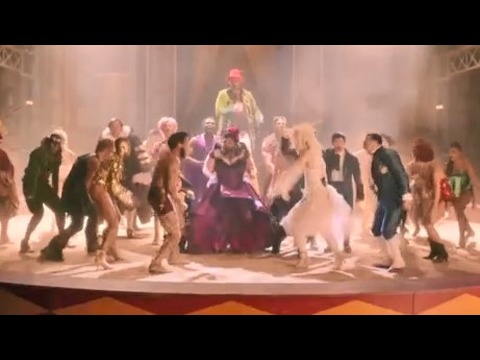
洋楽最新ヒット2020.08.20ディス・イズ・ミーグレイテスト・ショーマン・キャスト
洋楽人気動画2018.01.11グッド・ライフGイージー、ケラーニ
洋楽人気動画2017.01.27ホワット・ドゥ・ユー・ミーン?ジャスティン・ビーバー
洋楽人気動画2015.08.28ファイト・ソングレイチェル・プラッテン
洋楽人気動画2015.05.19ラヴ・ミー・ライク・ユー・ドゥエリー・ゴールディング
洋楽人気動画2015.01.22アップタウン・ファンクブルーノ・マーズ、マーク・ロンソン
洋楽人気動画2014.11.20ブレイク・フリーアリアナ・グランデ
洋楽人気動画2014.08.12ハッピーファレル・ウィリアムス
ポップス2014.01.08カウンティング・スターズワンリパブリック
ロック2013.05.31ア・サウザンド・イヤーズクリスティーナ・ペリー
洋楽人気動画2011.10.26ユー・レイズ・ミー・アップケルティック・ウーマン
洋楽人気動画2008.05.30ルーズ・ユアセルフエミネム
洋楽人気動画2008.02.21ドント・ノー・ホワイノラ・ジョーンズ
洋楽人気動画2008.02.15オンリー・タイムエンヤ
洋楽人気動画2007.10.03ミス・ア・シングエアロスミス
ロック2007.08.18タイム・トゥ・セイ・グッバイサラ・ブライトマン
洋楽人気動画2007.06.08シェイプ・オブ・マイ・ハートスティング
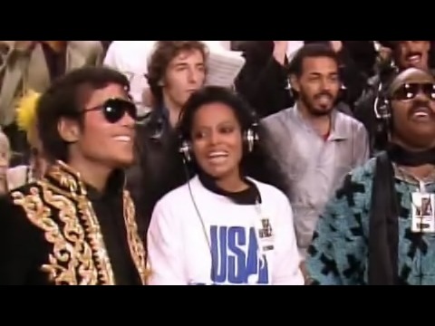
洋楽人気動画2007.03.18ウィ・アー・ザ・ワールド(U.S.A. フォー・アフリカ)マイケル・ジャクソン
洋楽人気動画2006.05.14ホテル・カリフォルニアイーグルス
ロック2005.07.06