TED日本語
TED Talks(英語 日本語字幕付き動画)
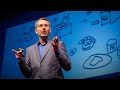
TED日本語 - トム・ウージェック: 厄介な問題を解決したい?ではトーストの作り方を説明してください
TED Talks
厄介な問題を解決したい?ではトーストの作り方を説明してください
Got a wicked problem? First, tell me how you make toast
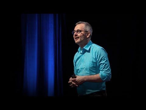
トム・ウージェック
Tom Wujec
内容
トーストの作り方は難しくは見えません。そのプロセスをステップごとに図示してくれと言われるまでは。トム・ウージェックは、いろんな人やチームにトーストの作り方を聞いてきました。そのプロセスが、仕事における大きな難しい問題がいかに解けるかについて、予想外の知見を明かしてくれるからです。この練習課題を行う方法を学んで、何千もの人々がトーストの作り方を描くのを見てきたウージェックの驚くべき洞察に耳を傾けましょう。


字幕
SCRIPT
Script
Some years ago, I stumbled across a simple design exercise that helps people understand and solve complex problems, and like many of these design exercises, it kind of seems trivial at first, but under deep inspection, it turns out that it reveals unexpected truths about the way that we collaborate and make sense of things.
The exercise has three parts and begins with something that we all know how to do, which is how to make toast. It begins with a clean sheet of paper, a felt marker, and without using any words, you begin to draw how to make toast. And most people draw something like this. They draw a loaf of bread, which is sliced, then put into a toaster. The toast is then deposited for some time. It pops up, and then voila! After two minutes, toast and happiness.
Now, over the years, I've collected many hundreds of drawings of these toasts, and some of them are very good, because they really illustrate the toast-making process quite clearly. And then there are some that are, well, not so good. They really suck, actually, because you don't know what they're trying to say. Under close inspection, some reveal some aspects of toast-making while hiding others. So there's some that are all about the toast, and all about the transformation of toast. And there's others that are all about the toaster, and the engineers love to draw the mechanics of this. (Laughter) And then there are others that are about people. It's about visualizing the experience that people have. And then there are others that are about the supply chain of making toast that goes all the way back to the store. It goes through the supply chain networks of teleportation and all the way back to the field and wheat, and one all actually goes all the way back to the Big Bang. So it's crazy stuff. But I think it's obvious that even though these drawings are really wildly different, they share a common quality, and I'm wondering if you can see it. Do you see it? What's common about these?
Most drawings have nodes and links. So nodes represent the tangible objects like the toaster and people, and links represent the connections between the nodes. And it's the combination of links and nodes that produces a full systems model, and it makes our private mental models visible about how we think something works. So that's the value of these things. What's interesting about these systems models is how they reveal our various points of view. So for example, Americans make toast with a toaster. That seems obvious. Whereas many Europeans make toast with a frying pan, of course, and many students make toast with a fire. I don't really understand this. A lot of MBA students do this.
So you can measure the complexity by counting the number of nodes, and the average illustration has between four and eight nodes. Less than that, the drawing seems trivial, but it's quick to understand, and more than 13, the drawing produces a feeling of map shock. It's too complex. So the sweet spot is between 5 and 13. So if you want to communicate something visually, have between five and 13 nodes in your diagram. So though we may not be skilled at drawing, the point is that we intuitively know how to break down complex things into simple things and then bring them back together again.
So this brings us to our second part of the exercise, which is how to make toast, but now with sticky notes or with cards. So what happens then? Well, with cards, most people tend to draw clear, more detailed, and more logical nodes. You can see the step by step analysis that takes place, and as they build up their model, they move their nodes around, rearranging them like Lego blocks. Now, though this might seem trivial, it's actually really important. This rapid iteration of expressing and then reflecting and analyzing is really the only way in which we get clarity. It's the essence of the design process. And systems theorists do tell us that the ease with which we can change a representation correlates to our willingness to improve the model. So sticky note systems are not only more fluid, they generally produce way more nodes than static drawings. The drawings are much richer.
And this brings us to our third part of the exercise, which is to draw how to make toast, but this time in a group. So what happens then? Well, here's what happens. It starts out messy, and then it gets really messy, and then it gets messier, but as people refine the models, the best nodes become more prominent, and with each iteration, the model becomes clearer because people build on top of each other's ideas. What emerges is a unified systems model that integrates the diversity of everyone's individual points of view, so that's a really different outcome from what usually happens in meetings, isn't it? So these drawings can contain 20 or more nodes, but participants don't feel map shock because they participate in the building of their models themselves. Now, what's also really interesting, that the groups spontaneously mix and add additional layers of organization to it. To deal with contradictions, for example, they add branching patterns and parallel patterns. Oh, and by the way, if they do it in complete silence, they do it much better and much more quickly. Really interesting -- talking gets in the way.
So here's some key lessons that can emerge from this. First, drawing helps us understand the situations as systems with nodes and their relationships. Movable cards produce better systems models, because we iterate much more fluidly. And then the group notes produce the most comprehensive models because we synthesize several points of view. So that's interesting. When people work together under the right circumstances, group models are much better than individual models.
So this approach works really great for drawing how to make toast, but what if you wanted to draw something more relevant or pressing, like your organizational vision, or customer experience, or long-term sustainability?
There's a visual revolution that's taking place as more organizations are addressing their wicked problems by collaboratively drawing them out. And I'm convinced that those who see their world as movable nodes and links really have an edge.
And the practice is really pretty simple. You start with a question, you collect the nodes, you refine the nodes, you do it over again, you refine and refine and refine, and the patterns emerge, and the group gets clarity and you answer the question.
So this simple act of visualizing and doing over and over again produces some really remarkable outcomes. What's really important to know is that it's the conversations that are the important aspects, not just the models themselves. And these visual frames of reference can grow to several hundreds or even thousands of nodes. So,one example is from an organization called Rodale. Big publishing company. They lost a bunch of money one year, and their executive team for three days visualized their entire practice. And what's interesting is that after visualizing the entire business, systems upon systems, they reclaimed 50 million dollars of revenue, and they also moved from a D rating to an A rating from their customers. Why? Because there's alignment from the executive team. So I'm now on a mission to help organizations solve their wicked problems by using collaborative visualization, and on a site that I've produced called drawtoast.com, I've collected a bunch of best practices. and so you can learn how to run a workshop here, you can learn more about the visual language and the structure of links and nodes that you can apply to general problem-solving, and download examples of various templates for unpacking the thorny problems that we all face in our organizations. So the seemingly trivial design exercise of drawing toast helps us get clear, engaged and aligned.
So next time you're confronted with an interesting challenge, remember what design has to teach us. Make your ideas visible, tangible, and consequential. It's simple, it's fun, it's powerful, and I believe it's an idea worth celebrating.
Thank you.
(Applause)
何年か前に 複雑な問題を理解し 解決する力を付けるための シンプルなデザイン練習課題に 出会いました 多くのデザイン練習課題と同様 一見すると自明な問題に見えますが 良く検討してみると 私たちが協同したり 物事を理解する方法について 意外な真実を 教えてくれるのが分かります
この問題は 3つの部分からなっていて 誰でもやり方を知っている ことから始めます トーストの作り方です まず真っ白な紙と サインペンを用意して 言葉は一切使わずに トーストの作り方を絵にしてもらいます 多くの人は こんな絵を描きます 食パンの塊があって それをスライスし トースターに入れ しばらく待つと パンが飛び出して ハイできあがり! 2分後にはトーストと幸せを手にします
私は何年もかけて このようなトーストの絵を 何百も集めてきましたが 中にはとても 良く描けているものがあり トーストを作るプロセスが 非常に明快に図示されています それからあんまり 良くないのもあります 本当にひどくて 何を言おうとしているのか 自分で分かっていません いろいろ見ていくと トースト作りのある面だけ 見ているものがあるのに気付きます たとえばトーストだけが 取り出され トーストの変容が描かれている ものがあります トースターとは何か 説明しているものもあります そしてエンジニアというのは 内部の仕組みを描きたがるものです (笑) 一方 人に焦点を 当てたものもあって 人にとって それが どういう体験かを描いています それからトーストができるまでの サプライチェーンを考えて 店から始まっているものや 輸送過程を描いているもの 小麦や畑まで遡るもの さらにはビッグバンに 遡るものまであります すごいことに なっているわけですが これらの絵は それぞれ大きく 異なっていても 共通しているものが あるのがわかります おわかりになりますか? 何が共通しているでしょう?
ほとんどの絵に ノードと矢印があるということです ノードは トースターや人のような 具体的な物を表し 矢印がノードの間を 繋いでいます このノードと矢印の 組み合わせによって システムモデルが できあがっていて 物事の仕組みを我々が どう捉えているかという メンタルモデルを 目に見える形にしています それがこのような モデルの価値です システムモデルの 興味深い点は 人による観点の違いを 明らかにすることです たとえばアメリカ人というのは トーストはトースターで 作るものだと思っています 一方 ヨーロッパの人たちは トーストはフライパンで作るものだと思っています そして学生の多くは トーストを たき火で作ります 私には解しかねるんですが MBAの学生の多くがこういう絵を描きます
ノードの数を数えることで 複雑度を測ることができます 平均的な図には 4~8個のノードがあります 4個未満だと 単純化しすぎですが 一目で理解できます ノードが13個より多くなると 煩雑で圧倒されるような 絵になってしまいます スイートスポットは ノード数5~13個です 何かを視覚的に 伝えたい場合は 5~13個のノードがある図を 使うといいです 私たちはみんな たとえ絵は上手くなくとも 複雑なものを 単純なものへと分解し 再構成する方法を 直感的に理解しているんです
それが この課題の 第2部へと繋がります トーストの作り方を こんどは付箋やカードを使って 表現します するとどうなるでしょう? カードを使うと 多くの人は より明快で詳細で 論理的なノードを 描くようになります 各ステップを分析して モデルを組み上げながら ノードをレゴブロックみたいに いろいろ移動し 並べ替えるんです 当たり前のことに思えるかもしれませんが とても重要なことです 表現し 考え 分析するというのを 短いサイクルで繰り返していくというのは 明快さに到る 唯一の道なんです それがデザインプロセスの 本質的なところです システム理論の研究者が 指摘していることですが 表現を変更する容易さと モデルを改善する気になるかどうかは 相関しています 付箋によるシステムは より流動的であるだけでなく 静的な絵と比べて 一般にずっと多くのノードを含んでいて 内容が豊かになっています
この課題の第3部では やはりトーストの作り方を描きますが こんどはグループでやります するとどうなるか? こんな風になります 最初はゴチャゴチャしていますが その後もっとゴチャゴチャになっていき それから本当に ゴチャゴチャになります しかしみんなでモデルを 洗練させていくうちに どれが良いノードか わかってきて 繰り返しごとに モデルが明快になっていきます 他の人のアイデアを元に アイデアを出すようになるためです そうして幅のある 個々人の観点をまとめた 統一的なシステムモデルが でき上がります これは通常ミーティングで 起きるのとは ずいぶん違ったことですね こうして作られた絵では ノードの数が20以上になることもありますが 参加者は圧倒されるようには 感じません そのモデルを作り上げるプロセスに 参加しているからです もう1つ興味深いのは グループの人たちは 組織的な構造を自然に 追加するということです たとえば対立を 解消するために 枝分かれパターンや並行パターンを 入れたりします ちなみにこれは 黙ってやった場合の方が ずっと早く ずっと良い 結果が得られます とても興味深いことです おしゃべりは邪魔になるんです
この課題から得られる 教訓ですが 図は 物事をノードと その間の関連からなる システムとして捉えさせることで 理解を助けます 動かせるカードを使うと より良いシステムモデルが得られます より柔軟に改善が 行われるためです グループでカードを使ってやった時に 最も広範なモデルが得られます 様々な観点が 取り込まれるためです 興味深いことだと思います 適切な環境でグループが 協同作業してできたモデルは 個々人によるモデルより ずっと良いものになるんです
このアプローチはトーストの作り方を図示する時 とても上手くいったわけですが 何かもっと切迫した 大きな問題に対してはどうでしょうか? たとえば組織のビジョンとか 顧客体験とか 長期的持続可能性といった 問題の場合では?
現在 視覚化の革命が 進んでいて 多くの組織が 難しい問題を 協同で図解することによって 解決しています 動かせるノードと矢印を使って 世界を理解する人たちには 有利な点があると思います
やり方は すごく簡単です 疑問からスタートして ノードを集め ノードを改良していき それを繰り返すうちに パターンが現れて 明快な理解が得られることで 問題への答えを見出すんです
この視覚化して繰り返し改善していく というシンプルな活動によって 非常に目覚ましい 結果が得られます ここで注意すべきなのは モデル自体だけでなく この過程を通じて行われる 対話が重要だということです このようにして得られる 視覚的な枠組みは ノードの数が数百から 数千に及ぶこともあります 1つの例はロデールという 大手出版社です ある年に 大きな損失を出して 経営陣は3日かけて 業務全体を視覚化することにしました 個々のシステムに到る 業務全体の可視化を行った後 ロデール社の収入は 5千万ドル改善され 顧客からの評価も DからAに改善されました なぜか? 経営陣が一致した見方を得られたからです 協同で可視化をすることによって 厄介な問題を解決できるよう 組織を手助けすることを 私はミッションとするようになり drawtoast.com という サイトを作りました ここにはたくさんのベストプラクティスが 集められています このワークショップの やり方だとか 視覚言語や ノードと矢印を使った 様々な構造について学び 一般的な問題解決に 応用できます また どこの組織でも直面する 難しい問題を解きほぐすのに使える 様々なテンプレートが ダウンロードできます トーストの作り方を図示する という一見単純な課題が グループで明快な理解や 協力や 一致を得るために とても役に立つのです
こんど興味深い問題に 直面した時は どうかデザインが何を教えてくれるか 思い出してください アイデアを目に見え 触れられる 意味あるものにすることです これはシンプルで楽しく 強力な手法であり 祝福する価値のある アイデアだと思います
どうもありがとうございました
(拍手)
品詞分類
- 主語
- 動詞
- 助動詞
- 準動詞
- 関係詞等
TED 日本語
TED Talks
関連動画

ものごとをよく見る技術ウェンディ・マクノートン
おすすめ 12021.11.20自分の創造性を解放しようイーサン・ホーク
2020.08.11心のレジリエンスを高めるための3つの秘訣ルーシー・ホーン
2020.07.06現状を打破するには「共謀者」を見つけなさいイプシタ・ダスグプタ
2020.02.14勝利と成功がイコールになるとは限らない理由ヴァロリー・コンドース・フィールド
2020.01.23健全な決断をするのはなぜ難しいのかデイヴィッド・アッシュ
2019.12.18自分の物語を変えることで人生は変わるロリ・ゴットリーブ
2019.11.22子供が他者の意見を気にし始めるのはいつか?サラ・ボット
2019.09.13注目されたいという欲求は創造性を削ぐ - TED Talkジョセフ・ゴードン=レヴィット
2019.09.12予測不能な世界で必要な人間らしいスキルとはマーガレット・ヘファナン
2019.09.10成功するチャンスと年齢に秘められた本当の関係 - TED Talkバラバーシ・アルベルト・ラースロー
2019.09.03適応能力を測定する3つの方法とそれを向上させる方法ナタリー・フラトー
2019.07.31人はなぜ怒るのか そして怒りはなぜ健全なのか - TED Talkライアン・マーティン
2019.07.11健全な愛情と不健全な愛情の見分け方 - TED Talkケイティ・フッド
2019.06.11人を助けることで幸せになれる ― でもそのやり方が重要 | TED Talkエリザベス・ダン
2019.05.20悲しみはそこから「次へ進む」ものではなく、共に歩んでいくもの - TED Talkノラ・マキナニー
2019.04.25


洋楽 おすすめ
RECOMMENDS
洋楽歌詞
ステイザ・キッド・ラロイ、ジャスティン・ビーバー
洋楽最新ヒット2021.08.20スピーチレス~心の声ナオミ・スコット
洋楽最新ヒット2019.05.23シェイプ・オブ・ユーエド・シーラン
洋楽人気動画2017.01.30フェイデッドアラン・ウォーカー
洋楽人気動画2015.12.03ウェイティング・フォー・ラヴアヴィーチー
洋楽人気動画2015.06.26シー・ユー・アゲインウィズ・カリファ
洋楽人気動画2015.04.06シュガーマルーン5
洋楽人気動画2015.01.14シェイク・イット・オフテイラー・スウィフト
ポップス2014.08.18オール・アバウト・ザット・ベースメーガン・トレイナー
ポップス2014.06.11ストーリー・オブ・マイ・ライフワン・ダイレクション
洋楽人気動画2013.11.03コール・ミー・メイビーカーリー・レイ・ジェプセン
洋楽人気動画2012.03.01美しき生命コールドプレイ
洋楽人気動画2008.08.04バッド・デイ~ついてない日の応援歌ダニエル・パウター
洋楽人気動画2008.05.14サウザンド・マイルズヴァネッサ・カールトン
洋楽人気動画2008.02.19イッツ・マイ・ライフボン・ジョヴィ
ロック2007.10.11アイ・ウォント・イット・ザット・ウェイバックストリート・ボーイズ
洋楽人気動画2007.09.14マイ・ハート・ウィル・ゴー・オンセリーヌ・ディオン
洋楽人気動画2007.07.12ヒーローマライア・キャリー
洋楽人気動画2007.03.21オールウェイズ・ラヴ・ユーホイットニー・ヒューストン
洋楽人気動画2007.02.19オネスティビリー・ジョエル
洋楽人気動画2005.09.16